Transcription
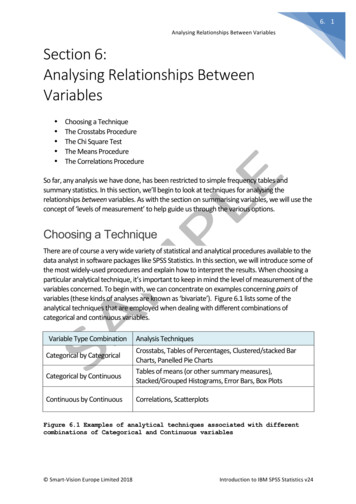
6. 1Analysing Relationships Between VariablesSection 6:Analysing Relationships BetweenVariables Choosing a TechniqueThe Crosstabs ProcedureThe Chi Square TestThe Means ProcedureThe Correlations ProcedureSo far, any analysis we have done, has been restricted to simple frequency tables andsummary statistics. In this section, we’ll begin to look at techniques for analysing therelationships between variables. As with the section on summarising variables, we will use theconcept of ‘levels of measurement’ to help guide us through the various options.Choosing a TechniqueThere are of course a very wide variety of statistical and analytical procedures available to thedata analyst in software packages like SPSS Statistics. In this section, we will introduce some ofthe most widely-used procedures and explain how to interpret the results. When choosing aparticular analytical technique, it’s important to keep in mind the level of measurement of thevariables concerned. To begin with, we can concentrate on examples concerning pairs ofvariables (these kinds of analyses are known as ‘bivariate’). Figure 6.1 lists some of theanalytical techniques that are employed when dealing with different combinations ofcategorical and continuous variables.Variable Type CombinationCategorical by CategoricalCategorical by ContinuousContinuous by ContinuousAnalysis TechniquesCrosstabs, Tables of Percentages, Clustered/stacked BarCharts, Panelled Pie ChartsTables of means (or other summary measures),Stacked/Grouped Histograms, Error Bars, Box PlotsCorrelations, ScatterplotsFigure 6.1 Examples of analytical techniques associated with differentcombinations of Categorical and Continuous variables Smart-Vision Europe Limited 2018Introduction to IBM SPSS Statistics v24
6. 2Analysing Relationships Between VariablesCrosstabs (sometimes called ‘contingency tables’) are one of the most popular and usefulways to explore interactions and relationships between categorical variables and this will bethe first technique that we explore.The Crosstabs ProcedureCrosstabulation allows us to compare the number or percentage of cases that fall into eachcombination of the groups created when two or more categorical variables interact. A goodway to begin using crosstabs is to think about the data in question and to begin to formquestions or hytpotheses relating to the categorical variables in the dataset. These mightinclude:Is the respondents’ place of birth related to their type of employment?Do married and unmarried people rate the ferry the service in the same way?Are men and women equally likely to experience health problems?Let’s begin by looking at the relationship between place of birth and employment type. Torequest crosstabs, from the main menu click:AnalyzeDescriptive StatisticsCrosstabsThe crosstabs dialog requires at least one variable to be added to the row dimension and oneadded to the column dimension. From the source variable list select:Place of birth (placeofbirth)Send the variable into the Row(s) dimensions by clicking the corresponding button. Click:Now from the source variable list, select:Type of paid employment (job)Send the variable into the Column(s) dimensions by clicking the corresponding button. Click: Smart-Vision Europe Limited 2018Introduction to IBM SPSS Statistics v24
6. 3Analysing Relationships Between VariablesYou may notice that the ‘OK’ button becomes active as we have now specified the minimumrequirements to run the Crosstabs procedure with the default options. Figure 6.2 shows thecompleted dialog.Figure 6.2 Completed Crosstabs dialog with default settingsRun the procedure by clicking:OKThe output is shown in figure 6.3.Figure 6.3 Basic Crosstab showing just frequency counts in the cells Smart-Vision Europe Limited 2018Introduction to IBM SPSS Statistics v24
6. 4Analysing Relationships Between VariablesApart from the initial ‘Case Processing Summary’ table which indicates that there were nomissing values and that all 330 records were present, the crosstab itself simply shows howmany respondents fell into the different groups regarding their place of birth and type of paidemployment. The values where the frequency counts appear are referred to as the cells in thetable. We can also see that it makes no difference which variable is in the rows or the columnsas the frequency counts have no direction. The simplicity of the table however betrays thefact that it’s hard to compare one group to another. This is because as the column and rowtotals show, the group sizes are different. For example, there are 147 people born on RedvaleIsland but only 37 born elsewhere in Europe. Let’s re-run the crosstab and request furtherstatistics in the cells that will enable us to compare the proportional differences moreeffectively. From the main menu click:AnalyzeDescriptive StatisticsCrosstabsThe dialog is retrieved with the variables still in their respective dimensions. To compare therespondents born in different locations in terms of their employment type, click the buttonmarked:This opens a sub-dialog where we can request additional statistics. You can see that ObservedCounts are already selected. In the area marked ‘Percentages’, check the box marked:RowFigure 6.4 shows the Cells sub-dialog. Smart-Vision Europe Limited 2018Introduction to IBM SPSS Statistics v24
6. 5Analysing Relationships Between VariablesFigure 6.4 Requesting Row Percentages to be displayed in a Crosstab CellsTo run the updated crosstab, click:ContinueOKThe Output is displayed in figure 6.5.Figure 6.5 Crosstab showing frequency counts and row percentagesSo now we can see that an extra row has been added for each level of the ‘Place of Birth’variable. The new row label says ‘% within Place if birth’. It is easier to compare these groupsusing percentages, as we can now say that, for example, 55.8% of those respondents born on Smart-Vision Europe Limited 2018Introduction to IBM SPSS Statistics v24
6. 6Analysing Relationships Between Variablesthe island are in permanent jobs as opposed to 64.9% of those born ‘Elsewhere in Ruritania’.Furthermore, the crosstab indicates that 21.6% of those born ‘Elsewhere in Europe’ are in‘Seasonal’ employment. This is the largest proportion by far but notice that the frequencycount in the cells indicates that this group is comprised of only 8 cases. So, although addingpercentages does make the crosstab more interpretable, it’s important to include thefrequency counts as we need to bear in mind that some of the groups sizes are relativelysmall. Only 37 respondents in total were born ‘Elsewhere in Europe’ and only 15 were born‘Elsewhere in the World’.Let’s see the effect of adding more information to the cells. From the main toolbar, click the‘Recall recently used dialogs’ button:CrosstabsCellsIn the area marked ‘Percentages’, check the box marked:ColumnFigure 6.6 shows the completed Cells sub-dialog.Figure 6.6 Requesting Row and Column Percentages in a CrosstabTo run the updated crosstab, click: Smart-Vision Europe Limited 2018Introduction to IBM SPSS Statistics v24
6. 7Analysing Relationships Between VariablesContinueOKThe Output is displayed in figure 6.7.Figure 6.7 Crosstab with Row and Column percentages in the cellsThe crosstab is now looking a lot larger and more complex than before. Again, an extra row ofvalues has been added. This time, the numbers relate to the percentage within ‘The type ofpaid employment’ which is the column variable. Here we can see that although 55.8% of therespondents born on the island are in permanent employment (which is 82 out of a row totalof 147 cases), of those in permanent employment, 42.3% were born on the island (which is 82out of a column total of 194). We can also see that 80% of the 10 seasonal workers are peopleborn elsewhere in Europe.We can see that crosstabs can convey a great deal of detailed insight when comparing theinteractions between categorical variables. Let’s look at adding a third dimension to acrosstab with a new example.From the main toolbar, click the ‘Recall recently used dialogs’ button:CrosstabsReset Smart-Vision Europe Limited 2018Introduction to IBM SPSS Statistics v24
6. 8Analysing Relationships Between VariablesThe crosstab dialog is now reset to its default settings. From the source variable list choosethe variable we created in the last chapter:Marital Status (simplified) [marital3] and add it to the rows dimension. Now choose the rating scale variable,Facilities for small children (rating6) and add it to the columns dimension.Request ‘Row Percentages’ to be displayed in the cells and click:OKThe output is displayed in figure 6.8.Figure 6.8 Crosstab showing Marital Status (simplified) against rating of‘Facilities for Small children’You can see that there are some marked differences between people of different maritalstatuses and their evaluation of the ferry service’s facilities for small children. Exactly 64% ofmarried respondents rate this aspect of the ferry’s service as ‘Excellent’ compared to only51.9% of those previously married. It would be interesting to break this relationship downfurther by finding out if these differences are true for male and female respondents. To do so,from the main toolbar, click the ‘Recall recently used dialogs’ button:CrosstabsChoose the variable: Smart-Vision Europe Limited 2018Introduction to IBM SPSS Statistics v24
6. 9Analysing Relationships Between VariablesGender of respondent (gender) and add it to the box marked:LayerThe completed dialog is shown in figure 6.9.Figure 6.9 Crosstab dialog with an additional variable in the Layer boxTo run the procedure, click:OkThe output is shown in figure 6.10 Smart-Vision Europe Limited 2018Introduction to IBM SPSS Statistics v24
6. 10Analysing Relationships Between VariablesFigure 6.10 Crosstab output split by layer variable ‘Gender ofrespondent’What is striking from the crosstab output, is that the effect of adding the gender variable as alayer field shows that although the difference between married and previously marriedrespondents in terms of their likelihood to rate ‘facilities for small children’ as ‘Excellent’ is stillpresent, this is particularly true for male respondents. In fact, close to 70% of malerespondents who were classed as either married or never married rate this aspect of theservice as ‘Excellent’. Again, this shows the power of crosstabs to reveal complex interactionswithin categorical variables.Let’s look at a couple of final examples using the Crosstabs procedure, or rather let’s look atan example of using crosstabs in conjunction with a test of statistical significance. Smart-Vision Europe Limited 2018Introduction to IBM SPSS Statistics v24
6. 11Analysing Relationships Between VariablesThe Chi Square TestThe chi square test (also known as ‘Pearson’s Chi-Squared Test’) was developed in 1900. It’s apopular statistical test primarily because it is such a useful addition to the crosstabsprocedure. Chi Square tests are often the first ‘significance test’ that students of statistics areintroduced to. Although we don’t have time to go into the statistical theory that underpinsthe test, we can illustrate how it is applied with a simple example.Once again, from the main toolbar, click the ‘Recall recently used dialogs’ button:CrosstabsClear the crosstab by clicking:ResetFrom the source variable list, choose the variable:Gender of respondent (gender)And add it to the ‘Row(s)’ box. From the source variable list, choose the variable:Value for money (rating1)And add it to the ‘Column(s)’ boxClick the ‘Cells’ button and request that row percentages are displayed.Now click the button marked:StatisticsYou may notice that there are a number of statistical tests one could choose. From the subdialog, check the box marked:Chi-squareFigure 6.11 shows the completed sub-dialog. Smart-Vision Europe Limited 2018Introduction to IBM SPSS Statistics v24
6. 12Analysing Relationships Between VariablesFigure 6.11 Requesting a Chi-square testTo run the procedure, click:ContinueOKThe generated output is shown in figure 6.12.The crosstab shows some apparent differences in the way in which male and femalerespondents have evaluated the ferry service in terms of ‘value for money’. Note that 31.5%of female respondents have rated the service as ‘Excellent’ in this respect compared to 23.9%of male respondents. Considering this discrepancy between the sexes in the crosstab output,we might ask ourselves whether the magnitude of the differences is so small that we wouldexpect to see them in many cases, or whether they are so large that we would only encounterthem relatively rarely. This is what researchers mean when they talk about statistical‘significance’. Looking that the table below the crosstab, we can see the Pearson Chi-Squaretest itself. Smart-Vision Europe Limited 2018Introduction to IBM SPSS Statistics v24
6. 13Analysing Relationships Between VariablesFigure 6.12 Crosstab output with associated Chi-square test ofsignificanceThe chi-square test is used to assess whether two categorical variables are independent ofone another in the population. To put that in practical terms, our data is drawn from a sample,so it could be that the differences we’re seeing between males and females here, are simplythe result of sampling variation (the fact that no two data samples are likely to give exactly thesame results). The column marked ‘Asymptotic Significance (2-sided)’ shows us a probabilityvalue that allows us to assess how often these sorts of differences would occur due to chance.In this case, the value for Pearson Chi-Square is 0.177 (equivalent to 17.7%). In statisticalanalysis, the convention follows that this is too large a value to regard this relationship is‘statistically significant’ as it indicates that differences of this magnitude can occur too oftendue to random variation to assume that female respondents really do rate the ferry service interms of ‘value for money’ differently from male respondents.The most common rule of thumb is that the significance value (technically speaking, this is theprobability that the null hypothesis is true) should be no larger than 0.05 (5%) before regardingan observed relationship as statistically significant. Let’s run one last crosstab. From the maintoolbar, click the ‘Recall recently used dialogs’ button:Crosstabs Smart-Vision Europe Limited 2018Introduction to IBM SPSS Statistics v24
6. 14Analysing Relationships Between VariablesSwap the variable ‘Value for money (rating 1)’ in the columns dimension with the variable‘Facilities for small children (rating 6)’. Now click:OKThe output is shown in figure 6.13.Figure 6.13 Second crosstab output with associated Chi-square test ofsignificanceNotice that 67.5% of male respondents have evaluated this aspect of the ferry service as‘Excellent’ compared to 54.4% of females. Indeed, twice as many female respondents asmales have indicated that they thought the facilities for small children were ‘Poor’. In thiscase, the Chi-Square test of significance is shows a value of .034 (equivalent to 3.4%) thisbelow the .05 (5%) threshold so we would regard this relationship as ‘significant’.Thus far we have used the crosstabs procedure as an example of a technique we can employto examine the relationships between categorical variables. In the next section, we will see aprocedure that enables us to examine the relationships between categorical and continuousvariables. Smart-Vision Europe Limited 2018Introduction to IBM SPSS Statistics v24
6. 15Analysing Relationships Between VariablesThe Means ProcedureA simple approach to comparing the groups within a categorical variable in terms of acontinuous variable is to use a summary statistic. Summary statistics such as sums, means ormedian values can be used to compare one group to another. As an example, from the mainmenu click:AnalyzeCompare MeansMeansThe Means dialog is generated. Despite its title, the Means procedure can be used tocompare groups in terms of many more summary measures than arithmetic averages. Youmay also notice that the dialog is made up of two boxes marked ‘Dependent List’ and ‘Layer 1of 1’. In this case we can think of the top dependent box as the place where we sendcontinuous variables (or whichever variable we wish to use a summary measure such as anaverage with) and the bottom layer box as the target location for the categorical field (or thevariable containing the groups we want to compare).From the source variable list, select the variable:Age of respondent (Age)And send it to the box marked ‘Dependent List’. Now, select the variable:Health problems? (healthy)And send it to the box marked ‘Layer 1 of 1’. The complete dialog is shown in figure 6.14.To run the procedure, click:OKThe resultant output is shown in figure 6.15. Smart-Vision Europe Limited 2018Introduction to IBM SPSS Statistics v24
6. 16Analysing Relationships Between VariablesFigure 6.14 Completed Means DialogFigure 6.15 Output from the ‘Means’ procedureThe means output is fairly straightforward to interpret. It shows that the average age of the295 people who report having no health problems is 43.37 whereas for the 35 people whoindicated that they do have health problems, the mean age is 65.6 years. For all 330respondents in the sample, the mean age is 45.73. You may also notice that by default theoutput includes the standard deviation value for each group. Standard Deviations are knownas measures of dispersion as they indicate the degree of ‘spread’ within each of the groups. In Smart-Vision Europe Limited 2018Introduction to IBM SPSS Statistics v24
6. 17Analysing Relationships Between Variablesother words, these values quantify the average amount by which the individual members of agroup differ from the overall mean value for the group. Let us return now to the meansprocedure and explore it a little further. From the main toolbar, click the ‘Recall recently useddialogs’ button:MeansFrom the returned dialog, within the Layer box where it says, ‘Layer 1 of 1’, click:NextThe box now appears empty and has the title ‘Layer 2 of 2’. From the source variable list, click:Gender of respondent (gender)Now let’s enhance the procedure with additional statistical measures. Click the buttonmarked:OptionsA sub-dialog is generated offering you the opportunity to change which measures aredisplayed in the means procedure. As you can see there are several additional measures.From the list choose:MedianMinimumMaximum and click the selection button each time:The completed sub-dialog is shown in figure 6.16. Smart-Vision Europe Limited 2018Introduction to IBM SPSS Statistics v24
6. 18Analysing Relationships Between VariablesFigure 6.16 Sub-Dialog for additional measures for Means ProcedureTo run the procedure, click:ContinueOKFigure 6.17 shows the results.Figure 6.17 Layered Means report with additional summary measures Smart-Vision Europe Limited 2018Introduction to IBM SPSS Statistics v24
6. 19Analysing Relationships Between VariablesInterestingly, the layered report shows that for those with health problems, there is a markeddifference in the average age of male and female respondents (57 and 72.5 respectively). Themeans procedure is a simple but powerful tool for exploring group differences betweencombinations of continuous and categorical variables. At this point, we can briefly introducethe concept of using pivot trays with SPSS output tables. Pivoting allows us to alter the displayof values and fields within tables by transposing fields, moving rows and columns or creatingmultidimensional layers. To activate the pivot controls:Double click on the table of means in the output viewerYou may notice that a dotted line appears around the outside of the table. To request thepivot trays, from the main menu within the viewer window, click:PivotPivoting traysThe pivoting tray is generated. To illustrate how we can use the tray to manipulate thedimensions in the table,Click the icon next to the word ‘Statistics’ and drag it to the empty slot in the top left box underthe word ‘Variables’ (in the ‘Layer’ dimension)Now:Click the icon next to the word ‘Gender’ and drag it to the empty slot in the top right boxpreviously occupied by the ‘statistics’ icon (in the columns dimension)Figure 6.18 illustrates this process. The results of this process are shown in figure 6.19. Smart-Vision Europe Limited 2018Introduction to IBM SPSS Statistics v24
6. 20Analysing Relationships Between VariablesFigure 6.18 Using pivot trays to change table appearancesFigure 6.19 Pivoted Means table with statistics measures layered Smart-Vision Europe Limited 2018Introduction to IBM SPSS Statistics v24
6. 21Analysing Relationships Between VariablesAs the statistical measures have now been placed in the layer dimension, we can interact withthem and choose to display one at a time. As shown in figure 6.20, using the drop-downmenu we can now choose to display a different summary measure such as a median.Figure 6.20 Pivoted Means table interacting with the layered statisticsLater in the course we will take another look at interacting with SPSS Statistics output. Fornow, we can turn our attention to analysing the relationships between pairs of continuousvariables.The Correlations ProcedureIn this section of the course, we have used two procedures to help us investigate therelationships between exclusively categorical variables (crosstabs) or combinations ofcategorical and continuous fields (the ‘Means’ procedure). In this next example, we will seehow we can employ correlation coefficients to examine the relationship between pairs ofcontinuous fields. The best way to illustrate how correlation measures work is to think of howwe normally visualize the relationships between pairs of continuous variables. Scatterplots arethe graphical equivalent of correlation coefficients. A correlation coefficients is a single valuethat indicates how strong the linear relationship is between the two variables and whetherthe relationship is positive of negative. If we look at the charts in figure 6.21 we can seedifferent scatterplots with various correlation values. It is important to understand thatcorrelation coefficients always range from -1 to 1. If we were to request a correlation of acontinuous variable against a copy of itself we would find that the correlation value was 1.00indicating that the variable is perfectly correlated with its copy. A positive value simplyindicates that high values in one variable are associated with high values in another. Anegative correlation indicates that as one value rises the other tends to fall (such as alcoholintake and reflex reaction time). Smart-Vision Europe Limited 2018Introduction to IBM SPSS Statistics v24
6. 22Analysing Relationships Between VariablesCorrelation: 0.86Correlation: 0.43Correlation: - 0.67Correlation: - 0.7Correlation: 0.01Figure 6.21 Illustration of various correlation values and theirassociated scatterplotsFigure 6.21 contains a number of scatterplots of pairs of continuous variables. Each measurerelates to an aspect of a car’s performance or history. In fact, each point in the scatterplotsrepresents the individual make and model of an automobile. Chart A shows a strong positivecorrelation between horsepower and vehicle weight (0.86). This simply illustrates that onaverage, the weight of a car is highly correlated with its horsepower. In fact, we can see thatthis relationship is linear in nature as it tends to follow a straight line. Chart B on the otherhand illustrates a positive relationship between the time to accelerate from 0 to 60 mph and Smart-Vision Europe Limited 2018Introduction to IBM SPSS Statistics v24
6. 23Analysing Relationships Between Variablesthe miles per gallon of gasoline consumption. In other words, the longer a vehicle takes toreach 60 mph from a standing start, the more efficient its overall fuel consumption is. We cansee from the chart that the relationship is a little more random (or ‘noisy’) and as such, thecorrelation value, although positive, is weaker (0.43) than the previous example. Chart Cshows a strong negative relationship (- 0.7) between time to accelerate and horsepower.Here we can see that cars with a lot of horsepower take less time to reach 60 mph that thosewith less horsepower: as one value increases the other tends to decrease. Chart D illustratesthe limitations of correlations although it shows a strong negative relationship (- 0.67) it is notwell expressed by a straight line. We can conclude from this that weak correlations don’tnecessarily indicate that there is no relationship, just that there is no linear relationship. In thisexample, the correlation value would be even stronger if the relationship was less curvilinear.Finally chart E shows that when the relationship is effectively random, the correlation value isclose to zero.To generate our own correlations for continuous variables, from the main menu click:AnalyzeCorrelateBivariateThis generates the correlation dialog. From the source variable list choose the followingvariables:Age of respondent (age)Hours worked per week (workhrs)Year arrived in Redvale (resideyr)Notice that the type of correlation is indicated by the check box marked ‘Pearson’.The completed dialog is shown in figure 6.22. To run the procedure, click:OKThe output is shown in figure 6.23. Smart-Vision Europe Limited 2018Introduction to IBM SPSS Statistics v24
6. 24Analysing Relationships Between VariablesFigure 6.22 Completed Correlations DialogFigure 6.23 Correlations outputWe’ve only asked for correlations for three variables, yet the output shows a table with threevalues each in nine cells. Of course, the cells running diagonally from left to right show acorrelation of 1 as each variable is being correlated with itself. However, if we look at themiddle cell in the first column, we can see that this is the correlation of ‘Hours worked perweek’ against ‘Age of respondent’. Here the value is -.209 indicating a weak negativecorrelation (older people tend to work fewer hours). We can also see that the middle valuecorresponds with the row label ‘Sig. (2-tailed)’. This is a test of significance that tells us thatalthough the correlation is weak, it is unlikely to be the result of chance (technically speaking Smart-Vision Europe Limited 2018Introduction to IBM SPSS Statistics v24
6. 25Analysing Relationships Between Variablesthis is testing the null hypothesis that the correlation is actually equal to zero in thepopulation). The double asterisk next to the correlation value itself simply tells us that thesignificance value is below .01 (the 1% level). Generally, the significance value is not veryinteresting in correlation analysis since it doesn’t indicate that the correlation is particularlystrong, merely that the value is large enough to not be regarded as a random fluctuation. Thelast value in each of the cells is the number of cases that were used to calculate thecorrelation. Although our strongest correlation is a negative relationship between the year therespondent arrived in Redvale and their age (a correlation value of -.674) we can see that only189 out of 330 cases was used in the calculation. This of course is because a large proportionof people were born on the island and they are coded as ‘Not Applicable’ (missing). The thirdcorrelation is a reasonably strong positive one with a value of .394. This is between year ofarrival on the island and hours worked per week, indicating that the more recent the arrival ofthe respondent the more hours they work.Earlier in the course we discussed the fact that sometimes ordinal data are treated as if thevariables were continuous in nature. This is particularly true when researchers wish tocalculate average scores with rating scales. In fact, within statistical research, there are anumber of procedures that make less stringent assumptions about the nature of the data thatyou may be working with. These procedures are referred to as non-parametric techniques.The correlations procedure in SPSS Statistics includes a non-parametric technique known asSpearman’s correlation that is often used when analysing correlations between pairs ofordinal variables. To demonstrate this, from the main toolbar, click:Bivariate CorrelationsResetThe dialog is now cleared back to its default setting, from the source variable list choose thefollowing ordinal variables:Value for money (Rating1)Comfortable Environment (Rating2)Courtesy of Ferry Staff (Rating3)Regularity of service (Rating4)Ferry Cafeteria (Rating5)Facilities for Small Children (Rating6)Journey Time (Rating7)Within the dialog Uncheck the box marked PearsonCheck the box marked SpearmanThe completed dialog is shown in figure 6.24. Smart-Vision Europe Limited 2018Introduction to IBM SPSS Statistics v24
6. 26Analysing Relationships Between VariablesFigure 6.24 Completed Correlations dialog with Spearman correlationselectedTo run the procedure, click:OKThe initial output is shown in figure 6.25.Figure 6.25 Spearman correlation matrixAs we can see, the procedure has created a large table with lot of values. To make it easier tofocus on the Spearman correlation values themselves, double-click on the output table and Smart-Vision Europe Limited 2018Introduction to IBM SPSS Statistics v24
6. 27Analysing Relationships Between Variablesuse the pivoting tray to send the statistics to the layers dimension so that the output looks likefigure 6.26.Figure 6.26 Pivoted Spearman Correlation tableThe non-parametric correlation table, shows that allow there are many statistically significantcorrelations, the values themselves are very weak so we shouldn’t spend too much timeconcerning ourselves with them.In this section, we have looked at three key methods for analysing relationships betweenvariables with different combinations of measurement level.
As with the section on summarising variables, we will use the concept of 'levels of measurement' to help guide us through the various options. Choosing a Technique There are of course a very wide variety of statistical and analytical procedures available to the data analyst in software packages like SPSS Statistics.