Transcription
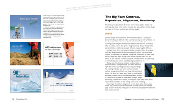
Simplentation Zen: eynoldsserePfoxsiRterlivery by Garrs from ChapSample pagesentation Design and DeIdeas on PreOn this page you can see five samples of simpleslides in which elements were arranged with thehelp of the “rule of thirds” grid (you can easilycreate your own using the guides in Keynote orPowerPoint). The rule of thirds is not a rule atall, it is only a guideline. But it is a very usefulguideline to use when you are aiming to achievea balanced look.You’ll also notice that the images themselveshave pretty good “rule of third” proportions.The iStockphoto images were chosen in partbased on the photo’s proportions and how theimage guided the eye and contained emptyspace for text or other design elements. (Imagesused for the slides on this page are fromiStockphoto.com.)152Presentation ZenCopyright 2008 by Garr ReynoldsThe Big Four: Contrast,Repetition, Alignment, ProximityThese four principles are not all there is to know about graphic design, butunderstanding these simple related concepts and applying them to slide designcan make for far more satisfying and effective designs.ContrastContrast simply means difference. And for whatever reason—perhaps ourbrains think they are still back in the savannah scanning for wild predators—weare all wired to notice differences. We are not conscious of it, but we arescanning and looking for similarities and differences all the time. Contrast iswhat we notice, and it’s what gives a design its energy. So you should makeelements that are not the same clearly different, not just slightly different.Contrast is one of the most powerful design concepts of them all becausereally any design element can be contrasted with another. You can achievecontrast in many ways—for example, through the manipulation of space (nearand far, empty and filled), through color choices (dark and light, cool andwarm), by text selection (serif and sans serif, bold and narrow), by positioningof elements (top and bottom, isolated and grouped), and so on.Making use of contrast can help you create a design inwhich one item is clearly dominant. This helps the viewer“get” the point of your design quickly. Every good designhas a strong and clear focal point and having a clearcontrast among elements (with one being clearly dominant)helps. If all items in a design are of equal or similar weightwith weak contrast and with nothing being clearly dominant,it is difficult for the viewer to know where to begin. Designswith strong contrast attract interest, and help the viewer make sense of thevisual. Weak contrast is not only boring, but it can be confusing.Every single element of a design such as line, shape, color, texture, size,space, type, and so on can be manipulated to create contrast. On the nextpage are some slides that make good use of contrast compared with slides thathave weaker contrast.Copyright 2008 by Garr ReynoldsChapter 6 Presentation Design: Principles and Techniques153
WEAK CONTRASTRepetitionBETTER CONTRASTThe principle of repetition simply means the reusing of the same or similarelements throughout your design. Repetition of certain design elements in aslide or among a deck of slides will bring a clear sense of unity, consistency,and cohesiveness. Where contrast is about showing differences, repetition isabout subtly using elements to make sure the design is viewed as being partof a larger whole. If you use a stock template from your software application,then repetition is already built into your slides. For example, a consistentbackground and consistent use of type adds unity across a deck of slides.However, you must be careful not to have too much repetition among yourslides. Most of the built-in templates have been seen many times before andmay not suit your unique situation. Many of the standard templates also havebackground elements that will soon become tiring, rather than generatinginterest the tenth time a different slide is shown but with the same repetitiveelement. For example, a starfish in the lower right (not my favorite but perhapsappropriate for a presentation on marine biology) is an element that wouldbe a stronger repetitive element if its size and location occasionally shifted inharmony with the content of different slides and in a way that was subtle anddid not interfere with the primary message.The slides on the next page are a goodexample of repetition. In these slides froma presentation on the process of designinga book, Swiss designer and photographerMarkuz Wernli Saito used his own full bleedphotos for all his slides. To help give theentire presentation a unified look, he used asimilar red note and paperclip to “hold” histext in each slide. The placement of the noteand paperclip image was not always in thesame location in every slide, nor was the sizealways the same, but the consistent use ofthis one element and the red color served toad a subtle repetitive element that gave hisvisuals a professional and unified look.154Presentation ZenCopyright 2008 by Garr ReynoldsCopyright 2008 by Garr ReynoldsChapter 6 Presentation Design: Principles and Techniques155
AlignmentThe whole point of the alignment principle is that nothing in your slide designshould look as if it were placed there randomly. Every element is connectedvisually via an invisible line. Where repetition is more concerned with elementsacross a deck of slides, alignment is about obtaining unity among elementsof a single slide. Even elements that are quite far apart on a slide should havea visual connection, something that is easier to achieve with the use of grids.When you place elements on a slide, try to align them with another element.Many people fail to make an effort to apply the alignment principle, whichoften results in elements being almost aligned but not quite. This may notseem like a big deal, but these kinds of slides look less sophisticated andoverall less professional. The audience may not be conscious of it, but slidesthat contain elements in alignment look cleaner. And assuming other principlesare applied harmoniously as well, your slides should be easier to understandquickly.ProximityThe principle of proximity is about moving things closer or farther apart toachieve a more organized look. The principle says that related items should begrouped together so that they will be viewed as a group, rather than as severalunrelated elements. Audiences will assume that items that are not near eachother in a design are not closely related. Audiences will naturally tend to groupsimilar items that are near to each other into a single unit.People should never have to “work” at trying to figure out which caption goeswith which graphic or whether or not a line of text is a subtitle or a line of textunrelated to the title. Do not make audiences think. That is, do not make them“think” about the wrong stuff, like trying to decipher your slide’s organizationand design priority. A slide is not a page in a book or magazine, so you are notgoing to have more than a few elements or groups of elements. Robin Williams,in her best-selling book The Non-Designer’s Design Book (Peachpit Press) saysthat we must be conscious of where our eye goes first when we step back andlook at our design. When you look at your slide, notice where your eye is drawnfirst, second, and so on. What path does your eye take?156Presentation ZenCopyright 2008 by Garr ReynoldsCopyright 2008 by Garr ReynoldsChapter 6 Presentation Design: Principles and Techniques157
The two slides on this page showthat by aligning all elements flushright, a strong invisible line iscreated on the right side that tiesall elements together in a way thatis more interesting than the morecommon symmetrical title. Typeand color are adjusted to creategreater contrast and interest. Thered dot in the title ties in with thered logo at the bottom.This title slide lacks a designpriority. Due to poor use ofalignment and proximity theslide seems to contain fivedifferent elements.This slide uses symmetricalbalance and better proximity,with related items now clearlytogether. Greater contrast isalso achieved by adjusting typesize and color to give the designa clear priority.158Presentation ZenCopyright 2008 by Garr ReynoldsCopyright 2008 by Garr ReynoldsChapter 6 Presentation Design: Principles and Techniques159
The slide on the left looks busierdue to the abrupt contrast betweenthe background color of the images.By aligning the text and the photosand making the image backgroundstransparent (in this case by simplychanging the slide background towhite) the slide is much cleaner and“noise” is reduced.This slide features a typical graph exported fromExcel. It is impossible to identify the countries asthe text is too small and at an angle. The biggestproblem is this is too much data for a display.This amount of information would be betterpresented in a handout.The text and data are easier to see as thecontrast between the foreground and backgroundis much better. Only the key variables are chosento include in the display, which allows the barsand figures to be larger. Information on theexcluded variables can be put into a document tobe taken away.The background color is not a good fit with the colorsof the bars nor does it provide enough contrast; thetext is hard to read. The background of the sushiphoto adds unnecessary noise to the visual.Here the background of the sushi photo“disappears” to match the white background ofthe slide. The text and bars and background havemuch better contrast and are easier to read.The background image on theslide on the left has too muchsalience, making the title hard tosee. Choosing a more appropriatebackground image that allowsthe text to remain clearly in theforeground and grouping the textlines makes for a stronger title slide.By making the background of thefish photo seem transparent (againby changing the slide backgroundcolor in this case) the image and textblend together harmoniously into amore unified visual.The slide on the left has a busytemplate which makes the usefularea of the slide about 1/3 smaller.The slide on the right uses theimage to cover the entire slide. Thetext is clearly foreground and theimage serves both as backgroundand at times foreground, makingthe overall visual more dynamic andmore unified with a cleaner, moredramatic look.Images on this page and opposite pagefrom iStockphoto.com.160Presentation ZenCopyright 2008 by Garr ReynoldsCopyright 2008 by Garr ReynoldsChapter 6 Presentation Design: Principles and Techniques161
In Sum Design matters. But design is not about decoration or about ornamentation.Design is about making communication as easy and clear for the viewer aspossible.The more strikingly visual yourpresentation is, the more people willremember it. And more importantly,they will remember you.— Paul Arden Keep the principle of signal-versus-noise in mind to remove all nonessentialelements. Remove visual clutter. Avoid 3-D effects. People remember visuals better than bullet points. Always ask yourself howyou can use a strong visual—including quantitative displays—to enhanceyour narrative. Empty space is not nothing; it is a powerful something. Learn to see andmanipulate empty space to give your slide designs greater organization,clarity, and interest. Use the principle of contrast to create strong dynamic differences amongelements that are different. If it is different, make it very different. Use the principle of repetition to repeat selected elements throughout yourslides. This can help give your slides unity and organization. Use the principle of alignment to connect elements visually (through invisiblelines) on a slide. Grids are very useful for achieving good alignment. This willgive your slide a clean, well-organized look. Use the principle of proximity to ensure that related items are groupedtogether. People will tend to interpret items together or near to each other asbelonging to the same group.162Presentation ZenCopyright 2008 by Garr ReynoldsChapter 6 Presentation Design: Principles and Techniques163
152 Presentation Zen Chapter 6 Presentation Design: Principles and Techniques 153 On this page you can see five samples of simple slides in which elements were arranged with the help of the “rule of thirds” grid (you can easily create your own using the guides in Keynote or PowerPoint). The rule of thirds is not a rule at all, it is only a guideline. But it is a very useful guideline to .