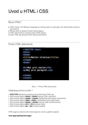
Transcription
L4: CSS Responsive DesignWeb Engineering188.951 2VU SS20Jürgen Cito
L4: CSS Responsive Design Media Queries Responsive and Adaptive Images and Fonts Flexible Box Layouts (Flexbox) Grid Layouts
Learning Goals Differentiate between different options to achieve responsive layouts Understand how images and fonts can be made responsive Properly use media queries for responsive design Understand the role of Flexbox and Grid layouts
Responsive Design is a way ofimplementing web layoutsbased on current standards,HTML5 and CSS3.Web Layout ApproachesGracefuldegradationInterface AInterface BMobile-first /ProgressiveenhancementInterface AInterface BResponsivedesignInterface AInterface BSlides by Michael Nebeling and the work by Michael Nebeling and Moira C. Norrie: Responsive Design and Development: Methods,Technologies and Current Issues, In: Proc. 13th Intl. Conf. on Web Engineering (ICWE 2013), LNCS, vol. 7977, pp. 510-513. Springer, 2013.
Responsive DesignLet content fill the container and define min/max constraintsUse relative units to specify position and size of text and mediaTechniques Media QueriesFluid, Grid-based LayoutResponsive ImagesFont Scaling Required eb-design/
Media Queries Previously only media types (screen, print, braille, handheld ) @media rule Additional features n Build complex queries using logical operators (not, and, only)@media only screen and (max-width: 500px) { }@media tv and (min-width: 700px) and (orientation: landscape) { } !-- comma acts as 'or' -- @media (min-width: 700px), handheld and (orientation: landscape) { }
ViewportThe virtual “window”Viewport Visible area of webpageSize content to viewportAvoid horizontal scrollingAvoid necessity to zoom meta name "viewport"content "width device-width,initial-scale 1.0,maximum-scale 3,minimum-scale 0.5" / Control viewport in HTML5 Through meta-element Consider mobile Sometimes narrower/widerPrevent default WebContent/UsingtheViewport/
Media Queries#header {height: 200px;}#navigation {width: 300px;}#content {width: 900px;}#footer {height: 200px;}@media screen and (max-width: 768px) {#header {width: 80px;height: 120px;display: inline;}#navigation {width: 560px;height: 120px;}#content {width: 640px;height: 760px;}#footer {height: 80px;}}@media screen and (max-width: 1024px) {.8
Media Queries and Fluid LayoutsUse of CSS3 media queries for defining breakpoints and style switches@media screen and (max-width: 680px) { . }However No linear progression between fix-sized designsSnaps at break pointsHorizontal scrolling may be required in-betweenDoesn't allow styling for future or unknown devicesFluid Layout: Deal with the "grey area" between breakpoints Use relative values for sizes to resize Consider maximum width for content#info { width: 50%; }#container { max-width: 960px; }
Fluid Images Scale images like content using relative values Problems Browser needs to scaleLarge downloadimg {width: 50%;max-width: ded-content.html#adaptive-images
Responsive and Adaptive Images Detect visitor screen size, resolution, and pixel density Fetch respective image, size or version (additional download!) Use JavaScript, CSS media queries, and/or HTML5 markup picture source src "pic-mobile.jpg" media "(max-width: 720px)" / source src "pic-tablet.jpg" media "(max-width: 1280px)" / source src "pic-desktop.jpg" / img src "default.png" / !–- User Agent not supporting picture element -- /picture ntent.html#adaptive-images
Scaling FontsScaling Fonts Use media queries and relative values for your fonts Font scales according to viewport and stays readable@media screen and (min-width: 481px) and (max-width: 768px) {p { font-size: 0.9em; }}@media screen and (max-width: 480px) {p { font-size: 0.7em; }}What's wrong with pixels? Dependent on screen resolution Resolution increase àfont size decrease Many modern mobile devices have high-density screens àdifficult to read
CSS Layout ModesLayouts Block, Inline, Table, Positioned, Grid, Flexible, Not all CSS properties apply to all modes Support for layouts still varydisplay: mode ; Check with: http://caniuse.com p Lorem ipsum dolor sitamet, consectetueradipiscing elit. /p -webkit-column-count: 3;-moz-column-count: 3;column-count: 3;
Layout Modes - Flexboxdisplay: flex;Flexbox enables aligning and distributing elementswithin a container Expands items to fill available free spaceShrinks items to prevent overflowFlex container: Contains flex itemsFlex items: Define properties on how the elementshould align and flow within the containerW3C: https://www.w3.org/TR/css3-flexbox/Image credit: SS Flexible Box Layout/Using CSS flexible boxes
Layout Modes - Flexbox Container Properties flex-direction, flex-wrap, flex-flow, justify-content, align-items, align-content Item Properties order, flex-grow, flex-shrink, flex-basis, align-self
“Holy Grail Layout” with FlexboxHoly Grail Layout Header, FooterFluid content, fixed sides 2 equal height columnsContent before remaining columns“order” property only for visual ordering header nav article footer Flexible Box Layoutmainmainmainmain{ display: flex; }article { order: 2; min-width: 12em; flex: 1; }nav{ order: 1; width: 200px; } !DOCTYPE html aside{ order: 3; width: 200px; }. header . /header @media all and (max-width: 600px) { main main { flex-flow: column; } article . /article main article, main nav, main aside { nav . /nav order: 0; width: auto; aside . /aside } /main } footer . /footer ility header article nav aside footer aside
Layout Modes - Griddisplay: grid;Grid layout enables control of sizing andpositioning of boxes within a grid system Grid Line: Horizontal and vertical dividing line within a grid Grid Track: Space between two adjacent grid lines —columns or rows of the grid Grid Cell: Single unit of the grid Grid Area: Adjacent grid cells that form a rectangleExample: Defining tracks in a grid (2 rows and 3 columns)display: grid;grid-template-rows: 100px 100px;grid-template-columns: 400px 200px 100px;Name individual lines to reference latergrid-template-columns: [first] 400px[main] 200px [side] 100px [last];W3C: https://drafts.csswg.org/css-grid/Image credit: -layout-module-for-the-web/
Layout Modes - GridPlacement of child elements in the grid grid-row, grid-column Element in one particular grid cell Element spanning a grid areaHorizontal and vertical alignment support Content distribution — align within the container justify-content — align horizontally align-content — align vertically Aligning elements within grid cell justify-self align-selfgrid-row: 3;grid-row: 2 / 5;grid-column: 3 / span 2;
Layout Modes - GridFractional Unit “fr” One part of the available space Can be mixed with other units when defining grid areas Examples of 4 column grid layout All 4 columns each taking the same amount of spacegrid-template-columns: 1fr 1fr 1fr 1fr; 3rd column has fixed size and 4th column is relative to container sizegrid-template-columns: 1fr 1fr 20px 20%; Multiple fractions are the sum of single fractions(in this example, the 4th column is the same size as column 1 and 2)grid-template-columns: 1fr 1fr 20px 2fr;
Layout Modes - Flexbox vs GridOne-dimensional vs Two-dimensional layout Flexbox (1D) - Content first Enable existing content to align and adaptRules decided by children.wrapper {width: 500px;display: flex;flex-wrap: wrap;}.wrapper div {flex: 1 1 150px;} Grid (2D) - Layout first Specific rigid layout in mind children are placed inDeclaratively control specifically where elementsend up — Rules decided by parent div class “wrapper” div One /div div Two /div div Three /div div Four /div div Five /div /div .wrapper {display: grid;grid-template-columns: repeat(3, 1fr);}Layout modes are not defined for entire page butfor a specific container. Flexbox and Grid are notmutually exclusive within a page. Mix and matchas you see S/CSS Grid Layout/Relationship of Grid Layout
Web Layout Approaches Slides by Michael Nebeling and the work by Michael Nebeling and Moira C. Norrie: Responsive Design and Development: Methods, Technologies and Current Issues, In: Proc. 13th Intl. Conf. on Web Engineering (ICWE 2013), LNCS, vol. 7977, pp. 510-513. Springer, 2013. Mobile-first / Progressive enhancement Interface B Responsive
