Transcription
MobiVis: A Visualization System for Exploring Mobile DataZeqian Shen Kwan-Liu Ma†Visualization & Interface Design Innovation (VIDi)University of California, DavisA BSTRACTThe widespread use of mobile devices brings opportunities to capture large-scale, continuous information about human behavior.Mobile data has tremendous value, leading to business opportunities, market strategies, security concerns, etc. Visual analytics systems that support interactive exploration and discovery are neededto extracting insight from the data. However, visual analysis ofcomplex social-spatial-temporal mobile data presents several challenges. We have created MobiVis, a visual analytics tool, whichincorporates the idea of presenting social and spatial informationin one heterogeneous network. The system supports temporal andsemantic filtering through an interactive time chart and ontologygraph, respectively, such that data subsets of interest can be isolated for close-up investigation. “Behavior rings,” a compact radialrepresentation of individual and group behaviors, is introduced toallow easy comparison of behavior patterns. We demonstrate thecapability of MobiVis with the results obtained from analyzing theMIT Reality Mining dataset.Keywords: Mobile Data, Social-Spatial-Temporal Data Visualization, Information Visualization, Visual AnalyticsIndex Terms: I.3.6 [Computer Graphics]: Methodology andTechniques—Interaction techniques;H.5 [Information Systems]:Information Interfaces and Presentation—User Interfaces1I NTRODUCTIONThe extensive use of mobile devices has impacted our everyday life,from how we communicate socially to how we do our work. In2004, over 600 million handheld devices were sold, which outnumbers the amount of personal computers sold that year [1]. This number will quickly grow to over a billion. If we collect and analyzedata captured by these mobile devices, we can discover communities, understand social behaviors, and infer important connectionsamong events. This sort of information has tremendous value, suggesting business opportunities, market strategies, security concerns,etc. Efforts to collect such data using mobile phones have been ongoing [16, 5], and analysis of the collected data becomes a pressingproblem. We are in need of new methods beyond the traditionaldata mining and statistical techniques.Visualization has been shown to provide good overviews of largecomplex data. Visual analytics tools that allow us to “see” themobile data and support interactive exploration and discovery areneeded for extracting insights from the data. However, visual analysis of the mobile data presents several challenges, which demandsnew approaches to this important problem. First, mobile data iscomplex since it contains social, spatial and temporal information.All the social and spatial data are time-varying. GPS data providesubjects spatial locations, and we can infer social relations fromcalling data and Bluetooth proximity information. Next, mobile e-mail:† e-mail:zqshen@ucdavis.eduma@cs.ucdavis.eduIEEE Pacific Visualisation Symposium 20084 - 7 March, Kyoto, Japan978-1-4244-1966-1/08/ 25.00 2008 IEEEdata can be very large-scale. For example, the MIT Reality Miningexperiment [5] captures more than 3 million cell phone activitiesof one hundred subjects over the course of only nine months. Filtering techniques are necessary to support exploring such a largedata set. Finally, one of the most important topics for social sciencestudy is to classify and compare human behavior patterns. Thus, effective visualization of individual and group behaviors are desired.We have studied how to visualize and analyze large social-spatialtemporal data.In this paper, we present MobiVis, a visualization system, whichsupports intuitive exploration of social-spatial-temporal data captured by mobile devices. We introduce the idea of using a heterogeneous network to present both social and spatial information in onesingle 2D graph visualization. In order to support exploring largescale mobile data, we have created a visual interface for performingtemporal and semantic filtering. We have also developed “behaviorrings,” which enable an analyst to examine and compare individualand group behavior patterns. We have evaluated MobiVis using theMIT Reality Mining data set, and show in this paper that MobiViscan detect findings that conventional tools cannot reveal directly.2R ELATED W ORKOne of the most important experiments collecting mobile data wasconducted at University of Helsinki. The Context project studiedcharacterization and analysis of information about users’ contextand its use in proactive adaptivity [16]. ContextPhone was designedand developed as a software platform consisting of modules to support logging mobile phone usage and communications. It runson mobile phones using Symbian OS (www.symbian.com) and theNokia Series 60 Smartphone platform (www.series60.com). Manymobile data collecting projects based on Context have been conducted. Researchers at MIT Media Lab conducted an experimentconsisting of one hundred subjects. They captured location, communication, Bluetooth proximity and device usage over the courseof nine months [5]. Studies of mobile data that mainly rely on statistical analysis rather than visual analysis have been conducted.For instance, in [4], periodic behavior patterns were analyzed andused to identify social communities. Algorithms that learn routesbetween important locations and predict the next location when theuser is moving were introduced in [12]. A few simple visualizationshave been created for the MIT Reality dataset [13, 2]. However,none of them support advanced visual analysis and exploration.Spatial-temporal data visualization have been widely studied [3,11]. GeoTime is a system for displaying and tracking events, objects and activities over time and geography within a single, interactive 3-D view [7, 17]. It focused on visualizing the traces of asingle event rather than group behaviors. For time-varying socialnetwork visualization, SoNIA incorporated innovative graph layoutand animation algorithms to enable a temporally coherent animated“movie” of the changing social networks [14]. A similar approachfor larger complex networks was introduced in [10].Different from their work, we introduce a method to put timevarying spatial and social information all together in one visualization. A heterogeneous network consists of different types ofentities (e.g., person and location) and relations (e.g., calling andproximity) is used. Visual representation of the heterogeneous net-175Authorized licensed use limited to: MIT Libraries. Downloaded on January 19, 2009 at 01:01 from IEEE Xplore. Restrictions apply.
work and semantic filtering techniques based on associated ontology graphs [18] are incorporated into our system.Timelines are good for presenting trends of time-varyingdata [8]. For example, in [19], univariate time series data are visualized in the form of calendars. Thus, recurrent patterns and trends onmultiple time scales can be observed simultaneously. Timelines canalso be used for temporal filtering. Timebox is a widget supportingdynamic query on time series data [6]. It allows users to filter databy selecting arbitrary timespans along the timeline. In MobiVis,a 2D time chart equipped with more advanced user interactions isimplemented.3 M OBI V ISMobiVis is a visual analytics system designed for exploring anddiscovery of mobile data. We address the challenges of visualizingcomplex social-spatial-temporal data in its design and implementation. In this section, we first introduce a methodology to formulatethe data into a heterogeneous network. Next, we discuss the interactive time chart and ontology graph, which enable temporal andsemantic filtering in MobiVis, respectively. Finally, we introducebehavior rings that can reveal periodical behavior patterns of individuals and groups.3.1 Data Formulation for VisualizationMobile data contains both spatial and social information. GPS unitson mobile phones record the spatial locations of subjects. Bluetoothproximity relations and calls can infer social relations among thesubjects. Usually, spatial information is visualized on a geographical map, and relational information is presented as a social networkin a node-link diagram. Therefore, two different mappings of thedata exist. In experiments performed by Klein et al. [9], they observed that “switching between completely different visualizationsconfused the users.” A good visualization system should use a minimum number of visualizations and construct in a unified fashion.We therefore decide to integrate both spatial and social views in asingle visualization. This would also help find the hidden correlation between social and spatial information.The social information including phone calls and proximity canbe formulated as an undirected graph, where each vertex denotesa person, and edges denote calls or proximity relations betweenpersons. Therefore, the edges are time-varying. The spatial information in mobile data can be defined as SP {(pi , l j ,t) : pi P, l j L}, which denotes that person pi is at location l j at time t.Since it can be thought of as time-varying relations between persons and locations, we can also formulate the spatial information asan undirected graph. Both persons P and locations L are convertedinto vertices. The “locate at” relations, SP, are converted into timevarying edges. Then, we can integrate the social graph and spatialgraph into one graph, which is a time-varying heterogeneous graph.An example is illustrated in Fig. 1 to demonstrate this idea. Thespatial view on the top 1 shows that person A moves along the redline from the CS Department to the Library, and arrives at TrainStation. Person B moves along the blue line from the Univ. Center to the Library, and arrives at the Central Park. The social network view at the bottom shows the relations among A, B and theother two persons. We integrate both views into the heterogeneousnetwork on the right by converting persons and locations to vertices. In the network, location vertices are drawn as triangles, andan edge connecting a person and a location denotes that the personhas visited the location. Note that the edges in the heterogeneousnetwork are time-varying. We draw all of them in the figure fordemonstration purpose. The mobile data often contains other typesof information, such as subjects’ occupations, ages and personalized phone settings. These information can also be integrated into1 The map of University of California, Davis is retrieved frommaps.google.comFigure 1: Using heterogeneous network to present both spatial andsocial information in mobile data. The spatial view at the top andthe social network view at the bottom are integrated into one singleheterogeneous network on the right.the heterogeneous graph using the similar formulation method (formore details, please read our previous paper [18]).Visualization of this time-varying heterogeneous graph is usedas the centerpiece in MobiVis. Therefore, we want to introduce formal definition of time-varying heterogeneous graphs. Thegraph is defined as G (V, E, vt, et). The nodes are static, whileedges are dynamic. V {v1 , v2 , ., vn } denotes the vertex setand E {(vi , v j ,timek ) : vi , v j V } denotes the edge set, wheretimek (day, hour) denotes the valid timespan of the edge. Theassociated ontology graph is defined as OG (TV , TE ). TV {t1 ,t2 , .,tm } is a set of vertex types and TE {(ti ,t j ) : ti ,t j TV }is a set of edge types. vt denotes a mapping from V to TV that associates a vertex to its type. If v is a vertex in the graph, vt(v) denotesthe type for vertex v. Similarly, et denotes a mapping from E to TEthat associates an edge with its type. If e is an edge in the graph,et(e) denotes the type for edge e. It is important to note that a heterogeneous graph cannot have vertices and edges with types that arenot presented in its associated ontology graph. In other words, TVand TE are, respectively, supersets of the vertex and edge types thatoccur in graph G. Both time-varying heterogeneous graphs and theassociated ontology graphs discussed in this paper are undirected.3.1.1 MIT Reality Mining DatasetIn this paper, a mobile dataset collected by MIT Media Lab in theReality Mining experiment [13, 5] is used. In the experiment, Nokia6600 smart phones, pre-installed with logging software, were distributed to one hundred subjects, of which seventy-five are eitherstudents or faculty in MIT Media Laboratory, and twenty-five areincoming students at MIT Sloan business school. The experimentwas run over the course of the 2004-2005 academic year. Over500,000 hours of continuous data on daily human behaviors werecaptured. Moreover, subjects were asked to take surveys regardingtheir social activities and interactions with others. Part of the MITReality Mining dataset is publicly available in the form of MySQLdatabase. The available dataset is somewhat noisy. After the cleaning process, we are able to obtain a dataset that contains social activities of 83 anonymous subjects from August 2004 to March 2005.The dataset contains personal information obtained from the usersurvey, Bluetooth proximity relations, phone calls, and locations.The ontology of the derived heterogeneous network is shown inFig. 2. There are 20 types of nodes in the network, including person, location, and 18 survey questions. There are two types of edgesbetween person nodes: phone calls and proximity relations. In thedataset, a person’s current location is indicated by the celltower towhich his/her mobile phone connects. Geographic information ofcelltower locations are not available. Fortunately, in the experiment,176Authorized licensed use limited to: MIT Libraries. Downloaded on January 19, 2009 at 01:01 from IEEE Xplore. Restrictions apply.
types will be derived, i.e., G[T S] (V ST S , EST S , vt, et) of a selectedset of node types T S TV , where V S {v V : vt(v) T S} andES {(vi , v j ) E : vt(vi ), vt(v j ) T S}. The subgraph is drawn inthe main visualization window of MobiVis. Fig. 3 shows the subgraph consisting of persons, positions and hangout places obtainedby selecting these node types in the ontology graph. Linlog [15],a force-directed graph layout algorithm, is used, because it is general enough to work with many types of networks, relatively easy toimplement, and adaptable to satisfy different requirements. The visualization shows that there are five major groups of people: Sloanstudents, Media Lab graduates, student, new graduates and seniorgraduates. Node sizes are determined by their degrees. The threemost popular hangout places are gym, restaurant/bar and friend’splace.3.2.2 Temporal Filtering Using Interactive TimechartFigure 2: Ontology graph of the mobile social network derived fromMIT Reality Mining dataset. The data is formulated as a time-varyingheterogeneous network. There are 20 node types, including person,location, and 18 survey questions. There are 21 edge types. Twotypes of edges exist between two person nodes: call and proximity.Nodes are static, while edges associated to proximity relations, calls,and locations are time-varying.subjects are asked to name their current location when a previouslyunseen celltower is encountered. We believe, the personalized celltower names (e.g., home, media lab, sloan, and parents) are morevaluable than geographical locations for social behavior analysis.The problem is that there are too many distinct celltower names. Itis not appropriate to map all of them as location nodes. We decideto put the names into several major categories, such as home, work,travel, etc. For example, “Jon home” and “home pearl st” are bothconsidered “home”. The classification is done automatically basedon manually picked keywords. Those names that cannot be classified are put into the category “others.” Each category is mappedto a location node. Edges associated to proximity relations, calls,and locations are time-varying. Besides person and location, eachsurvey question is considered as a node type and answers as nodesof that type. An edge between such an answer node and a personnode indicates that the subject gave such an answer for the particular survey question.3.2 Filtering TechniquesThe continuous human behaviors captured by mobile devices can bevery large. In MIT Reality Mining dataset, for instance, there arethousands of Bluetooth encounters during a regular weekday. Thevisual analytics tool should allow users to filter the sheer numberof data and isolate subsets of interest. In MobiVis, we incorporatetwo filtering methods: semantic filtering using ontology graph andtemporal filtering through a time chart. Their design and implementation are discussed below.3.2.1 Semantic Filtering Using Ontology GraphThe heterogeneous network derived from the mobile data can betoo large to visualize with limited screen space and resolution. InMobiVis, we use the semantic information that resides on the nodesand edges to filter the data and find subgraphs of interest. The semantic filtering technique introduced in [18] is used. An ontologygraph derived from the heterogeneous network is drawn as a semantic overview (See Fig. 2). It contains all node types and possible relations between them. The system allows users to interactively select node types in the ontology graph. As soon as nodetypes T S are chosen, a subgraph including only nodes with selectedFor mobile data, presenting and exploring the temporal informationare critical. Human behaviors in mobile data exhibit repetitive patterns and trends. Therefore, the visual representation should makethe repetitive patterns more salient and allow users to select recurrent timespans. Traditional 1D timeline is not effective in this case.In MobiVis, we choose 2D time charts with both axes denoting different time scales, and colors of blocks in the chart denoting timevarying values (See Fig. 5). In this example, the vertical and horizontal axes denote time and date, respectively. It is ideal for observing daily patterns. The vertical lines separate weeks, and horizontallines denote hours. The color of a block denotes the location of subject 57 at the time indicated by its coordinates. Red denotes work,blue is for home, and green is for entertainment places. We can seethat subject 57 usually goes to work around noon, and comes backhome around midnight. Users can change time scales of the axes tofit their tasks. For example, using days of a week for vertical axis,and weeks for horizontal axis, makes weekly patterns clearer.The time chart also enables users to select more than continuous timespans. Drawing a rectangle on the time chart,users can specify an advanced time window, which is defined as TW (start day, start hour, end day, end hour). A moment is in the timewindow (i.e., time(day, hour) TW ) if day [start day, end day) and hour [start hour, end hour). The timechart is linked with the heterogeneous graph visualization, whichshows an induced graph contains aggregated activities withinthe selected timewindow, i.e.,G[TW ] (V, ESTW , vt, et), whereESTW {(vi , v j ,timek ) E : timek TW }. Such time windowsare very useful in time-varying data analysis. For instance, userscan investigate recent night life of a subject by selecting activitiesbetween 9pm and midnight for the last three weeks (See Fig. 5).To isolate the same activities, in 1D timeline, users need to select9pm-midnight timespans for everyday of the last three weeks.The time chart has two modes. One mode shows the occurrenceof time-varying neighbors of a selected node as the example above,which shows the location neighbors of person node 57. Anothermode shows the occurrence of the selected node. The occurrence ofa node is defined as the sum of valid time-varying edges connectingto it at the moment. In other words, it is how many other nodes thathave the selected node as neighbors. Fig. 4 shows the occurrenceof location node “work,” i.e., the number of subjects at work, overtime. This example reveals clear patterns at different timescales.On a daily basis, the most common working hours are 11am 7pm.On a yearly basis, there is a large break near the end of Decemberbecause of the Christmas holiday season.3.3 Behavior RingsThe time chart can reveal the behaviors of a single subject or group,but does not support comparison. For example, we want to compare subjects’ weekly calling patterns. One way is to display multiple time charts side by side for this purpose but there is a limit on177Authorized licensed use limited to: MIT Libraries. Downloaded on January 19, 2009 at 01:01 from IEEE Xplore. Restrictions apply.
Figure 3: Network with person, position and hangout places. It shows subjects’ occupations and usual hangout places from the user survey.There are five major groups of people: Sloan students, Media Lab graduates, students, new graduates, and senior graduates. The three mostpopular hangout places are gyms, restaurants/bars and friend’s places.(a) In the daily view, the vertical axis denotes hours in a day. The most (b) In the weekly view, the vertical axis denotes days in a week. The weeklycommon working hours are from 11am to 7pm. The periodical vertical breaks working pattern is revealed.indicate weekends.Figure 4: Time chart whowing the number of subjects at work. Repetitive patterns can be observed in views of different timescales. In bothviews, there are two large breaks: Thanksgiving and Christmas holidays.178Authorized licensed use limited to: MIT Libraries. Downloaded on January 19, 2009 at 01:01 from IEEE Xplore. Restrictions apply.
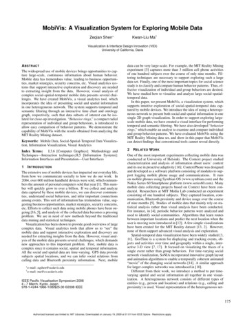
(a) A daily ring of calls illustrates the frequency of calls every weekday. Subject 29, 57, and 86 made calls more frequently. In addition, thisexample reveals that a subject often made more calls during weekendsthan weekdays.(b) An hourly ring of calls shows the frequency of calls every hour.Subject 29, 57, and 86 made more calls during night than daytime.Figure 6: In a behavior ring, occurrences of selected activities are arranged radially around a subject in counter-clockwise order. The ringsprovide an abstraction of subjects’ behaviors and allow users to compare across different individuals in the network view. In this example, dailyand hourly rings of phone calls for four subjects are illustrated. More phone calls are made after work, since only phone calls among participants,who are colleagues, are counted.Figure 5: Time chart showing the locations of subject 57 over time.Subject 57 usually goes to work around noon, and returns homearound midnight. Drawing a time window in the time chart, the activities between 9pm and midnight and within the three-week span from2004/9/5 to 2004/9/25 are selected.how many charts can be simultaneously displayed and how muchinformation can be shown on each chart. An alternative visual representation that is more compact and integrable with other representations is needed. We have developed a radial-layout designresembling Florence Nightingale’s coxcomb. We call it behaviorrings. Like coxcombs, we use radially lay-out, pie-shaped wedgesto represent time-varying information, such as some particular activity including phone calls, proximity relations, and locations accumulated over a selected period. The whole period (from August2004 to March 2005) is used by default. The size of the wedgecan represent the accumulated occurrence of the activity during auser-specified recurrent time, e.g., every Saturday. Color or texturemay be used to represent other information. Unlike coxcombs, wereserve a large portion of the inner region to display additional information. This additional information could be nested behaviorrings or other visual or textual representations. Furthermore, weuse behavior rings to represent nodes of a social network. This isan interesting and important option. Fig. 6(a) shows an example ofdaily behavior rings presenting accumulated occurrences of phonecalls of every day in a week from August 2004 to March 2005.Each ring contains 7 wedges, which denote 7 days in a week. In thevisualization, the wedges are arranged counter-clockwise, and thestarting point is marked by a longer spike. Subjects 29, 57, and 86made calls more often than the other two subjects. In addition, wecan also see that these three subjects made more calls during weekends than weekdays. We further investigate these subjects’ hourlycalling patterns during the same period by enabling the hourly behavior ring. In an hourly ring, wedges denoting every hour in a dayare arranged counter-closewise as in Fig. 6(b). Subjects 29, 57, and86 made more phone calls during the night than the daytime. Bothdaily and hourly calling patterns show that these three subjects callmore often after work. The reason is that only calls among participating subjects, who are colleagues, are counted in the dataset.Therefore, they usually do not need to call each other when they areat work.A network of behavior rings display much richer informationabout the the involved subjects. Together with cluster operations,the user can interactively combine nodes to see the behavior of alarge group. In the network view, users are allowed to circle a region and all person nodes within the region are selected. Then, amacro ring, which shows the aggregated activities of the selectedperson nodes, is drawn. In Fig. 7, we compare the weekly behaviorpatterns of subjects with different positions by enabling group behavior rings of proximity relations. Subjects are grouped accordingto their academic positions. Behavior rings of every group are visualized. Groups including “New Grad”, “Student”, and “Media LabGrad” gather together very often, while subjects belonging to Sloanbusiness school do not. Senior graduate students are often alone.In addition, we can find that persons are closer to each other duringweekdays when they are at work.Behavior rings provide abstractions of subjects’ dynamic behaviors in the network view and enable users to find subjects with interesting behaviors for further investigation.4R ESULTSOrganizational behavior patterns in MIT Reality Mining data areanalyzed to demonstrate the capability of MobiVis for visual analysis of mobile data. Moreover, examples of using MobiVis to findand resolve inconsistencies and uncertainties in data are presentedin this section.4.1 Inferring Friendship Network From Observed BehaviorsOne of the key issues in social network analysis is friendship. Social scientists usually obtain the friendship network by user survey.179Authorized licensed use limited to: MIT Libraries. Downloaded on January 19, 2009 at 01:01 from IEEE Xplore. Restrictions apply.
group of subjects are to others. In the behavior ring of Sloan students at bottom left, the wedge size increases at 9am, while in thoserings of Media Lab students, the wedge increases around 12pm.Thus, the group of Sloan students gather together two hours earlier than those groups of Media Lab students. Because subjects arecloser to each other during work hours, their closeness can suggests whether they are at work or not. Therefore, we further studythe daily working pattern by enabling the behavior rings of the timefor which subjects stay at location “work.” In Fig. 9(b), the behavior ring of Sloan students shows that they go to work around9am. In the rings of Media Lab students, the wedges become significant around 10am. Therefore, we can draw the conclusion thatSloan students go to work earlier than those from the Media Lab. Inaddition, senior graduate students spend the longest time at work,because all the wedges in their behavior ring are of considerablesize.Figure 7: Comparison of group behaviors using behavior rings. Persons are divided into groups by their academic positions. Rings ofproximity activities are enabled. The visualization reveals that persons in group “Student”, “Media Lab Grad”, and “New Grad” are often close to someone else. People are closer to each other duringweekdays.In addition to the self-reported information, we can also infer thefriendship network from observed human behaviors. For example,persons who often hang out together during weekends are likely tobe friends. In Fig. 8, examples are presented to show how MobiViscan help isolate important social behaviors and infer the friendshipnetwork.First, we try to infer the friendship network from phone calls.The assumption is that friends often call each other. We select allperson nodes and phone calls among them. Positions are also addedinto the visualization (See Fig. 8(a)). Each edge denotes the calling relation between two persons, and its width denotes the totalduration of calls between them. There are two closely connectedfriendship groups. The group at the bottom left consists of studentsfrom Sloan business school, and the one at top right is from MediaLab. Comparing the connection density of two groups, we can conclude that students from Sloan are more likely to make friends witheach other. Inside the group of Media Lab, senior graduate studentshave less friends.Besides phone calls, friends also tend to hang out with each otherin their spare time. We choose to examine the proximity relationsduring Saturday nights, which are defined as periods between 11pmon Saturday and 3am Sunday morning. All Saturday nights are selected on the time chart. Person nodes, position nodes, and proximity edges are added into the visualization (See Fig. 8(b)). Thefriendship network presented here is very similar to the one inferredfrom phone calls. People from Sloan rarely get together with thosefrom Media Lab on Saturday nights.From the study above, we can draw the conclusion that in theMIT Reality Mining experiment, subjects are more likely to makefriends with their colleagues under the assumption that phones andproximity relations on Saturday nights can
have been created for the MIT Reality dataset [13, 2]. However, none of them support advanced visual analysis and exploration. Spatial-temporal data visualization have been widely studied [3, 11]. GeoTime is a system for displaying and tracking events, ob-jects and activities over time and