Transcription
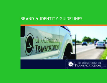
BRAND & IDENTITY GUIDELINES
ii ODOT Brand & Identity Guidelines
TABLE OF CONTENTSBrand Overview. 2Our Voice. 3The History of Our Logo. 4Our Logos. 5The Zephyr-DOT.6The Wordmark.7The Zephyr.8The Seal.9Which Logo Should I Use?. 10Improper Logo Usage . 11Color Palette.12Typography. 14Trebuchet. 15Cambria. 16Myriad Pro & Minion Pro.17Email Signatures.18Letterhead.20Presenting. 22Photography. 24Iconography. 26ODOT Brand & Identity Guidelines 1
BRAND OVERVIEWWith early beginnings as an advisorycommission in the late 19th century, the OhioDepartment of Transportation has evolvedinto one of the premier state transportationdepartments in the nation. Although ourresponsibilities have vastly grown, thesame core mission “to investigate and builda safe, continuous and connected statetransportation system,” lives on today.From plowing snow in the winter, toreplacing culverts and bridges, to advancinglarge-scale complex construction projects,ODOT’s brand is one of the most highly visibleand impactful state agencies. But we aremore than just the vital work we do. We are5,000 unique, smart and passionate people,working together, improving the quality oflife and economy for those who live, work andvisit in Ohio.Our brand is an extension of all that we are:our long history, diversity and culture. And ifour people are our most valuable asset, thenour brand is our most visible one.The following branding and identityguidelines are the foundation tocommunicating ODOT’s message,consistently, clearly and with purpose.2 ODOT Brand & Identity Guidelines“ if our people are ourmost valuable asset,then our brand is ourmost visible one ”
OUR VOICEOur tone of voice is warm, thoughtful andintelligent. We speak to our partners likefriends in simple, direct and natural terms.Never boastful or full of jargon, we engagepeople in conversations and communicatethe benefits of our products and services.There is a positive, forward-looking energyto what we do. We are all about listening,innovating and delivering ingenioussolutions that benefit everyone. Our goal incommunicating is to recognize and reflecton our people and their interactions withthe public and our partners to clearly tellODOT’s story.ODOT Brand & Identity Guidelines 3
THE HISTORY OF OUR LOGOShortly after the Ohio Department ofHighways was rechristened the OhioDepartment of Transportation in 1972, acontest was held to develop a new logo, oremblem for ODOT. The selected design wassubmitted by Randy Witherspoon of thePublic Information staff at ODOT’s CentralOffice in Columbus.ODOT officials were looking for a symbolshowing mobility without confinement orlimitation. They felt an abstract creationwould be best, so the emblem would fitfuture transportation concepts, as well asconcepts which were current in 1972.The symbol started out blue and white, andover time, other colors were tried, includingred, until the familiar road sign greenbecame the final, lasting color.Some people describe the center of theemblem as a wing. Others call it a zephyr,which is really a soft, gentle breeze. Nomatter what you call the symbol, it depictsforward movement, and that is whatthe Ohio Department of Transportationattempts to do, move forward, to meet theneeds of the citizens of Ohio.4 ODOT Brand & Identity Guidelines1972
OUR LOGOSThe ODOT Zephyr is a powerful image. Itconnects ODOT’s people and culture to thediverse audiences we serve. It is a dynamicreflection of the department’s activecommitment to serving the needs of ourtransportation system and the people thatrely on it.As our most visible asset, we have anobligation to ensure the ODOT Zephyr isused properly. To meet various operationalneeds and situations, there are four distinctlogo designs. Each has a unique purposeand standards defining its use.THE ZEPHYR-DOTTHE WORDMARKTHE ZEPHYRTHE SEALODOT Brand & Identity Guidelines 5
OUR LOGOS: THE ZEPHYR-DOTThe Zephyr-DOTPANTONE 347 GREEN/ PANTONE BLACKThe Zephyr-DOT consists of The Zephyrand the letters D O T. It can be presentedalone or with the website identifier. TheZephyr-DOT should never be altered exceptas identified below.The preferred way to present The ZephyrDOT is in Pantone 347 (ODOT Green) andPantone Black over a white backgroundwith proper clear space.The Zephyr-DOT may also be presented inpure white over an approved solid colorbackground (see Color Palette, page 12).CLEAR SPACEThe Zephyr-DOT should never be used forformal contracts, reports, official businessdocuments or on official government forms.REVERSED WHITE6 ODOT Brand & Identity GuidelinesPANTONE BLACK
OUR LOGOS: THE WORDMARKThe WordmarkThe Wordmark consists of The Zephyrand the text “Ohio Department ofTransportation.” The Wordmark should neverbe altered except as identified below.PANTONE 347 GREENPANTONE BLACKREVERSED WHITE / PANTONE 347 GREENREVERSED WHITE / PANTONE BLACKThe preferred way to present The Wordmarkis in Pantone 347 (ODOT Green) over a whitebackground with proper clear space.The Wordmark may also be presented inpure white over an approved solid colorbackground (see Color Palette, page 12).CLEAR SPACEFor publications which cannot be printed incolor, The Wordmark can also be presented inblack over a white background.Business Unit LogosThe Wordmark is also the basis for internalDivision and Office representations toexemplify the unity of us all workingtogether as One ODOT. Contact the Divisionof Communications for assistance with thecreation of official internal business unitlogos. No other business unit logos will besupported.Di v ision of Oper ationsOffice of structur al engineer ingODOT Brand & Identity Guidelines 7
OUR LOGOS: THE ZEPHYRThe ZephyrPANTONE 347 GREENPANTONE BLACKThe most prominent, and therefore widelyused, of ODOT’s logo assets is The Zephyr.The Zephyr should never be altered exceptas identified below.The preferred way to present The Zephyris in Pantone 347 (ODOT Green) over awhite background with proper clear space.Designers should make every attempt topresent The Zephyr in this way.CLEAR SPACEFor publications which cannot be printed incolor, The Zephyr can be presented in blackover a white background.In rare cases, The Zephyr may be presentedin pure white over an approved solid colorbackground (see Color Palette, page 12).8 ODOT Brand & Identity Guidelinesaxa 4 xREVERSED WHITEx
OUR LOGOS: THE SEALThe SealPANTONE 347 GREENPANTONE BLACKThe Seal is the most formal of ODOT’slogo assets. It consists of The Zephyrsurrounded by the text “State of OhioDepartment of Transportation.” It shouldnever be altered except as identified below.The preferred way to present The Seal is ineither Pantone 347 or Pantone Black over awhite background with proper clear space.CLEAR SPACEDesigners should make every attempt topresent The Seal over a white background.Any deviation must first be approved by theDivision of Communications.aThe use of The Seal should always be preapproved by the Office of the Director andthe Division of Communications.xUse of The Seal onODOT EquipmentThe only permissible deviation of the Sealis the use of reversed white Zephyr andwording on a solid green field (Pantone 347or comparable sign material standard) whichcan be used solely on ODOT equipment.EQUIPMENT ONLY SEALa 4 xxODOT Brand & Identity Guidelines 9
WHICH LOGO SHOULD I USE?The Zephyr-DOTThe WordmarkThe ZephyrThe SealThe Zephyr-DOT is mostappropriate for internalannouncements and digitalplatforms such as emailnewsletters and masscommunications, social media,video and web-based materials.It also is great for ODOT swagand printed giveaways.The Wordmark is slightly moreformal than The Zephyr. Its sizeand shape make it best for useon business cards, reports, andat the top of documents whenthe use of letterhead is notappropriate.The Zephyr is the most visibleand valuable of our brand’sassets. It can stand aloneor be used in conjunctionwith other identifiers. It ismost appropriate for generalcorrespondence, fliers, internalbusiness documents, reports andpresentations.The Seal should be reserved forvery formal business functions,contracts, and to identify ODOTowned equipment and facilities.“When in doubt, useThe Zephyr-DOT”It should never be used forformal contracts, officialbusiness documents, or onofficial government forms.Questions about when to usethe Zephyr-DOT? Contact theDivision of Communications.10 ODOT Brand & Identity GuidelinesThe Wordmark also looks greaton digital and print publicationswhen presented in whiteover an approved solid colorbackground.Do not use the Wordmark next toheadline text that also says “OhioDepartment of Transportation.”It also is not usually appropriatefor social media.The Zephyr should not be usedfor formal contracts or on officialgovernment forms. Any use ofThe Zephyr to replace a letter ina word must be approved by theDivision of Communications.It is not appropriate to use theseal in emails, most publications,presentations, social media,video, web-based materials, oron printed giveaways.The use of The Seal should alwaysbe pre-approved by the Office ofthe Director and the Division ofCommunications.
IMPROPER LOGO USAGEIllustrated here are examples ofinappropriate usages of the ODOT logo.These images and variations similar tothem have been discontinued and are notto be used.Do Not:1. Change the logo’s orientation. TheZephyr always points to the right.2. Add extraneous effects to the logo. Thisincludes but is not limited to: bevel andemboss, lighting effects, drop shadowsand gradients.Ohio Department ofTransportation3. Scale the logo disproportionately.4. Attempt to recreate the logo.5. Change the logo’s color.6. Do not add graphics to the logo.Ohio Department ofTransportationOhio Department ofTransportation7. Do not place the logo on backgroundsthat limit legibility of the logo.8. Do not create a pattern with the logo.Reach out to the Division ofCommunications with any questions orconcerns regarding use of the logo.Please ask for permission, not forgiveness!OHIO IS SMARTINNOVATION & TECHNOLOGY LEADERAutonomous & connected vehiclesSmart highways, sensor technologiesDrones7ODOT Brand & Identity Guidelines 11
COLOR PALETTEColor plays an important role in the ODOTcorporate identity program. The colorsshown are recommendations for variousmedia. The palette comprises theprimary colors with seven supportinghigh-contrast colors and three neutralcolors. The red, yellow and orangevariations also represent some of ourcore business functions.The color palette is reflective of ourbrand’s overall voice and image. Usingthis color palette creates cohesivenessand consistency, yet still allows forcreativity.PRIMARY COLORSPMSRGBCMYKHEXPMSRGBCMYKHEX533 CPMS 7628 C31, 42, 68RGB 158, 42, 4395, 72, 15, 67 CMYK 8, 93, 78, 33#1f2a44HEX #9e2a2bPMSRGBCMYKHEXBlack C0, 0, 00, 0, 0, 100#000000PMSRGBCMYKHEX611 CPMS 715 CPMS 7579 CPMS 306 C215, 200, 38RGB 246, 141, 46RGB 220, 88, 42RGB 0, 181, 2267, 1, 89, 10 CMYK 0, 54, 87, 0 CMYK 0, 74, 100, 0 CMYK 75, 0, 5, 0#d7c826HEX #f68d2eHEX #dc582aHEX #00b5e2PMSRGBCMYKHEXNEUTRAL SUPPORTING COLORS7527 C214, 210, 1963, 4, 14, 8#d6d2c4Choose one dominant colorfrom the paletteDocument white space12 ODOT Brand & Identity GuidelinesOpaque WhiteRGB 255, 255, 255CMYK 0, 0, 0, 0HEX #FFFFFFHIGH-CONTRAST SUPPORTING COLORSPMSRGBCMYKHEXSuggested ratio of color todocument white space347 U0, 153, 10593, 0, 100, 0#009969PMSRGBCMYKHEX7590 C212, 181, 15811, 27, 33, 0#d4b59ePMSRGBCMYKHEX414 C168, 169, 15813, 8, 17, 26#a8a99ePMSRGBCMYKHEX404 C118, 110, 9952, 49, 56, 18#766e63Use accent colors sparingly7650 C117, 33, 8751, 98, 38, 87#752157
ACCEPTABLE BACKGROUNDSThe reversed white logo can be placed ona solid bar or background of the green orblack primary colors, or on one of the highcontrast supporting colors presented in theColor Palette on the previous page.PRIMARY COLORSHIGH-CONTRAST SUPPORTING COLORSODOT Brand & Identity Guidelines 13
TYPOGRAPHYTypography is a powerful and oftenoverlooked tool. When used properly, theright font commands attention, createsclarity, elicits emotions, and above all,creates a voice. That’s why typographyis such an important component of ourbrand’s visual identity.Trebuchet should be the default fontfor ODOT letters, publications, digitalcommunications, and presentations. Therecommended usage for body text is 10 or11 point regular. Larger sizes and use ofbold and italic variations are permittedand encouraged for headings and othernon-body uses.Serif fonts, such as Cambria, aid inreadability for text-heavy documents.Cambria should be used for printdocuments that contain large sections oftext. The recommended usage for bodytext is 10 or 11 point regular.14 ODOT Brand & Identity Guidelines
TYPOGRAPHY - TREBUCHETPrimary Business Font 1Trebuchet stuvwxyz1234567890Trebuchet MS is a humanist sans-serif fontdesigned by Vincent Connare in 1996 forMicrosoft. Connare took his inspiration forTrebuchet Italichighway signs and sans serif typefaces v wx y z1234567890the typeface design—named after a typeof medieval siege engine—from AmericanAkzidenz Grotesk and Alternate Gothic.Tr e b u c h e tTrebuchet BoldPrimary Business FontsThis is an example of mixing a sans serifheading with a serif font.17 pt Trebuchet11 pt stuvwxyz12 3 456789 0Trebuchet Bold ItalicPrimary Business FontsThis is an example of mixing a large, boldsans serif heading with a matching sansserif body text.17 pt Trebuchet11 pt TrebuchetABCDEFGHIJKLMNOPQRSTVWXYZabcdefghijklm nopqrstuv wxyz12 3 4 5 67 8 9 0ODOT Brand & Identity Guidelines 15
TYPOGRAPHY - CAMBRIAPrimary Business Font 2Cambria RegularCambria was designed by Dutch typefacedesigner Jelle Bosma in 2006, with inputfrom Steve Matteson and Robin Nicholas.It is intended as a serif font that not onlyis suitable for body text, but is also veryreadable printed small or displayed on alow-resolution computer monitors and haseven spacing and proportions.Cambria ItalicABCDEFGHIJKLMNOPQRSTV W CambriaCambria BoldPrimary Business FontsThis is an example of mixing a sans serifbody text with a serif heading.17 pt Cambria11 pt TrebuchetABCDEFGHIJK LMNOPQR ST V W X Y Zabcdefghijk lmnopqrst v w x y z1 2 3 4 5 67 8 9 0Cambria Bold ItalicPrimary Business FontsThis is an example of using a serif heading witha serif body text.16 ODOT Brand & Identity Guidelines17 pt Cambria10 pt CambriaABCDEFGHIJKLMNOPQRSTV W X YZabcdefghijklmnopqrst v wx yz1 2 3 4 5 678 9 0
TYPOGRAPHY - MYRIAD PRO & MINION PROSecondary FontsMyriad ProEmployees with access to certain Adobeproducts may find these secondary fontsuseful for their typographical needs: ‘MyriadPro,’ a humanist sans-serif typeface designedby Robert Slimbach and Carol Twombly forAdobe Systems, and ‘Minion Pro,’ a classicalserif typeface inspired by late Renaissanceera type—neutral, practical, and slightlycondensed to save space—designed byRobert Slimbach in 1990 for Adobe Systems.Myriad Pro RegularA B C D E F G H I J K L M N O P Q R S T V W X Y Za b c d e f g h i j k l m n o p q r s t u v w x y z12 3 4 5 67 8 9 0Myriad Pro ItalicA B C D E F G H I J K L M N O P Q R S T V W X Y Za b c d e f g h i j k l m n o p q r s t u v w x y z12 3 45 678 9 0Myriad Pro &Minion ProMinion ProMinion Pro RegularABCDEFGHIJKLMNOPQRSTVWXYZab c defg h ijk l m nopqrst uv w x y z123 4 5 6789 0Minion Pro Bold ItalicABCDEFGHIJKLMNOPQRSTVWXYZabcde fghijklmnopqrstuv wxyz123456789 0ODOT Brand & Identity Guidelines 17
EMAIL SIGNATURESIn the 21st Century, email is ourmost common form of day-to-daycorrespondence. As such, email is one ofthe most visible ways we communicatewith our external audiences and witheach other.Maintaining a consistent look and feelin all of our corporate emails will let ourinternal and external audiences knowimmediately that they are correspondingwith an ODOT employee. It also helps usbuild the visibility of The Zephyr so thatmore people will quickly identify it withODOT.Clear, consistent corporate emailidentification strengthens our ODOTbrand and brings a professional,corporate cohesion to our digitalcommunications.“ email is one of the mostvisible ways we communicatewith our external audiencesand with each other.”18 ODOT Brand & Identity Guidelines
EMAIL SIGNATURESEmails should always be written in 11 pt.Calibri or another approved font (see pg. 1517). Stylized or scripted fonts should neverbe used for email.It is not necessary to use the full emailsignature on every email you send. Your fullemail signature should be included whenrepresenting yourself as an ODOT employeefor official business, but it isn’t necessaryfor day-to-day emails between coworkers.Background/wallpaper/stationaryis not permitted. Additions such asinspirational quotes and additionalgraphics other than those identifiedhere are also not permitted.All ODOT Employees mustutilize the approved signaturefor email. Any variationsmust be approved by theDivision of Communications.Your NameYour Job TitleODOT Office of x1980 W. Broad St., Columbus, Ohio 43223xxx.xxx.xxxxtransportation.ohio.govName should be ODOT Green,bold, 12 pt. CalibriWorking title (notclassification) should beitalics, 11 pt. CalibriDistrict/Division/Officeshould be regular, 11 pt.Calibri. Acceptable For ThisLine (Choose ONE)ODOT District XODOT Central OfficeODOT Division of .ODOT Office of .Report-in location addressshould regular, 10 pt. CalibriAll email signatures mustinclude a phone numberAll email signatures mustinclude a link totransportation.ohio.govEmail signatures caninclude either of these twowordmarksODOT Brand & Identity Guidelines 19
LETTERHEADAlthough more of our communicationtools are digital these days, lettersare still one of ODOT’s most visibleand frequently used forms of printedcommunication.ODOT does not provide printedletterhead; therefore, consistent andcoordinated use of our electronicletterhead is an important partof preserving and enhancingprofessionalism and consistencythroughout the department.20 ODOT Brand & Identity Guidelines
LETTERHEADODOT provides official electronic letterheadspecific to each of its primary locations foruse in business correspondences. Primarylocations are limited to ODOT Central Officeand the 12 ODOT District headquarters.District and Central Office business unitsthat are not at the exact mailing addressor locations provided should still use theirrespective area’s electronic letterhead.Because of the potential for poor quality andinconsistency, individual offices, divisions, andprograms may not create their own letterheador envelopes without permis sion from theDivision of Communications.Only the names of the current Governor andthe ODOT Director should appear in the headerof the letterhead.General Letter GuidanceLetters should always be written usingapproved fonts (see pg. 15-17) and be signedwith a name, title and business unit (i.e.division, office, district).Every attempt should be made to print originalcorrespondences in color. If black and whiteletterhead is necessary, please contact theDivision of Communications for assistance.Ohio Department of TransportationJohn R. Kasich, GovernorJerry Wray, Director1980 W. Broad Street, Columbus, OH 43223614-466-7170transportation.ohio.govJanuary 1, 2017John Smith215 Generic Blvd.Anytown, OH 0000Dear John Smith:Congratulations, this letter serves as an official offer of employment with the Ohio Department of Transportation,Division of [Division Name] as a [Position], [Class Number]. Your starting base rate of pay will be [Pay Rate] per hour.The effective date of your permanent appointment will be [Effective Date]. You have been enrolled in New HireOrientation that will provide you with valuable information needed on your road to becoming a successful ODOTemployee. New Hire Orientation is scheduled as follows:When10 January 2017Where1980 W. Broad Street, Conference Room GBWhatNew Hire OrientationDuring New Hire Orientation you can expect to receive information on topics such as pay, benefits, safety, work rules &policies specific to ODOT, as well as learning about the many functions of the Department. After you have completedNew Hire Orientation, you will meet with your supervisor for additional information including job assignments, atraining plan, and goals. We hope that after your orientation that you will not only be informed but excited to beginyour career with ODOT.As an employee of the State of Ohio, you are given a unique State of Ohio User ID Number (SOUID); your number is[Employee ID]. Your ID number is not only an identifier but gives you access to the state of Ohio employee website.Once you have access, the website will allow you to securely access your pay stubs, benefit information, and updateyour contact information. During orientation you will receive instructions for setting up your website password,however pay stub viewing will not be available to you for several weeks due to our bi-weekly delayed pay schedule.Welcome to ODOT! We are pleased to have you as a part of our team! If you have any further questions, pleasecontact me at [Phone Number] or [Email].Sincerely,[HCM Analyst Name]HCM Senior AnalystOffice of Human ResourcesExcellence in GovernmentODOT is an Equal Opportunity Employer and Provider of ServicesODOT Brand & Identity Guidelines 21
PRESENTINGOur people participate in hundredsof speaking engagements each year.These events provide an opportunityto further connect our brand with ouraudience. Whether speaking at a nationalconference or to a local Rotary, you arean ambassador of the ODOT brand. Whenpresenting, the goal is to provide clarity,NOT confusion.Employing the guidelines set out in“our voice” along with the presentationtemplate, you will be able to give apresentation that is clear, concise andconversational, as well as visuallyengaging.When presenting, the goal is toprovide clarity, NOT confusion.22 ODOT Brand & Identity Guidelines
PRESENTINGPowerPointPowerPoint is the most widely used form ofpresenting and is a great way to tell ODOT’sstory. The template illustrates a great exampleof PowerPoint slide design that is engaging, easyto read and tells the story using a combinationof graphics and minimal text. When using thistemplate and laying out your own slides, pleaseremember:TRANSPORTATION BUDGET FISCAL YEARS 2018-20191. Who is your audience and what do they want?We often focus on the content or data and notthe needs of the audience.2. Outline your presentation first, BEFORElaying out your slides.3. Less is more. Can you make your point with agraphic or chart instead of text?TRANSPORTATION MANAGEMENT4. Use San-serif fonts such as Trebuchet (that’sthe ODOT approved one!).5. Using a chart? Keep the colors and designsimple and clean.6. Keep slide effects and transitions to aminimum. Please, we beg of you!7. And one last thing DO NOT animate ANYof the logos. Sorry, no spinning or explodingZephyrs.PLANDESIGNBUILDMAINTAINDATA & TECH: MEASURE TO MANAGEAdvanced Asset ManagementFocus on Preservation, Safety & Performance4ODOT Brand & Identity Guidelines 23
PHOTOGRAPHYPhotography can send a powerfulmessage and convey the spirit of ODOTand its people. Photos should be ableto tell a story and communicate ourcreativity, diversity and pride. Thefollowing are some guidelines:1.4.2.4.1. Look for interesting ways to capturethe subject.2. Use elements to lead the eye into thephoto.3. Frame the subjects with otherelements.5.3.2.4. If you can do so safely, hold thecamera at the level of the action.5. Use a wide aperture to make thebackground out of focus.6. Get close to the subject.7.6.6.7. Elevate yourself or seat part of a largegroup.8. Put the sun at subjects back and useflash to fill in the shadows.9. People can be looking off camera orgiving direct eye contact.10. Put the subject in a relevant contextand environment.11. Use different camera angles.24 ODOT Brand & Identity Guidelines7.8.
PHOTOGRAPHY: WHAT NOT TO DOFinding engaging and effective imagescan be challenging, but when done right,there is no denying that a picture isworth a thousand words. Here are a fewexamples and suggestions to think aboutwhen taking or selecting pictures for usein supporting your ODOT materials.1.2.1. Always use a high quality settingon your camera or phone. DO NOTuse low-resolution, blurry or grainyphotos.2. DO NOT take or use photos that aretoo far away from subject. Movecloser, zoom in, or crop more tightlyon the subject if possible.4.3.3. Try to separate your subject fromdistracting or cluttered backgrounds.Avoid using embarrassing orunflattering settings or angles.4. DO NOT photograph your subjectsquinting while facing the sun. Put thesun at their back and use a flash to fillin the shadows (see image 8 previouspage), or find a more suitable location.5.5. Always think about safety! For youas the photographer, and of yoursubjects. Make sure proper operationsare reflected and personal protectiveequipment is worn.ODOT Brand & Identity Guidelines 25
ICONOGRAPHYUsing modern iconography and easy-toread charts and info-graphics can be veryeffective ways to give your documents andpresentations dynamic flair and visualinterest. Keeping uniformity in thesedesign elements is important to ensure thatODOT-produced material looks appealingand consistent.A few examples of the style for ODOT iconsare provided here. Additional graphics andicons are being developed and will be madeavailable. The use of generic graphics andclip art should be avoided.26 ODOT Brand & Identity Guidelines
APPENDICES
For more information or questions, contact:ODOT Division of Communications 1980 W. Broad Street Columbus, Ohio 43223 transportation.ohio.gov/brandlast updated 5.11.2020
Our brand is an extension of all that we are: our long history, diversity and culture. And if our people are our most valuable asset, then our brand is our most visible one. The following branding and identity guidelines are the foundation to communicating ODOT’s message, consis