Transcription
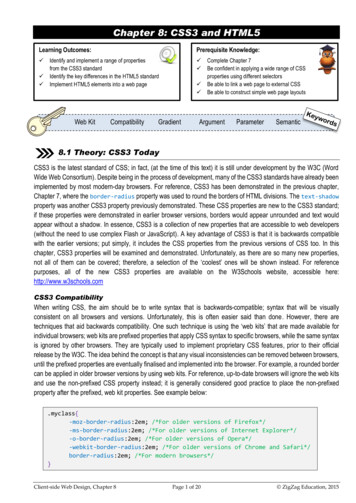
Chapter 8: CSS3 and HTML5Learning Outcomes: Prerequisite Knowledge:Identify and implement a range of propertiesfrom the CSS3 standardIdentify the key differences in the HTML5 standardImplement HTML5 elements into a web pageWeb KitCompatibility GradientComplete Chapter 7Be confident in applying a wide range of CSSproperties using different selectorsBe able to link a web page to external CSSBe able to construct simple web page layoutsArgumentParameterSemantic8.1 Theory: CSS3 TodayCSS3 is the latest standard of CSS; in fact, (at the time of this text) it is still under development by the W3C (WordWide Web Consortium). Despite being in the process of development, many of the CSS3 standards have already beenimplemented by most modern-day browsers. For reference, CSS3 has been demonstrated in the previous chapter,Chapter 7, where the border-radius property was used to round the borders of HTML divisions. The text-shadowproperty was another CSS3 property previously demonstrated. These CSS properties are new to the CSS3 standard;if these properties were demonstrated in earlier browser versions, borders would appear unrounded and text wouldappear without a shadow. In essence, CSS3 is a collection of new properties that are accessible to web developers(without the need to use complex Flash or JavaScript). A key advantage of CSS3 is that it is backwards compatiblewith the earlier versions; put simply, it includes the CSS properties from the previous versions of CSS too. In thischapter, CSS3 properties will be examined and demonstrated. Unfortunately, as there are so many new properties,not all of them can be covered; therefore, a selection of the ‘coolest’ ones will be shown instead. For referencepurposes, all of the new CSS3 properties are available on the W3Schools website, accessible here:http://www.w3schools.comCSS3 CompatibilityWhen writing CSS, the aim should be to write syntax that is backwards-compatible; syntax that will be visuallyconsistent on all browsers and versions. Unfortunately, this is often easier said than done. However, there aretechniques that aid backwards compatibility. One such technique is using the ‘web kits’ that are made available forindividual browsers; web kits are prefixed properties that apply CSS syntax to specific browsers, while the same syntaxis ignored by other browsers. They are typically used to implement proprietary CSS features, prior to their officialrelease by the W3C. The idea behind the concept is that any visual inconsistencies can be removed between browsers,until the prefixed properties are eventually finalised and implemented into the browser. For example, a rounded bordercan be applied in older browser versions by using web kits. For reference, up-to-date browsers will ignore the web kitsand use the non-prefixed CSS property instead; it is generally considered good practice to place the non-prefixedproperty after the prefixed, web kit properties. See example below:.myclass{-moz-border-radius:2em; /*For older versions of Firefox*/-ms-border-radius:2em; /*For older versions of Internet Explorer*/-o-border-radius:2em; /*For older versions of Opera*/-webkit-border-radius:2em; /*For older versions of Chrome and Safari*/border-radius:2em; /*For modern browsers*/}Client-side Web Design, Chapter 8Page 1 of 20 ZigZag Education, 2015
8.2 Practical: New CSS3 PropertiesBordersCSS3 has some new additional properties that can be used to style the borders of a HTML element; one such familiarproperty is the border-radius property, as previewed in the previous chapter. However, there are also two otheruseful border properties in CSS3, and they are the box-shadow property and the border-image property. The boxshadow property adds a shadow effect to the outline of a HTML element. The border-image property creates aborder from a specified image. Both of these properties are demonstrated in the syntax below: !DOCTYPE html html head title CSS3 is cool! /title meta charset "UTF-8" link rel "stylesheet" type "text/css" href "my style sheet.css" /head body div id "mydiv" /div div id "mydiv2" /div /body #mydiv{ /html height:100px;width:50%;The image used to create themargin-left:auto;border applied to the secondmargin-right:auto;division is shown -shadow:11px 11px 5px t:auto;HTML Tips!margin-right:auto;background-color:pink;When setting the boxborder:30px; /*this property is still required!*/shadow property, the firstborder-image:url(border.png) 30 30 30 30 round;argument specifies, in}pixels, the distance of theshadow to the right. Thesecond is the distance ofthe shadow downwards,the third is the blurradiance (in pixels) andthe final argument is thecolour (in hexadecimal).HTML Tips!Note that when setting the border-image property, thevalue is set in pixels, but for some strange reason, the ‘px’unit is not specified!Client-side Web Design, Chapter 8Page 2 of 20 ZigZag Education, 2015
When setting the border-image property, the 30 30 30 30 round; syntax specifies, in order, the top, right, bottomand left width of the image border; from these arguments the browser can determine which part of the image to showto create the border effect. Note that the space left between the opposite sides will be used to determine the middlesection of the border; for example, if an image is 90 pixels wide and 90 pixels high, and all arguments are set to 30pixels, this would leave 30 pixels in the centre of each side; this remaining part of the image would be used to createthe middle border.TopBottomborder-image:url(border.png) 30 30 30 30 round;RightLeftFinally, the round value is used to round the pixel values evenly so that the image border does not appear abruptlycut off. For reference purposes, it is worth trying the border-image property with and without the round value towitness the effect of it first-hand.Remember, like all properties in this chapter, that the border-image property is part of the new CSS3 specificationand thus may not exist with earlier browser versions. However, note that this property is available as part of the webkits for earlier versions of Safari and Opera, and thus the syntax could be amended to the following for greatercompatibility:.border:30px; /*this property is still required!*/-webkit-border-image:url(border.png) 30 30 30 30 round;-o-border-image:url(border.png) 30 30 30 30 round;border-image:url(border.png) 30 30 30 30 round;.GradientsIn Chapter 7, a gradient background was added to the ‘advanced web page’ by using a small .png image, combinedwith the background-image and background-repeat properties. In CSS3, this technique is not necessarilyrequired, as gradient effects can now be created in the browser itself, without the need to use an image. This isachieved by using the background property and setting the values accordingly. Another cool feature, part of CSS3,is that these gradients do not necessarily have to be linear in fashion; they can also be radiant in appearance. Belowis the syntax that can be used to create a liner gradient:#mydiv{ /*Top to -gradient(#F9F3FF, #CC99FF);}Client-side Web Design, Chapter 8Page 3 of 20 ZigZag Education, 2015
Similar to the border-image property, although this is a new CSS3 property it is still available in earlier versions ofweb browsers, by using the individual web kits that are available for each web browser. Therefore, to help resolvecompatibility issues, the above syntax would be better written as:#mydiv{ /*Top to t-linear-gradient(#F9F3FF, #CC99FF); /*For early Safari*/background:-o-linear-gradient(#F9F3FF, #CC99FF); /*For early Opera*/background:-moz-linear-gradient(#F9F3FF, #CC99FF); /*For early Firefox*/background:linear-gradient(#F9F3FF, #CC99FF); /*keep me last! Modern day*/}The previous example created a gradient from top to bottom. However, it is also possible to change the direction of thegradient; for example, a horizontal gradient (in this case left to right), as opposed to a vertical gradient. The CSS syntaxto achieve this is demonstrated below. This syntax also includes the more ‘compatible’ version of the CSS syntax:#mydiv{ /*Left to -linear-gradient(left, #F9F3FF, #CC99FF);background:-o-linear-gradient(right, #F9F3FF, #CC99FF);background:-moz-linear-gradient(right, #F9F3FF, #CC99FF);background:linear-gradient(to right, #F9F3FF, #CC99FF);}In CSS3, it is also possible to create gradients that consist of more than two colours. This is achieved by specifyingadditional colour arguments, separated by the comma. An example of this is demonstrated in the CSS syntax below,but be aware that it is possible that more than three colours can be used. Again, the more compatible version is writtenfor reference purposes.#mydiv{ /*Top to t-linear-gradient(pink, yellow, green);background:-o-linear-gradient(pink, yellow, green);background:-moz-linear-gradient(pink, yellow, green);background:linear-gradient(pink, yellow, green);}HTML Tips!A linear gradient does not have to be just vertical orhorizontal. For example, angles can be created by usingeither the key word ‘bottom right’ (note that this differs fordifferent web kits) or by entering the number of degreesfollowed by the ‘deg’ unit; for example, ‘180deg’.Client-side Web Design, Chapter 8Page 4 of 20 ZigZag Education, 2015
One of the most useful features in CSS3, when creating gradients, is the ability to be able to blend the gradient intothe background; this is visually effective and can be used to produce fading effects. This is achieved by using the ‘rgba’function; this function is used to specify a colour (by specifying a red, green and blue value between 0 and 255) andsetting the transparency. The transparency is the last argument, and can be set to either 0 (for transparent) or 1 (forfull colour). Below is the CSS syntax that can be used to create a gradient with a fading effect into transparency:Green value#mydiv{ /*Left to Right*/height:200px;Blue valueRed t(left, rgba(255,0,0,1), ht, rgba(255,0,0,1), ight, rgba(255,0,0,1), rgba(255,0,0,0));background:linear-gradient(to right, rgba(255,0,0,1), rgba(255,0,0,0));}TransparentFull colourIn CSS3, it is also possible to create radial gradients (as opposed to linear gradients), and thisis achieved by changing the property value keyword from ‘linear’, to ‘radial’. The CSS syntaxto achieve this is demonstrated in the box below:#mydiv{ kit-radial-gradient(pink, yellow, green);background:-o-radial-gradient(pink, yellow, green);background:-moz-radial-gradient(pink, yellow, green);background:radial-gradient(pink, yellow, green);}Activity 8.1Create a web page that includes a suitable title andthree divisions that are centred and span 80% of thepage width. Ensure there is a suitable gap betweeneach division. The first division should have a boxshadow and a radial gradient background; use anycolours for the border and radial gradient. The seconddivision should have a border image (use any suitableimage) and should have a faded gradient (from colourto transparent). The final division can have any bordertype; however, the background colour should be amulticoloured gradient.Client-side Web Design, Chapter 8Page 5 of 20HTML Tips!Be aware that Internet Explorerversion 9 and earlier does notsupport gradients. ZigZag Education, 2015
TransformsSince the early CSS days, there have been some serious innovations, one of which being the ability to ‘transform’HTML elements like never before. For example, it is now possible to turn, scale, spin and stretch elements. In CSS3,it is possible to apply both 2D and 3D transformations to HTML elements, although, this text will focus primarily on 2Dtransformations, the first of which is the ‘rotate’ method. The syntax for this is demonstrated below:#mydiv{ r:cyan;transform:rotate(40deg);}In the example above, the division is rotated 40 degrees. Although the transform property is part of the CSS3specification, this feature is also available in earlier versions of Internet Explorer, Chrome, Safari and Opera. The morecompatible version of this syntax is demonstrated below:#mydiv{ r:cyan;-ms-transform:rotate(40deg); /*For early IE*/-webkit-transform:rotate(40deg); /*For early Safari, Chrome & Opera*/transform:rotate(40deg); /*Put me last! Modern day browsers!*/}Another cool transform method is ‘scale’. This can be used to significantly increase or decrease the size of a HTMLelement; this is based on arguments that are given to the width and height parameters. For example, this syntaxscale(2,4) would result in the width being twice its original size, and the height would be four times the original size.An example of how to use this property, including the more compatible version, is demonstrated below:#mydiv{ yan;-ms-transform:scale(2,4);/*For early IE*/-webkit-transform:scale(2,4); /*For early Safari, Chrome & Opera*/transform:scale(2,4); /*Put me last! Modern day browsers!*/}Activity 8.2Original sizeScaled sizeClient-side Web Design, Chapter 8Create a web page that includes two divisions, eachwith a different background colour. Enter a smallamount of text into each division, before using therotate and scale methods to transform theirappearance, respectively.Page 6 of 20 ZigZag Education, 2015
Word WrappingCSS can sometimes be frustrating, especially when the visual results are not at all as expected. In the early days ofCSS, if a single word in a paragraph was too long and the containing element too small, the word would not naturallytext-wrap and would ‘overspill’ onto the page (and outside the HTML element). Not only was this extremely annoying,it was also very ugly!Thankfully, CSS3 has a new property called word-wrap that can be used to wrap words onto the next line that are toolong. The syntax to achieve this is demonstrated below:p{ /*Word Wrap*/width:200px;border:1px solid d;}TransitionsThe W3C believe that the future of the web is HTML5 and CSS3. They believein the notion that web pages are interactive and accessible on any device,regardless of the browser type or device manufacturer. Although the world ismoving towards this concept, there are still many accessibility problems; forexample, Flash (a platform used to create interactive content) is a populartechnology, but unfortunately is not supported by many devices. HTML5 andCSS3 aim to rectify this by making the web a place where no additional pluginsor platforms are required to create interactive content.HTML Tips!The value 2s is short for twoseconds. Also, be aware thatthe transition CSS property isnot available in many of theearlier browsers, includingInternet Explorer.Transitions in CSS3 are an example of this advancement in thinking; in CSS3, HTML elements can have multipleinteractive styles (that ‘transition’ from one style to another) without the need to use Flash, or even JavaScript.A transition is applied toa HTML element using#mydiv{ /*Transition*/the CSS transitionheight:50px;width:50px;property and specifyingbackground-color:skyblue;the property (in this case-webkit-transition:width 2s; /*For early Safari*/width) to transitiontransition:width 2s; /*Put me last! Modern day browsers!*/and set the duration of}the effect (in this case#mydiv:hover{ /*On Hover Style*/two seconds). Anwidth:300px;example of this}property is illustratedright.Normal division styleClient-side Web Design, Chapter 8On mouse hover division stylePage 7 of 20 ZigZag Education, 2015
The transition property can also be used to transition more than one CSS property. This is achieved by specifyingmultiple values (both the targeted CSS property and the duration of the transition) proceeded and separated by acomma; for example, transition:width 2s, height 3s;. An example of using multiple transitions isdemonstrated below:#mydiv{ lor:skyblue;-webkit-transition: width 2s, height 2s, border 2s, transform 2s;transition:width 2s, height 2s, border 2s, transform 2s;}#mydiv:hover{ /*On Hover Style*/width:200px;height:200px;border:2px solid m:rotate(40deg);transform:rotate(40deg);}Normal division styleOn mouse hover division styleHTML Tips!Activity 8.3The transition property does not have to beused solely with the ‘hover’ pseudo-class; itcould (for example) be used with the ‘active’pseudo-class (on mouseclick). However, it mustbe said that mouse hover is the most likelypseudo-class to be used with this property.Create a web page thatincludes a single division; usea ‘transition’ to animate thedivision when the mousecursor is hovered over thedivision.Client-side Web Design, Chapter 8Page 8 of 20 ZigZag Education, 2015
AnimationsSimilar to ‘transitions’, animations is a CSS property that aims to remove the need for Flash and, to some degree, evenJavaScript. To create an animation in CSS3, the @keyframes rule is used (CSS syntax that is used to generate theanimation). The ‘keyframe’ is used to contain a CSS style that the selected animation will gradually change to. The‘keyframe’ must be given a unique name, as well as a transition start and end property/value. The animation propertyitself must, as a minimum, contain the name of the targeted keyframe and the duration of the animation, in seconds. Asimple example (including the compatible web kits) of how to use the animation property is demonstrated below:#mydiv{ or:skyblue;-webkit-animation:coolweb 3s; /*Chrome, Safari, Opera*/animation:coolweb 3s;}@-webkit-keyframes coolweb{ /*Animation Style for Chrome, Safari, Opera or:red;}}@keyframes coolweb{ /*Animation d-color:red;}Before AnimationAfter Animation}The example above is a very simplistic example of CSS3 animations; however, it is possible to make them moreadvanced by using multiple CSS properties in the animation. Another useful feature is the ability to be able to specifywhen a change should happen; this is achieved by using a percentage between 0 and 100. An example of this isdemonstrated in the syntax below:#mydiv{ or:skyblue;-webkit-animation:coolweb 8s; /*Chrome, Safari, Opera*/animation:coolweb 8s;}@-webkit-keyframes coolweb{ /*Animation Style for Chrome, Safari, Opera r:red;}75%{background-color:pink;}Activity 8.4100%{background-color:cyan;}Create a web page that includes a single}division; use an animation to manipulate its@keyframes coolweb{ /*Animation Style*/appearance. Research how to make the25%{background-color:yellow;}division move and apply this :pink;}100%{background-color:cyan;}}25%Client-side Web Design, Chapter 8Page 9 of 2050%75%100% ZigZag Education, 2015
Multiple columnsThere are some new properties available in CSS3 that allow web developers to easily create column effects, similar tothat of a newspaper. Using columns is a popular layout technique; this is probably because it is aesthetically pleasing.The CSS property used to create columns is the column-count property; this is used by setting its value to the desirednumber of columns. There is also a column-gap and a column-rule property; these are used to specify the gap (inpixels) between columns and to set the width, style and colour of the rule that appears between the columns. All ofthese properties are demonstrated in the syntax below:#mydiv{ /*Columns*/-webkit-column-count:3; /*Chrome, Safari, Opera*/-moz-column-count:3; /*Firefox*/column-count:3;-webkit-column-gap:30px; /*Chrome, Safari, Opera*/-moz-column-gap:30px; /*Firefox*/column-gap:30px;-webkit-column-rule:5px solid skyblue; /*Chrome, Safari, Opera*/-moz-column-rule:5px solid skyblue; /*Firefox*/column-rule:5px solid skyblue;}Box ResizingThe final CSS3 property examined in this chapter is the resize property. This property specifies whether a user isable to resize a HTML element or not. The value of this property can be set to ‘both’ (to resize both the width and heightof an element), ‘horizontal’ (to resize the width only) or ‘vertical’ (to resize the height only). The syntax of how to usethis property is demonstrated below:Activity 8.5Create a web page thatincludes two divisions; the firstshould contain a lot of text andbe split into four columns. Therule between the columns shouldbe styled too. The seconddivision should also include text,but should be made so that itcan be resized by the user.#mydiv{ /*Resize*/border:2px solid red;padding:20px 40px;width:300px;resize:both;overflow:auto;}Before ResizeAfter ResizeClient-side Web Design, Chapter 8Page 10 of 20 ZigZag Education, 2015
8.3 Theory: The New HTML5 StandardWhat is so different about HTML5?All of the web pages demonstrated in this text are HTML5 pages; they have all been declared using the appropriate‘doc type’ ( !DOCTYPE html ) and all have followed the HTML5 standard. For example, all containing tags are closedand written in lower case. However, some of the more interesting elements belonging to the HTML5 standard have notbeen touched on, elements that really stand it apart from all other previous versions. Therefore, from this point forwards,this chapter will provide a quick ‘crash course’ into the magical world of HTML5.Before looking at what is new in HTML5, it is best to identify what existing tags (from the previous version of HTML)have been removed. Some of the once popular tags that are now deprecated (no longer part of the HTML standard)include applet , big , center , font , frame , frameset and tt . Although these elements are nolonger part of the standard, their ‘purpose’ has not been removed; for example, the font of an element is nowmanipulated using CSS and frame-like pages can still be created using the iframe tag.One of the most interesting concepts about HTML5 is that it has returned to a ‘true’ markup language; in other words,developers can now define their own ‘semantic’ HTML elements. Semantic means ‘to give meaning to’. Consider if adeveloper created a division on a web page that would hold sports results: the div tag is a HTML element, but itinforms nothing about the content within the division. To a search engine the div tag offers no meaning. Yet, if thistag was replaced with, for example, sportsresults , this tag would instantly be meaningful to both people andmachines alike. An example of how self-defined semantic tags can be used in HTML5 is demonstrated below: !DOCTYPE html html head title HTML5 is cool! /title meta charset "UTF-8" link rel "stylesheet" type "text/css" href "my style sheet.css" /head body sportsresults{ sportsresults display:block; p Here are the sports results! /p border:2px solid red; /sportsresults height:75px; /body width:250px; /html background-color:skyblue;}HTML Tips!When adding new semantic tags in HTML5, useCSS to set their display property to ‘block’;this will ensure that the elements behave asthough they were a normal HTML division.Client-side Web Design, Chapter 8Page 11 of 20 ZigZag Education, 2015
Compatible HTML5Unfortunately, there are some known compatibility issues when implementing HTML5; the problem being of coursethat, although HTML5 is catered for by modern-day browsers, older browser versions (especially Internet Explorer) donot allow for these new semantic elements to be implemented. Thankfully there are some small steps that can be takento maximise the potential for browser compatibility. One of the most important is adding the ‘HTML5 enablingJavaScript’, to the head section of a HTML5 document; this is highlighted in the syntax below. Notice that the script isplaced inside a comment; this is because modern-day browsers will ignore the script, whereas earlier versions ofInternet Explorer will read and interpret it. In theory, this script, written by Sjoerd Visscher, will help to make earlierversions of Internet Explorer more compatible with HTML5. !DOCTYPE html html head title HTML5 is cool! /title meta charset "UTF-8" link rel "stylesheet" type "text/css" href "my style sheet.css" !--[if lt IE 9] script src s" /script ![endif]-- /head body sportsresults p Here are the sports results! /p /sportsresults /body /html HTML5 Semantic TagsAs stated earlier, some tags are non-semantic in their meanings; forexample, the HTML elements div and span offer no indicationabout their content. Yet, some HTML tags were already semantic; forexample, the table and img tags clearly define their content, andthus can be classed as semantic elements. To make HTML more‘semantic’, HTML5 has included a set of new tags that help to definemeaning.As most web developers often label their divisions with meaningfulnames anyway, for example div id "nav" or divid "footer" , it made sense to create elements that could describetheir content more closely; therefore, HTML5 introduced some newelements, including header , footer , aside , nav , section , article , main and summary . How some of thesenew elements can be applied in practice is clearly shown in the wireframethat is illustrated to the right. header nav article aside section footer Client-side Web Design, Chapter 8Page 12 of 20 ZigZag Education, 2015
8.4 Practical: HTML5 ElementsHTML5 LayoutRather than using ID element selectors, although perfectly valid, in HTML5 it is preferable to use the new semanticelements, as demonstrated in the wireframe on the previous page. Written below is the HTML5 and CSS syntax thatcan be used to create a simple web page layout, using the new semantic elements: !DOCTYPE html html head title HTML5 is cool! /title meta charset "UTF-8" link rel "stylesheet" type "text/css" href "my style sheet.css" !--[if lt IE 9] script src s" /script ![endif]-- /head body header h1 Semantic Tags Rock! /h1 /header nav a href "#" The Footer Tag /a a href "#" The Header Tag /a a href "#" The Article Tag /a a href "#" The Nav Tag /a /nav article h1 Independent Article /h1 p I am a self-contained article! /p /article aside h1 Side Bar /h1 p I am a side bar with relating information to the page! /p /aside section h1 Section /h1 p I am general content with a header! /p /section footer p I am the footer text! /p /footer /body Activity 8.6 /html Create a semantic web page that includes at leasta header, footer, sidebar, navigation bar andmain placeholder. The web page should be styledso that it is attractive; perhaps research colourschemes and complementing colours. The pagecan be on any topic, but the content should belengthy enough to fill the sections created.HTML5 section ElementClient-side Web Design, Chapter 8Page 13 of 20 ZigZag Education, 2015
header, nav, article, aside, section, er:1px solid black;border:1px solid 0px;margin-left:31%;border:1px solid ght:400px;text-align:center;border:1px solid -top:3px;height:100px;width:100%;border:1px solid order:1px solid ;}Client-side Web Design, Chapter 8Page 14 of 20 ZigZag Education, 2015
To clarify the meaning (and the correct use) of the new semantic tags, refer to the table below: article /article The article element should be used to contain independent information that is notnecessarily directly linked to the website itself. The content should be completelyunderstandable and readable on its own, without referring to any other part of thewebsite or web page. aside /aside The aside element is used to contain information that is to be placed into a sidebar. The information in a side bar should technically be related to the subject onthe main web page. footer /footer The footer element is used to indicate the ‘footer’ of a web page. A footer elementshould typically be used to contain information about the web page author,copyright details, contact information and/or hyperlinks to other useful web pageson the website; for example, the ‘terms of use’ or the full copyright policy. header /header The header element is used to specify the ‘header’ of a web page and, therefore,should generally contain introductory content. The header element can also beused multiple times in a single web page. main /main The main element is used to contain the ‘main’ information that would normallybe displayed on a web page. The content stored in this section should be uniqueto the web page and not repeated. There should not be more than one mainelement on a single web page. nav /nav The nav element is used to define a section of a web page that wi
Chapter 8: CSS3 and HTML5 8.1 Theory: CSS3 Today CSS3 is the latest standard of CSS; in fact, (at the time of this text) it is still under development by the W3C (Word Wide Web Consortium). Despite being in the process of development, many of the CSS3 standards h
