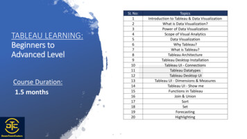
Transcription
Microsoft Excel 2010 - Level 3CHAPTER 3CHART OBJECT FORMATTINGINFOCUSWPL E833While charts are created with a default appearance, you canchange the formatting of each object that comprises the chart tocreate a fully customised version.In this session you will: Watsonia Publishinggain an understanding of chart objects and how they canbe formattedlearn how to select chart elementslearn how to use shape styles to format objectslearn how to change column colourlearn how to change the colour of a pie slicelearn how to change bar colourslearn how to change chart line colourslearn how to use shape effectslearn how to fill the chart area and the plot arealearn how to fill the backgroundgain an understanding of the Format dialog boxlearn how to use the Format dialog boxlearn how to apply a theme to a chart.Page 25Chart Object Formatting
Microsoft Excel 2010 - Level 3UNDERSTANDING CHART OBJECT FORMATTINGCharts are complex drawings that are made up ofa wide range of text and graphical elements.Each object can be formatted individually tocreate fully customised charts. The objects in achart vary a little depending on the chart type, butin general the objects are fairly standard. This pageexamines a range of chart objects and theformatting that can be used to modify them.123425Chart ObjectsChart objects include lines, shapes and the background of the slide. The following examples apply tothe column chart shown above. The chart background is the area behind the chart and it is usually hidden. You caninsert a picture in the background to make the chart more visually appealing.The chart area is the overall area occupied by the chart.The plot area is the area in which the figures are plotted.Series are the groups of figures plotted on the chart. In this example there are threeseries: Jan, Feb and Mar.The vertical and horizontal axes mark the edges of the chart and display the categoriesand scale.Object Formatting Options Shape Fill settings, such as solid colour, gradient, picture and texture, change the inside of ashape.Shape Outline settings control the colour, weight and pattern of lines or the outlines of shapes.Shape Effects modify the entire shape by adding different surface textures, shadows, glow effects,soft edges, bevel effects or 3-D effects. Examples of different effects are shown on the series, plotarea and chart area above.Shape Styles modify shapes with various combinations of shape fill, outline and effect. Watsonia PublishingPage 26Chart Object Formatting
Microsoft Excel 2010 - Level 3SELECTING CHART ELEMENTSBefore you can apply formatting to an element ina chart, you need to be able to select itaccurately so that you don’t accidentally formatthe wrong thing. Once you’re comfortableOpenFileTry This Yourself: working with charts, you’ll learn where to click toselect specific objects, but if you’re not sure, Excelprovides a special control which helps you do justthat. It’s called Chart Elements.2Before starting this exercise youMUST open the file E833 ChartFormatting 1.xlsx.Click on the chart to display theChart Tools tab, then click onthe Format tabClick on the Title to select itPale blue handles will appeararound the title showing that it isselected. Now you can format ormove the title .4Click on a number in the verticalaxis to select itYou can also select elementsfrom a list.Look at the Chart Elementscontrol in the Current Selectiongroup6This indicates that the Vertical(Value) Axis is selected.Click on the drop arrow forChart Elements to display thelistSelect Series “Dublin” to selectthe red line in the chartPale blue handles will appeararound each data point.Click outside the chart todeselect the seriesFor Your Reference Handy to Know To select chart elements:1. Click on the elementOR The only part of the chart that can’t beselected using Chart Elements is thebackground.1. Click on the drop arrow for ChartElements and click on the element name Watsonia PublishingPage 27Chart Object Formatting
Microsoft Excel 2010 - Level 3USING SHAPE STYLES TO FORMAT OBJECTSShape Styles take the guesswork out offormatting chart objects by allowing you to applya shape fill, outline and effects in one step. Theyare especially effective for series objects such asSameFileTry This Yourself: columns, lines, bars and pie slices. There’s a rangeof styles to choose from plus a selection ofcomplementary colours.2Continue using the previousfile with this exercise, or openthe file E833 ChartFormatting 2.xlsx.Click on the Costs By Monthchart sheet tabThis is a basic column chart.Click on the first blue columnfor Auckland, to select itThe entire Jan series will beselected.Click on the Chart Tools:Format tab in the Ribbon,then click on the More buttonfor Shape Styles to see theoptions5The tool tip displays the nameof each style as you point toit.Click on Intense Effect –ndAccent 1 (2 column, bottomrow) to apply itThe series is reformatted.Repeat steps 2 to 4 to applythe corresponding Intenseeffects to the Feb (red) andMar (green) seriesFor Your Reference Handy to Know To use a shape style to format a chart object:1. Select the chart object2. Click on the More button for ShapeStyles and select the style You can remove a Shape Style by clickingon the object and clicking on Reset to MatchStylein the Current Selection group ofthe Chart Tools: Format tab. Watsonia PublishingPage 28Chart Object Formatting
Microsoft Excel 2010 - Level 3CHANGING COLUMN COLOURIf you need to select alternative colours for acolumn in a chart, you can select from a widerange of pre-set colours from the current theme,from a selection of standard colours or evenspecify a custom colour. This allows you to formatcharts to match corporate style guides or othercolour schemes. Each column in the selectedseries will change colour.SameFileTry This Yourself: Continue using the previousfile with this exercise, or openthe file E833 ChartFormatting 3.xlsx.If the green series for Mar isn’talready selected, click on thegreen column for Auckland2Click on the Chart Tools:Format tab then click on thedrop arrow for Shape Fillto display the optionsThere is a selection of coloursbased on the theme as well asstandard colours and effects.stClick on Orange, Accent 6 (1row, far right column) to applythe colour to the series6This is one way to changecolour.Click on the drop arrow forShape Fillthen selectMore Fill Colours to displaythe Colours dialog boxYou can specify any colouryou like.Click on the Standard tab thenclick on green in the middlerdrow (3 from left)Click on [OK] to apply theintense green colourFor Your Reference Handy to Know To change column colour:1. Click on the column in the series to select it You can also select an alternative colourusing Shape Styles or apply one of thepicture, gradient or texture effects in ShapeFill.2. Click on the drop arrow for Shape Fill3. Click on the colour of your choice Watsonia Publishing If you click on Shape Fillitself ratherthan the drop arrow, it will apply the colourshown on the tool (i.e. the last applied).Page 29Chart Object Formatting
Microsoft Excel 2010 - Level 3CHANGING PIE SLICE COLOURPie charts are formatted so that each slice of thepie is a different colour. This is because a pierepresents a single group of figures rather thanmultiple series of figures. You may need toSameFileTry This Yourself: change the colour of a pie slice to improve thecontrast between colours if you print in black andwhite or you may just dislike the standard colours.2Continue using the previousfile with this exercise, or openthe file E833 ChartFormatting 4.xlsx.Click on the Sales Pie Chartchart sheet tabThere are four slices in thispie. We can change the colourof each of them, or change asingle slice.Click on the pie to select it3You’ll notice pale blue handlesat the corner of each slice.Click on the blue sliceThis time, only the blue slice isselected and the handles areslightly darker in appearance.On the Chart Tools: Formattab of the Ribbon, click on thedrop arrow for Shape Filland click on Aqua, Accent 5(top row, second from the end)4The slice will change colourwithout affecting the rest of thepieFor Your Reference Handy to Know To change the colour of a pie slice:1. Click on the pie chart to select it2. Click on the individual slice You can use Shape Fillto apply arange of fancy formatting options to pie slicessuch as textures and gradients. You caneven insert pictures to create some prettyweird effects.3. Click on the drop arrow for Shape Fill4. Click on the required colour Watsonia PublishingPage 30Chart Object Formatting
Microsoft Excel 2010 - Level 3CHANGING BAR COLOURSChanging the colour of a series of bars is thesame as changing the colour of a series ofcolumns. You select the series then apply adifferent colour. However, how do you changeSameFileTry This Yourself: the colour of a single bar or column in a chartwhen there is only one series? The first step is tochange a setting in the Format dialog box to alloweach bar to be a different colour.5Continue using the previousfile with this exercise, or openthe file E833 ChartFormatting 5.xlsx.Click on the Costs Bar Chartchart sheet tabThis is one series andtherefore it has one colour.Click on any one of the bluebars to select the series, thenclick on the Chart Tools:Format tab on the RibbonClick on the dialog boxlauncherfor the ShapeStyles group, to display theFormat Data Series dialogboxClick on the Fill category tosee the fill optionsClick on Vary colours bypoint until it appears with atickA range of colours will beapplied to the bars. Now youcan colour them individually.Click on [Close] then click onthe first bar so that it’s the onlyone selectedClick on the drop arrow forShape Filland selectOrange, Accent 67For Your Reference For Your Reference To change bar colours:1. Click on the barTo vary the colours of a single series:1. Click on the series2. Click on the dialog box launcherforShape Styles3. Click on Fill then click on Vary coloursby point and click on [Close]2. Click on the drop arrow for Shape Filland select a colour Watsonia PublishingPage 31Chart Object Formatting
Microsoft Excel 2010 - Level 3CHANGING CHART LINE COLOURSLine charts are especially useful for plottingvalues over time and showing trends. The colourof lines in a line chart can be changed usingShape Outlinewhile the colour of markersSameFileTry This Yourself: in a line chart can be changed using Shape Fill. This is a bit tricky, but once you’ve seen howit works, it should make sense.1Continue using the previousfile with this exercise, oropen the file E833 ChartFormatting 6.xlsx.Click on the Sales Trendschart sheet tab, then click onthe red line for DublinYou may find it easier to clickon one of the markers. Themarkers will appear selectedand the Chart Elementscontrol will display Series“Dublin”.2On the Chart Tools: Formattab of the Ribbon, click onthe drop arrow for Shape Fillin the Shape Stylesgroup, then click on Orange,Accent 6The markers will changecolour but the line will remainred – this is most clearlyseen in the legend.Click on the drop arrow forShape Outlineand clickon Orange, Accent 63This time the line itself willchange colourFor Your Reference Handy to Know To change chart line colours:1. Click on the line2. Click on the drop arrow for Shape Outlineand select a colour for the line Not every line chart will have markers but it’simportant to know that you can use ShapeFillto change the colour of this part ofthe line.3. Click on the drop arrow for Shape Filland select a colour for the markers Watsonia PublishingPage 32Chart Object Formatting
Microsoft Excel 2010 - Level 3USING SHAPE EFFECTSJust to make sure that you never run out ofoptions or get bored creating charts, Excelincludes a huge range of shape effects that youcan apply to objects in your chart. Shape effectsSameFileTry This Yourself: include presets, shadows, reflections, glow, softedges, bevel and 3-D rotation. You can apply oneor more effects although some settings overrideothers. Try a few and have fun!1Continue using the previousfile with this exercise, or openthe file E833 ChartFormatting 7.xlsx.Click on the green line toselect itOn the Chart Tools: Formattab of the Ribbon, click onShape Effectsin theShape Styles group, todisplay the list of options3Select Shadow, then click onthe first option on the left underOuterThe tool tip will read OffsetDiagonal Bottom Right. Ashadow will appear below thefirst line.Click on the purple line andpressrepeats the previouscommand and thereforeapplies the same shadow tothis line.5Repeat step 4 for the orangeand blue lines, then clickoutside the chart to deselect itFor Your Reference Handy to Know To apply a shape effect:1. Click on a shape to select it When applying shape effects, the coloursavailable under Glow are controlled by thetheme that is in place. Themes can beviewed, changed and modified on the PageLayout tab. Themes also affect the colourslisted under Shape Filland ShapeOutline.2. Click on Shape Effects3. Point to the shape effect you want thenselect an option Watsonia PublishingPage 33Chart Object Formatting
Microsoft Excel 2010 - Level 3FILLING THE CHART AREA AND THE PLOT AREAWhile you can play with the colours of lines andbars on a chart, sometimes all you need to do tojazz up a chart is to change the backgroundareas. The area behind the lines, columns, barsSameFileTry This Yourself: and pie slices is known as the plot area, while thearea outside (and behind) the plot area is known asthe chart area. These areas can be modified usingthe Shape Filloptions.1Continue using the previousfile with this exercise, or openthe file E833 ChartFormatting 8.xlsx.Click on the Chart Tools:Format tab of the Ribbon,then click on a blank, whitearea to the side of the chartYou should see the nameChart Area displayed in theTool Tip and in the ChartElements control 2Click on the drop arrow forShape Fill, then point toTexture and select Bluestthtissue paper (1 column, 5row)The area behind the plot areawill be filled.Click in the plot area which isthe white area behind the linesBlue handles should appear ateach corner.4Click on the drop arrow forShape Filland selectTan, Background 2 underTheme ColoursThis tones down the whitearea a little to make it morecompatible with the chart areafillFor Your Reference Handy to Know To fill the plot area or chart area:1. Click on the plot area or chart area If you set the fill for the plot area to No Fill,the fill for the chart area will be visiblethroughout the chart. This is the defaultsetting for pie charts.2. Click on the drop arrow for Shape Filland select an option Watsonia Publishing When you apply a fill to the plot area, becareful not to compromise the readability ofthe chart.Page 34Chart Object Formatting
Microsoft Excel 2010 - Level 3FILLING THE BACKGROUNDOne area of the chart sheet that is notimmediately visible is the background. This isbecause the chart initially occupies the entirearea available on a chart sheet. However, youcan resize the chart to reveal the background andthen add a picture to the background to brighten upthe page for display purposes.SameFileTry This Yourself: Continue using the previousfile with this exercise, or openthe file E833 ChartFormatting 9.xlsx.Click on the Sales Pie Chartchart sheet tab, click on thewhite chart area, then dragdown and in from the top righthand corner to resize it toabout ⅔ of the original sizeMove the mouse pointer to thetop, left of the chart area, thendrag the chart into the centreof the background2Click on the Page Layout tabof the Ribbon, then click onBackgroundin the PageSetup group, to display theSheet Background dialog boxNavigate to the Course Filesfor Excel 2010 folder, click onE833 Background.jpg andclick on [Insert]The image will appear behindthe chart4For Your Reference Handy to Know To fill the background:1. Size down the chart and reposition ifnecessary to reveal the background Background graphics are for display onlyand do not print. If you want a picture to print,you should add it in the chart area.2. Click on Backgroundon the PageLayout tab3. Locate the image, then click on [Insert] Watsonia Publishing You can remove a background picture byclicking on Delete Backgroundon thePage Layout tab.Page 35Chart Object Formatting
Microsoft Excel 2010 - Level 3THE FORMAT DIALOG BOXEach object in a chart can be formatted andadjusted in a myriad of ways. These settings areso numerous that they would just not fit on aribbon or in a single dialog box, so Excel hascreated many dialog boxes for the purpose andeach of these is prefixed Format. This pageexamines some examples of the Format dialog boxand how they are used and accessed.Accessing the Format Dialog BoxThe Format dialog box for each object or element on a chart can be displayed by selecting theelement and then clicking on Format Selectionor on the dialog box launcher for Shape Styles,or by right-clicking on the element and selecting Format .Variation in the Format Dialog BoxDepending upon the element that you have selected when you display the Format dialog box, andthe type of chart that you are working with, you will see a series of setting categories and variouscontrols within these. Some samples are shown below:Notice that even the two Format DataSeries dialog boxes vary, becauseone is for a column chart and theother for a pie chart. Watsonia PublishingPage 36Chart Object Formatting
Microsoft Excel 2010 - Level 3USING THE FORMAT DIALOG BOXThe Format dialog box includes a series ofcategories of settings for the chart element thatyou had selected when you displayed the dialogbox. These categories vary as do the settings inSameFileTry This Yourself: each category. However, the controls provide greatflexibility and allow you to take formatting to awhole new level.1Continue using the previousfile with this exercise, or openthe file E833 ChartFormatting 10.xlsx.On the Sales Pie Chart chartsheet, click on the pie to selectthe slicesOn the Chart Tools: Formattab of the Ribbon, click onFormat Selectionin theCurrent Selection group, todisplay the Format DataSeries dialog boxThe controls relate specificallyto a pie chart.Select the percentage amountin Pie Explosion and type 12Click on the Shadow category,then click on Presets underShadow and click onPerspective Diagonal LowerRight (last option)Click on [Close]The changes will be applied tothe chart5For Your Reference Handy to Know To use the Format dialog box:1. Click on the chart element While you have the Format dialog box open,you can click on different parts of the chartand the Format dialog box will changeautomatically to display the relevant settings.2. Click on Format Selection3. Make the required changes4. Click on [Close] Watsonia PublishingPage 37Chart Object Formatting
Microsoft Excel 2010 - Level 3USING THEMESIf you can’t be bothered fiddling around with thefine detail of formatting a chart, or simply don’thave time to indulge in fancy formatting, you canuse a theme to change the appearance of aSameFileTry This Yourself: chart. The advantages of using themes are thatthere is a wide range to select from, they format allaspects of the chart and they are consistent if youneed to format charts in separate workbooks.1Continue using the previousfile with this exercise, or openthe file E833 ChartFormatting 11.xlsx.Click on the Costs By Monthchart sheet tab, then click onthe white edge of the chart toselect the chart areaThis is a standard columnchart with colour and effectchanges. The chart needs tobe reset before you can applya theme.2Click on the Chart Tools:Format tab, then click onReset to Match StyleThis removes all individualmodifications such as colourchanges and shape effects.Click on the Page Layout tab,then click on Themestodisplay the listClick on Apex (or a theme ofyour choice) to apply theformatting changes, then clickoutside the chart to deselect it4Notice the change to the fontsand coloursFor Your Reference Handy to Know To apply a theme to a chart:1. Select the chart2. Click on the Page Layout tab then click onThemes3. Select the required theme Before you apply a theme to a chart, youmust remove any existing formats that youdon’t want retained, by clicking on Reset toMatch Style. Individual changes toshape fill, outlines and effects overridethemes. Themes format the entire workbook. Watsonia PublishingPage 38Chart Object Formatting
chart vary a little depending on the chart type, but in general the objects are fairly standard. This page examines a range of chart objects and the formatting that can be used to modify them. Chart Objects Chart objects include lines, shapes and the background of the slide. The following examples apply to the column chart shown above.