Transcription
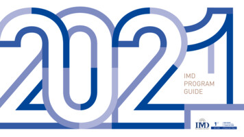
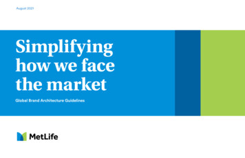
August 2021Simplifyinghow we facethe marketGlobal Brand Architecture Guidelines
MetLife Global Brand ArchitectureIntroductionContentsThe following guidelines are meant to provide instruction and illustrate bestpractices for global identity system creation and usage at MetLife. The examplesthat are shown have been selected to provide context and represent best practices.Although detailed, this document is not exaustive. Other key factors when designinginclude budget, audience, and key executive stake holders.For further guidance, please contact your regional marketing leads.The topic covered, include:The MetLife Global BrandArchitecture Guidance- MetLife Master Brand- Products and Services- Co-Sponsor/Promotion- Internal Programs and Initiatives- App Icon2
MetLife Global Brand ArchitectureVisual IdentityPhilosophyIntroductionWhile we continue to establish our newglobal brand design system, it is importantto be unified in our approach to MetLife'svisual identity. Introducing new brandingand logos can create dissonance andconfusion for our customers. Furthermore,the more logos we introduce the morediluted our brand becomes.3
MetLife Global Brand ArchitectureMay 20214IntroductionBrand Architecture frameworkMasterbrandProducts/ServicesProduct NameCo-branding & PartnershipsCompany Name
MetLife Global Brand ArchitectureMay 2021MetLife Masterbrand5
MetLife Global Brand ArchitectureMay 2021Masterbrand6Primary LogoPartnership “M” SymbolWordmarkMetLife LogoOur symbol and our wordmark always appear together to form our logo.Reflecting our role as our customers' trusted partner, our newsymbol comprises two simple shapes that come together to createan “M.” The blue color reflects our brand heritage, while thevibrant green–new to our color palette–represents growth and vitality.Our symbol and our wordmark always appear togetherto form our logo.Whenever possible, reproduce our logo in full coloron a white background.
MetLife Global Brand ArchitectureMay 2021Masterbrand7Logo Reproduction VersionsPrimaryOur primary logo is full-color on a white background.Logo ExceptionSecondaryReversedOur reversed logo is white text, primarily on ablack background, and used only when anapplication on white is not an option.On ColorOur "transparent logo" is an all-whiteversion that accurately expresses thetranslucent overlap in the Partnership“M” symbol.StackedOur stacked logo is the full-colorPartnership “M” symbol with the MetLifeword mark text below.This logo should ONLY be used in specialcircumstances where the space for thelogo is square and limited in size.
MetLife Global Brand ArchitectureMay 2021MasterbrandClear Spaceand Minimum SizeClear Space for Primary Logo8Minimum SizePrint0.75” wide(19mm)Clear SpaceMaintaining an appropriate amount of clear space around our logocreates a positive impression and impact. Therefore, a minimum amountof clear space must always surround the MetLife logo, in order toseparate it from other elements such as headlines, text, or imagery. Theclear-space area is equal to the cap height of the MetLife “M” and isproportional to the size of the logo being used. The same clear-space ruleapplies to all dual-language logos and tagline lockups.Digital54px wideMinimum SizeCareful consideration should be given when determining the sizeof the MetLife logo. If it is too small, it will be ineffective. Theminimum size of the logo should be 0.75” wide (19mm) for printmaterials and 54px wide for digital applications.
MetLife Global Brand ArchitectureMay 2021Masterbrand9Dual-Language Logosand TaglinesJapaneseTraditional ChineseSimplified ChinesArabic ﻣﺘﻼﯾﻒ There are four approved dual-language logos:Japanese, traditional Chinese, simplified Chinese, andArabic. All other regions should use the English logo.Dual-language logos and tagline lockups are providedas master artwork, and proportions should not bealtered in any way.For master artwork, see appendix.Lockups in other countries may differ based on operatingnames and legal entities. These situations will be addressedon a case-by-case basis.
MetLife Global Brand ArchitectureMay 2021MasterbrandDual-languageStacked LogosEnglishJapanese10Traditional ChineseSimplified ChinesArabic ﻣﺘﻼﯾﻒ There are four dual-language logos for social media:Japanese, traditional Chinese, simplified Chinese,and Arabic. All other regions should use the Englishlanguage logo.Social media logos are provided as master artwork,and proportions should not be altered in any way.For master artwork, see appendix.
MetLife Global Brand ArchitectureMay 2021MasterbrandStacked LogoUsageTwitter11FacebookDock/ShortcutA special stacked version of our logo has been created, as an exception, to allowour brand to stand out on social media.Stacked versions of dual-language logos are available.
MetLife Global Brand ArchitectureMay 2021MasterbrandFaviconWebsite12Our Partnership “M” symbol may be used asa favicon on our websites. This is the only timethat our symbol should appear withoutour logotype.This is the only instance when our Partnership “M” symbol may be usedwithout the MetLife word mark.
MetLife Global Brand ArchitectureMay 202113Logo MisuseDo not flip the Partnership “M” symbol.Do not use any other color combination.Do not remove any part of the logo.Do not use the logo as a supergraphic.Do not resize any logo elements.Do not use alternate colors.Do not outline the logo.Do not create a repeat pattern withthe Partnership “M” symbol.is the leading.Do not use gradients on the logo.Do not lock up the logo withgraphic elements.Do not use the logo in a sentence.Department nameDo not put the new symbol next tothe legacy logo.Do not rotate the partnership“M” symbol.To maintain the integrity and clarity of our brand, do not modify the MetLifelogo in any way or associate it with conflicting elements. Above are someexamples of executions that are prohibited.Always use master artwork when reproducing our logo.For master artwork, see appendix.Do not attach MetLife internaldepartment names to the logo.
MetLife Global Brand ArchitectureMay 2021Co-Sponsor & PartnershipsProducts and ServicesWhen we sell our products through an external channel14
MetLife Global Brand ArchitectureMay 2021([DPSOHVProducts and ServicesThese guidelines define the appropriaterelationship between the MetLife brand andour individual products.ObjectivesDefine a clea relationship betweenthe MetLife brand and our products: O ur one brand is MetLife.(Do not create individual product logos.) D rive equity between productsand MetLife. Create consistency across our portfolio.See the next page for when to use theMetLife product lockup.15MetLife product lockupThis lockup provides consistency for individualproducts across all markets.Supplemental Term LifeProtectionwhen youneed it mostHeadline reflectsthe product benefit
MetLife Global Brand ArchitectureMay 2021([DPSOHVWhen to Use the MetLifeProduct LockupThe MetLife product should be used on all print collateral. On digital materials such as bannerads and website, products are applied slightly di erently due to space limitations, asillustrated below.16PrintBrochureAdDigitalSlipsheetBuck slipSupplemental Term LifeProtectionwhen youneed it mostAuto InsuranceBanner adsWebsiteFullprotectionto enhanceyour lifeSupplemental Term LifeMetLife TakeAlong DentalA new, innovative dental program forpart-timers, consultants, and retireesSMGet a quoteBrochure: Individual productAd: Individual productSlipsheet: Individual productBuckslip: Individual productProduct lockup is positioned on thetop left. Tagline is left-aligned and appearson the bottom/back as a sign-o .Product lockup is positioned on top leftwhenever possible.Product lockup is positioned on top left.Single sheets have no tagline unlessspace allows.Product lockup is positioned on bottom leftas a sign-o . No tagline, unless space allows.Banner ad: Individual product*No product lockup due to spacelimitations. The productname is styled to match productlockup type and color.No tagline, unless space allows.Website: Multiple productsNo product lockup. Product namesare listed in live text. Tagline appearsas headline in main carousel.For detailed guidance on productapplication on the website, pleasereference the digital guidelines.
MetLife Global Brand ArchitectureMay 2021([DPSOHVMetLife ProductLockupMetLife Product Lockup PrinciplesOur product lockup is comprisedof the MetLife logo and anindividual product name. Onlyindividual products are allowedto be locked up with theMetLife logo.17Font: MetLife Circular LightMetLife primary logoYY/3Product NameThe product lockup relationshipprovides consistency for individualproducts across all markets. Forcommunications promoting multipleproducts, no product lockupis used.Divider rule: height of partnership “M” symbolFont color and divider rule: MetLife BlueWhenever possible, alwaysreproduce our logo in full coloron a white background.The MetLife logo is locked up with the product name and has the samehierarchical prominence. This mutually reinforced relationship is criticalto the brand moving forward. Products should never be separateand distinct from the brand.For master artwork, see appendix.Product name cap height:height of letter “t” in the MetLifewordmark
MetLife Global Brand ArchitectureMay 2021Product Lockup MisuseWhen creating product lockups,please make sure to follow theguidelines as accurately as possible.Do not take creative liberties beyondwhat is outlined in this chapter.Here are some examples of productlockup treatments to avoid.([DPSOHV18Do not create your own product logo.PRODUCTNAMEDo not create a product logo using all caps.Do not alter the MetLife product lockup.ProductDo not use any other color combination.Product NameDo not put the product name in a holding shape.Product NameDo not create a product logo using core brand elements.Product NameDo not create a new product logo.ProductDo not remove the divider rule.ProductNameDo not stack the product name.ProductDo not add graphic elements to the product lockup.PRODUCT NAMEDo not write the product name in capitals.Product NameDo not change the weight of the product name.ProductDo not put the product name before the MetLife logo.ProductDo not change the weight of the divider line.
MetLife Global Brand ArchitectureMay 2021Sponsor/PromotionCo-Branding &PartnershipsWhen we partner with other companies19
MetLife Global Brand ArchitectureMay 2021Co-Sponsor & PartnershipsCo-promotion in ApplicationMetLife sponsorshipyWhen MetLife sponsors anotherparty, MetLife is the lead brand.As demonstrated here, please usethe MetLife logo and visual system.The MetLife logo should alsocome before the other party logo,either to the left of the otherparty logo in a horizontal formatas demonstrated here, or at top,above the other party logoin a vertical format.20y.3y.3x.3xx.3xx.3y.3xA pencil line can be used to showthe relationship between MetLifeand the other party logo as seenat right.y.3x.3xy.3y.3xxx.3x.3y.5xx
MetLife Global Brand ArchitectureMay 2021Co-Sponsor & PartnershipsCo-promotion inApplicationMetLife Co-promotion Type Lockup PrinciplesWhen MetLife sponsors anotherparty, MetLife is the lead brand. Asdemonstrated here, please use theMetLife logo and visual system.21Font: MetLife Circular LightMetLife primary logoYY/3Company NameThe MetLife logo should also comebefore the other party logo, eitherto the left of the other party logo ina horizontal format asdemonstrated here, or at top, abovethe other party logoin a vertical format.Divider rule: height of partnership “M” symbolFont color and divider rule: BlackA pencil line can be used to showthe relationship between MetLifeand the other party logo as seen atright.Font: MetLife Circular LightMetLife primary logoYY/3Company Name ExampleThat Is Very LongDivider rule: height of partnership “M” symbolFont color and divider rule: BlackThe MetLife logo is locked up with the product name and has the samehierarchical prominence. This mutually reinforced relationship is criticalto the brand moving forward. Products should never be separateand distinct from the brand.Long company name height:height of letter “t” in theMetLife wordmarkCompany name cap height:height of letter “t” in theMetLife wordmark
MetLife Global Brand ArchitectureMay 2021Co-Sponsor & Partnerships22Key Co-promotion ScenariosEvaluate on a case-by-case basis.RelationshipEndorsed by other partyEndorsed by MetLifeMetLife sponsorshipWhat is it?Another third-party brand endorses MetLife led content/offeringMetLife brand is an endorser to materials thatare generated and led by a selected third partyMetLife is sponsoring content/eventwith another partnerDental InsuranceMore foryour smilecar insuranceIn partnership withBrought to you byMetLife visual systemOther brand visual systemMetLife visual system
MetLife Global Brand ArchitectureMay 2021Co-promotion in ApplicationWhen an individual product is leadby MetLife and endorsed by otherparty, please use the MetLife logoor category lockup and visualsystem.In all cases, whenever MetLifeis the lead brand, the MetLifecategory lockup or logo is alwayspositioned before the other partylogo. In a vertical format, theMetLife brand is positioned on topwhereas the other party logo ispositioned on the bottom. In ahorizontal format, MetLifecategory lockup or logo is alwaysto the left of the other party logo.23Lead by MetLife, endorsed by other party1.5inxDental InsuranceMore foryour smileA descriptor is used abovethe other party logo to describetheir relationship to MetLife ifspace permits.Dental Insurancex1.5xBrought to you by8pts type0.5x1.5xOther party logo is alignedto the baseline of MetLife's tagline
MetLife Global Brand ArchitectureMay 2021Sponsor/PromotionApp Icon29
App icon theoryGlobal master applicationfeatures the Partnership M andall subsequent apps featurepictogram derived icon.Currently there is no global masterapp for reference.Boundries should includesignifica t core consumer facingfunction that ties to the broadesto ering of the Global brand.MetLife Global Master Application(currently no app fulfills a trulyglobal functionalityUS Mobile AppMETLIFE MOBILEREBRANDAPPDESIGNICON GRIDVISUALPRESSUREGUIDE TESTUS InfinitDocument Storage AppUS Auto &HomeMy JourneyTransponder AppUS Cary Technology HubCampus Directory AppProVida Pension App2
App icon designspecific tionMeasurements based on1024 x 1024px iconlogo 720px wide,centered vertically and horizontallytop 341 px for logo andclear space.logo centered verticallyand horizontallyopaque white backgroundfollow pictogram designspecs for form and color.lower 683 px forpictogram artpictogram MUST bleedo the bottom.pictogram MAY bleedleft and right.90 pxMETLIFE MOBILEREBRANDAPPDESIGNICON GRIDVISUALPRESSUREGUIDE TESTif pictogram does not bleed o both sides, then itmust be centered and allow at least 90px clear spaceon either side90 px3
Thank you.
the MetLife brand and our products: Our one brand is MetLife. (Do not create individual product logos.) Drive equity between products and MetLife. Create consistency across our portfolio. See the next page for when to use the MetLife product lockup. Products and Services 1SPUFDUJPO XIFO ZPV OFFE JU NPTU Supplemental Term Life