Transcription
Eastern Region Technical AttachmentNo. 2011-01January, 2011Box and Whisker Plots for Local Climate Datasets: Interpretation andCreation using Excel 2007/2010PETER C. BANACOSNOAA/NWS Burlington, VermontABSTRACTThis paper describes the creation and use of box and whisker plots in the statisticalanalysis of local climate and other hydrometeorological datasets. Box and whisker plots offer apictorial summary of important dataset characteristics including the central tendency,dispersion, asymmetry, and extremes, arrived at through percentile rank analysis and theplotting of maximum and minimum dataset values. Since box and whisker plots displaymeasures of central tendency and spread free from the assumption of a normal distribution, theyprovide an effective way of identifying asymmetrical attributes in meteorological datasets.Additionally, the underlying statistics are more resistant toward individual outliers than othermethods, such as mean and standard deviation. Common measures of variability, such asstandard deviation, may be interpreted based upon an assumption of an underlying standardnormal distribution for climate and weather analysis purposes, and might also prove tooabstract for non-technical users of climate data. Lastly, the graphically compact nature of boxand whisker plots facilitates side-by-side comparison of multiple datasets, which can otherwisebe difficult to interpret using more complete representations, such as the histogram. A box andwhisker plotting convention geared for meteorological applications is described herein, withexamples shown using climate data from the WFO Burlington, Vermont forecast area. Theappendix includes instructions for creating the box and whisker plot format advocated in thispaper, and a sample template is also available for download.Corresponding author address: Peter C. Banacos, NOAA/NWS/Weather Forecast Office, 1200Airport Drive, South Burlington, VT 05403. E-Mail: peter.banacos@noaa.gov
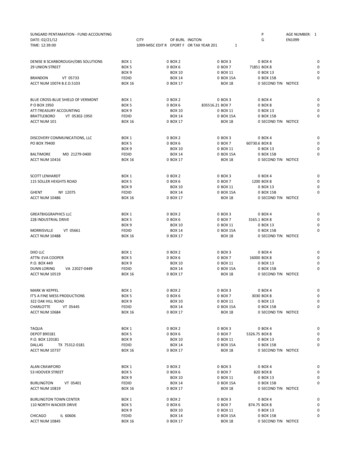
1.further discussion, as might routinely takeplace between the National WeatherService (NWS) and external users during orfollowing significant weather events.IntroductionConveying the normal variability ofweather conditions or specific weatherevents can be of critical importance as adecision and planning tool for engineers,agriculturists, recreational enthusiasts, andothers with weather sensitive interests.However, the large variability of weather inmid-latitudes is not necessarily easy tosummarize in statistical terms. Traditional30-year climate means and extremes maynot be effective in demonstrating naturalfluctuations in weather about the mean thatare typical on daily, seasonal, or annual timescales. Common measures of variability,such as standard deviation, are based uponthe assumption of a standard normaldistribution, and might also prove tooabstract for non-technical users of climatedata. What is often needed is a simplegraphical summary that portrays thestatistical dispersion in a manner that is easyto interpret for a wide range of users.Focusing climate statistics in termsof the variability of conditions rather thanthe central tendency also helps placeobserved or anticipated weather events intoa historical context. This providesoperational forecasters with a referencepoint to identify the occurrence of unusualweather conditions, the value of which hasbeen established in other studies (e.g.,Grumm and Hart 2001); specifically, itcontributes to improved situationalawareness. Putting into perspective weatherevents as they occur is also of stronginterest to the media and the general public.In the graphical era of the Internet, theability to quantify and view a currentweather event (e.g., heat wave, snowamount, etc.) against a range of past eventsof the same type is desirable. Interpretationof such information can form the basis ofOne way of graphically focusing onstatistical variability is by way of the boxand whisker plot (Tukey 1977), firstproposed by statistician John Tukey in 1970.Plotting conventions have varied since,based on application and user preferences.The goal of this paper is to advocate a formof the box and whisker plot for climate andother hydrometeorological datasets. Box andwhisker plots describe data in a manner thatis (1) pictorially compact and makes easycomparison with like datasets, (2) retains theability to interpret asymmetric aspects of thedata and data extremes, and (3) is useful toboth operational forecasters and externalusers of climate related datasets. Theremainder of the paper is organized asfollows. The basic structure of the box andwhisker plot is explained in Section 2. InSection 3, interpretation of box and whiskerplots is discussed. Some exampleapplications of box and whisker plots areshown and described in Section 4, followedby conclusions in Section 5. Lastly, anappendix is included to show the stepsnecessary to create box and whisker plots inExcel 2007/2010, which is available at mostNWS offices.2.The box and whisker plotThe form of the box and whisker plotadvocated here is a graphical 7-numbersummary of a given dataset, which includes:the median, the interquartile range (shownby the box), the outer range (shown by thewhiskers), and the climatological extremes(Fig. 1). The definition and computation ofeach of these values is described below.2
a.The medianThe quartile values can be plotted adjacentto the top and bottom of the box to quantifythese data for the reader.The median is the middleobservation in a ranked dataset (or mean ofthe two middle observations for an evennumbered dataset) and is a measure of thecentral tendency of the data. The median isequivalent to the 50th percentile in apercentile rank analysis with the samenumber of observations below as above themedian. An advantage of the median is itsresistance against outlying values for n 3 ,where n is the number of observations.Whereas the mean can be skewed by anextreme outlying observation, especially forrelatively small datasets, the median isunaffected and therefore remains robust. InFigure 1, the median is displayed as a solidbar within the box and the median valuewould be plotted alongside.b.c.The outer rangeThe whiskers represent an outerrange and are drawn as vertical linesextending outward from the ends of the box.Unlike the box, plotting conventions for thewhiskers vary (Schultz 2009). For example,Massart et al. (2005) draw the end of the topwhisker to the upper quartile (1.5 x IQR),and the end of the bottom whisker to thelower quartile – (1.5 x IQR). While thischoice is arbitrary, the goal of thismethodology is to flag outliers as thoseobservations which lie beyond the whiskers;in some applications these individualoutliers are plotted as dots. Otherconventions include extending the whiskersto the minimum and maximum values of thewhole dataset (McGill et al. 1978), or usingthe 10th and 90th percentiles to define theends of the whiskers (Cleveland 1985).The interquartile rangeThe box represents the middle 50%of the ranked data and is drawn from thelower quartile value to the upper quartilevalue (i.e., the 25th to 75th percentile). Thelower (upper) quartile is computed by takingthe median of the lower (upper) half of theranked data. The difference between theupper and lower quartile values is referred toas the interquartile range (IQR), and theheight of the box is proportional to thestatistical disparity or spread of the inner50% of the ranked data. The box portion ofthe plot visually stands out, which is adesirable aspect drawing the users attentionto the central half of the data (Frigge et al.,1989). The box is standardized asrepresenting the IQR in publishedapplications of box and whisker plots(Schultz 2009). For large, reliable samples,there is a 50% chance that futureobservations will be within the box portionof the graph (i.e., relative frequency can beinterpreted as a probability of occurrence).The author adopts the 10th and 90thpercentile for the ends of the whiskers, withdata values plotted alongside. In interpretinglarge and reliable datasets with thisconvention, there is a 10% probability offuture occurrence beyond the values at theends of the whiskers; an example of this isshown in the freeze climatology in Section4. Meteorological applications of box andwhisker plots have effectively employed the10th and 90th percentile for the whisker ends(e.g., Brooks 2004, Thompson et al. 2007).However, whiskers extending to the datasetmaximum and minimum values have alsobeen used (e.g., Dupilka and Reuter 2006).d.Maximum and minimum valuesMeteorologists, climatologists, andthe general public are often interested in3
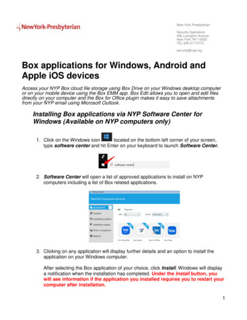
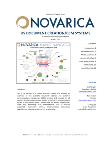
climatological extremes, so it is useful toadd the maximum and minimum values ofthe dataset to the traditional box and whiskerplot. These values are denoted by the “x” inFigure 1. Plotting the data value and date ofoccurrence of the extremes can also serve asa handy reference.3.zero skewness in the idealized data; the dataare perfectly symmetric about the median.An example of upward or positive skewnessis shown in Figure 2e; in this case themedian is shifted toward the lower portionof the box with a wider range ofobservations in the upper quartile ascompared to the lower quartile. The oppositeis true in Figure 2f, which is an example ofdownward or negative skewness. Thewhiskers in Figure 2e and Figure 2f alsoexhibit the same skewness character as theIQR.Knowledge of skewness tells theuser whether deviations from the median aremore likely to be positive or negative.Assuming a representative sample, thedistribution shown in Figure 2e and Figure2f would suggest meteorological data limitsare approached closer to the median in thenegative (positive) direction, and that faroutliers are less probable in that direction.Understanding data asymmetries can beuseful, and are otherwise lost in classicalstatistics based on the normal distribution(Massart et al. 2005).Interpreting box and whisker plotsa.Data patterns for individual boxand whisker plotsThere are several common patternsassociated with box and whisker plots formeteorological applications, as idealized inFigure 2. The length of the IQR (as shownby the box) is a measure of the relativedispersion of the middle 50% of a dataset,just as the length of each whisker is ameasure of the relative dispersion of thedataset outer range (10th to 25th percentileand 75th to 90th percentile). This dispersioncan be comparatively small (Fig. 2a) or large(Fig. 2b). Likewise, the maximum andminimum values may lie close to thewhisker ends (Fig. 2a) or far away (Fig. 2b),which is a measure of how markedlydifferent the extremes are from theremainder of the sample.When the length of the IQR is smallcompared to the whiskers, this suggests amiddle clustering of data about the medianwith long tails representing a largedispersion of the relative outliers (Fig. 2c).On the other hand, a large IQR compared tothe whiskers can be indicative of aclustering of observations near the 25th and75th percentile, or a bimodal distribution(Fig. 2d). In order to confirm a bimodaldistribution it is useful to investigate thedistribution more thoroughly, such as via ahistogram.A key advantage of the box andwhisker plot is the ability to visualizedataset skewness. In Figures 2a-d, there isb.Comparing box and whisker plotsand quantifying data differencesAnother advantage of the box andwhisker plot is the ability to comparemultiple datasets side-by-side, as idealizedin Figure 3. Important characteristics ofeach dataset (central tendency, skewness,dispersion, and extremes) are easy tointerpret and visualize. Qualitatively, therelative overlap between each box andwhisker plot indicates the degree to whicheach dataset is similar in its dispersion,with an emphasis on the IQR owing to thegraphing methodology (e.g., the box standsout relative to the rest of the data).While qualitative features stand out,care is needed in quantifying datasetdifferences particularly for small n. In4
Figure 3, there is visually the least overlapbetween datasets A-C, followed by datasetsB-C, and finally A-B. Whether or not thesedifferences are statistically significant ispartly a function of the sample size, andultimately requires significance testing.more practically than the standard deviationwould.The IQR is relatively large for mostsites, spanning roughly two-weeks for themiddle 50% of freeze dates both for the firstand last freezes. It can be interpreted thathalf of all years fall within the IQR.Likewise, it could be interpreted that freezedates beyond the ends of the whiskers are aonce-per-decade event. Note also that the30-year extremes and dates of occurrenceare shown for each location. There areasymmetries in these data as well. While acomplete meteorological discussion isbeyond the scope of this paper, note thatSouth Hero, Vermont shows a downwardskew toward later dates. Note that the rangebetween the 75th percentile (top of the box)and the median is only 5 days, whereas themedian to the 25th percentile covers 8 days.Likewise, the top whisker end lies 8 daysfrom the median versus 11 days for thebottom whisker end.In Figure 3, sample size is includedat the bottom of the graph beneath eachplot; this can be valuable especially if nvaries between datasets, as this informationmight not otherwise be known to thereader. Instructions for including thesample size are included in the appendix,and significance test methods are built intomost spreadsheet programs.4.BoxexamplesandwhiskerapplicationIn this section, we show twoapplications of the box and whisker plotmethodology applied to meteorological andhydrological data in the WFO Burlington,VT forecast area.a.b.Dates of first and last freezeThe date of first and last freeze(taken as the first and last seasonaloccurrences of a minimum temperature at orbelow 32oF) has important agriculturalimplications, and varies from year-to-yearand location-to-location. Figure 4 shows boxand whisker plots of the last freeze datesleading out of the cold season (Fig. 4a) andthe first freeze dates leading out of the warmseason (Fig. 4b) for select locations in theWFO Burlington, Vermont forecast area.These plots reveal the dispersion in thesedates both at individual sites and betweenlocations over a period of 30 years (sitesnearer to Lake Champlain tend to havelonger growing seasons). These graphsimmediately convey the variability to thereader in a way the mean date cannot, andLake Champlain lake levelBox and whisker plots can be appliedto hydrological applications as well, such asthe daily Lake Champlain lake level binnedby month (Fig. 5). These data show therelatively high lake level associated with the“spring melt” in April and May, and largedispersion presumably associated with thevariable timing of the seasonal melt, amountof snowpack in the basin, and precipitation.Thereafter, a logarithmic decrease in lakelevel occurs throughout the summer to aminimum in early fall, with a smaller IQRnoted showing smaller variation in the lakelevel. A secondary maximum in lake level isevident in late fall into early winterassociated with more frequent synoptic-scaleprecipitation and lesser evaporation ratesassociated with cooler air temperatures. TheLake Champlain flood stage of 100 feet has5
been added to the plot to show the data ascomparedtoimportantoperationalthresholds; flood stage has only beenexceeded in March, April, May, June, andDecember. The highest level of 101.88 feetoccurred on a day in April 1993 and thelowest level of 93.02 feet occurred on a dayin November 1953; extreme data is includedfor Lake Champlain back through 1950.5.significant amount of information withoutunduly taxing the reader.Thus, theirapplication should be agreeable foroperational purposes within the NWS andfor external users.AcknowledgementsThe author would like to express hisappreciation to Paul Sisson, Science andOperations Officer at WFO Burlington, forhis support of this work and valuablecomments. The review provided by DaveRadell and Josh Watson at NWS/EasternRegion Headquarters is also greatlyappreciated and resulted in improvements tothe paper.ConclusionsIn this paper, we have described thedefinition, use, and advantages of box andwhisker plots in the display andinterpretation of climate and otherhydrometeorological datasets. The box andwhisker plot pictorially summarizes thecentral tendency, dispersion, skewness, andextremes of a dataset in an easy to readformat, and one that makes comparisonsbetween multiple datasets easy, as shown inthe included examples. The box and whiskermethodology does not rely on the statisticalassumption of a normal distribution.Instructions for creating the box and whiskerformat used here is included in the appendixfor Microsoft Excel 2007/2010.ReferencesBrooks, H. E., 2004: On the relationship oftornado path length and width to intensity.Wea. Forecasting, 19, 310-319.Cleveland, W. S., 1985: The Elements ofGraphing Data, Hobart Press, 297 pp.Dupilka, M. L., and G. W. Reuter, 2006:Forecasting tornadic thunderstorm potentialin Alberta using environmental soundingdata. Part I: wind shear and buoyancy. Wea.Forecasting, 21, 325-335.Therearemanypotentialapplications of box and whisker plots in theanalysis of local climate and hydrologic dataat NWS offices. Likewise, the creation andinterpretation of such plots make greatstudent projects1. Box and whisker plots canbe created from local climate databases andmade available on office websites for publicviewing and decision support or planningpurposes. It is the author’s view that the boxand whisker format shown here provides aFrigge, M., D. C. Hoaglin, and B. Iglewicz,1989: Some implementations of the boxplot.The American Statistician, 43, 50-54.Grumm, R. H., and R. Hart, 2001:Standardized anomalies applied tosignificant cold season weather events:Preliminary findings. Wea. Forecasting, 16,736-754.1See the following URL for one such o/snowfall.shtml6
Massart, D. L., J. Smeyers-Verbeke, X.Capron, and K. Schlesier, 2005: Visualpresentation of data by means of box plots.LC-GC Europe, 18(4), 2-5.Thompson, R. L., C. M. Mead, and R.Edwards, 2007: Effective storm-relativehelicity and bulk shear in supercellthunderstorm environments. Wea.Forecasting, 22, 102-115.McGill, R., J. W. Tukey, W. A. Larsen,1978: Variations of box plots. The AmericanStatistician, 32, 12-16.Tukey, J. W., 1977: Exploratory DataAnalysis. Addison-Wesley, 688 pp.Schultz, D. M., 2009: Eloquent Science: APractical Guide to Becoming a BetterWriter, Speaker, and Atmospheric Scientist.Amer. Meteor. Soc., 440 pp.7
FiguresFigure 1. A generic box and whisker plot with extreme data points added. The height of the boxportion is given by the interquartile range of the dataset, and extends from the 25th to 75thpercentile. The horizontal bar within the box denotes the median value. The ends of the whiskersare drawn to the 10th and 90th percentile values. The extreme values are labeled with an “x” at themaximum and minimum points. The descriptors to the right of the box and whisker plot arereplaced with data point values in the format shown in Figs. 4-6.8
Figure 2. Idealized box and whisker plots for six data distributions. The datasets exhibit (a) smalldispersion, (b) large dispersion, (c) middle clustering (with long tails), (d) middle clusteringbased on a bimodal distribution (with short tails), (e) upward (positive skewness), and (f)downward (negative) skewness. Datasets (a)-(d) are symmetric about the median and have zeroskewness. The value scale along the ordinate is arbitrary, but linear.9
Figure 3. Box and whisker plots for three idealized data distributions (datasets “A”, “B”, and“C”). Number below each plot represents a dataset of sample size n. The value scale along theordinate is arbitrary, but linear.10
Figure 4. Box and whisker plots of (a) last spring freeze data and (b) first fall freeze data forlocations in the WFO BTV forecast area, based on 1976-2005 data.11
Figure 5. Box and whisker plot of monthly Lake Champlain Lake Level, based on daily readingsat the King Street Ferry Dock in Burlington, Vermont.12
APPENDIXCreating Box and Whisker Plots in Microsoft Excel 2007 / 2010The creation of box and whisker plots in Microsoft Excel 2007/2010 is described heresince (1) it is the standard spreadsheet software at NWS offices as of this writing, and (2)multiple steps are required to produce these plots. One can download the finished template; mple.xlsx. Be sure to save a copy of thisspreadsheet to your local computer/network. The template can be used to get started quickly byentering in your own data. Otherwise, follow the steps below to generate your own box andwhisker plots from scratch (note: ideally, climate analysis includes at least 30-years of data. Forsimplicity, this example includes only 10 years of data for three months for ease of explanation).Step 1. Type or import your climate data into Excel. If necessary, ASCII text files can be openedwithin Excel; the “import text wizard” will convert fixed width or delimitated text data into aspreadsheet format with data divided into individual cells.Step 2. Compute percentile rank statistics in the exact order shown below.13
Step 3. Highlight your percentile rank analysis labels and data (as shown below), then from theExcel top menu select Insert Line Line with Markers:Step 4. If the number of columns (3) is less than the number of rows (7, as it is here), once thegraph appears, you’ll need to click on the graph, select Design then “Switch Row/Column”to get the following:14
If the number of columns is greater than the number of rows, continue on to the next step.Step 5. Right click on the chart and select “Move Chart ” and “New sheet” to move the graphto a separate sheet. This will make the graph easier to work with.Step 6. Now we need to modify a series of chart attributes to turn the data points and lines into abox and whisker plot format. Right-click on the line corresponding to the maximum value, andselect “Format Data Series ”. Select “Plot Series On” Secondary Axis and “Line Color” “No Line”.Step 7. Repeat Step 6 for the minimum value line.Step 8. At this point, you will need to modify the secondary axis (on the right side of the chart)to match the values on the left side. Do this by right clicking on the secondary axis and selecting“Format axis”. Under “Axis Options” select the “Fixed” radio buttons for “Minimum”,“Maximum”, “Major Unit”, and “Minor Unit” and set to the same values as along the primaryaxis. You may want to do the same for the primary vertical axis (on the left side of the chart) toensure these values remain fixed as you work with your chart. At this point, your chart shouldlook like this:15
Step 9. Now we convert data to the box and whisker format.Median: Right click on the median (middle) line, then select “Format Data Series”. Select “LineColor” “No line”. Next, change the marker style by selecting “Marker Options”. Select“Built-in” and change the marker type to the big horizontal line, and increase the size to “15”. Asyou make these changes, you should see the modifications take place simultaneously in yourchart area. Next select “Marker Fill”, “Solid fill”, and change the color to black with atransparency of 0%. Then select “Marker Line Color”, “Solid line”, and change it to black also.In order for the median line to show up in the foreground of the box later, select “SeriesOptions”, plot on “Secondary Axis”. We are now done formatting the median. Click “Close”.Box: Right click on the 75th percentile, then select “Format Data Series”. Select “Line Color” “No line”. Repeat for the 25th percentile. Right click again on the 75th percentile. On the topmenu, select layout “Up/Down bars” “Up/Down Bars”. The bar should appear between the25th and 75th percentile. If it does not, ensure you have the 25th, 75th percentiles plotted againstthe Primary Axis with the maximum, minimum, and median values plotted against the SecondaryAxis. To add color fill to the box, right click on the box and select “format up bars”. Then select“fill” “Solid fill”, and modify the color as desired. The median line should still display withinthe box. If it does not, ensure the median is plotted against the secondary axis. Lastly, we removethe individual marker points. Right click on the 75th percentile. Select “Format Data Series” andunder marker options select “None”. Repeat for the 25th percentile.Whiskers: Now we need to add the whiskers. Do this by right-clicking on the 90th percentile,and then select “Format Data Series”. Select “Line Color” “No line”. Repeat for the 10thpercentile. Right click again on the 90th percentile. Select the chart, and from the chart toolsmenu at the top, select “layout” “Lines” “High/Low Lines”. This will add the whiskers16
from the 10th to 90th percentile points. If the whiskers do not connect from the 10th to 90thpercentile points, ensure they are plotted on the Primary Axis. Lastly, we remove the individualmarker points. Right click on the 90th percentile. Select “Format Data Series” and under markeroptions select “None”. Repeat for the 10th percentile.Maximum and Minimum Values: Meteorologists and climatologists are often interested inextreme (record) values, so we include them here along with the traditional box and whisker. Themarkers you select are personal preference. Here will we replace the default markers with “x” todenote the values.Right click one of the maximum values to highlight all the maximum data points. Select “FormatData Series” “Marker Options” “Built-In” Type: “x”. The default size of 7 is used inthis example. Under “Marker Line Color” we select “solid line”, and switch the color to blackwith a transparency of 0%. Click close. Now we will add data labels. Right click on themaximum data points and select “Add Data Labels”. The precipitation values corresponding tothese data labels should appear to the right of each “x”. You can also manually add the year therecord occurred by left clicking within each text box until a cursor appears. In this case, we willparenthetically add the year to each label. Repeat the steps in the paragraph above for theminimum data points.Legend: Since we have been removing the markers for the individual data points (except themaximum and minimum values), the legend is not particularly helpful. You can opt to simplyright click the legend and select “delete”. We will add additional interpretative details to thegraph title a bit later on.At this point, your graph should look something like this:17
Step 10. The remaining steps are mainly for aesthetics/personal preference.It is often advantageous to add data labels showing the values at the 10th, 25th, median, 75th, and90th percentile points. Similar to the maximum and minimum data labels, if you right mouseclick over the ends of the whiskers, box, and on the median, you can select the option for “AddData Labels”. The individual precipitation values will appear. You may need to manually movethe labels slightly to avoid overlap with other data labels. In the case example, we will also makethe median data labels bold face and slightly larger font to stand out.We will also make the axes labels (months, precipitation) bold face for aesthetics.When dealing with variable sample sizes between data categories, it is often desirable to add thesample size for each box and whisker to the secondary horizontal axis for the convenience of theviewer. To do this, select the chart and from the Excel top menu select “Layout” “Axes” “Secondary Horizontal Axis” “Show left to right axis”. The default adds the same labels asalong the Primary Horizontal Axis. To change this, right mouse click on the horizontal axis youwish to modify, select “Select Data ”. The Data Source Text Box will appear as follows:Select “Edit” under “Horizontal (Category) Axis Labels”. A window will appear to highlight theAxis label range. Highlight the row of cells corresponding to the sample size, as follows:18
Click “OK”. The axis should now show the sample size along one of the horizontal axes (belowthe graph in this example). That leaves us with something that looks like this:Step 11. The final step is to add a title, axis labels, and logos (as desired).Title: Every good graph should include a description of the data displayed (location, time frame,data type, etc.). Since box and whisker plots can vary, it is also useful to include someinformation about the graphing convention.To make the title, select the chart and from the Excel top menu, select “Layout” “CenteredOverlay Title”. Place the title within the default text box that appears.Axes: Each axis should be labeled. Select the chart and from the Excel top menu, select“Layout” “Axis Titles”. Create axis titles for each of the four axes in this case.Logos: Can be added as desired, or as necessary based on the dataset being used. Since these areofficial NWS data, we will add NWS/NOAA logos to the chart.Our final box and whisker plot looks like this:19
20
Excel 2007/2010, which is available at most NWS offices. 2. The box and whisker plot The form of the box and whisker plot advocated here is a graphical 7-number summary of a given dataset, which includes: the median, the interquartile range (shown by the box), the outer range (shown by the whiskers), and the climatological extremes