Transcription
Interaction, Usability and Aesthetics:What Influences Users’ Preferences?Antonella De Angeli, Alistair Sutcliffe & Jan HartmannCentre for HCI Design, School of Informatics, University of ManchesterP.O. Box 88, Manchester M60 1QD, UK{antonella.de-angeli} {a.g.sutcliffe}@manchester.ac.uk; ess [2]. Not only is beauty an important quality of aproduct but its effect seems to transcend the object andinfluence other judgements, in what is known as the haloeffect. For example, not only do people associate positivepersonality traits with attractive individuals [4], but theyalso tend to attribute more positive dimensions toindividuals in the company of a beautiful friend [8].In this paper we describe an evaluation of two websiteswith the same content but different interface styles(traditional menu-based and interactive metaphors). Aformative usability evaluation was carried out with heuristicassessment of aesthetics, and questionnaire assessment ofaesthetics, content, information quality, usability and posttest memory. The study revealed that perception ofinformation quality is affected by the interaction styleimplemented in the interface, in a manner resembling thehalo effect in person perception. Implications for websitedesign and evaluation are discussed.Consistent with the halo effect, initial research suggested acorrelation between the aesthetic quality of an interface, itsperceived usability, and the overall user satisfaction withthat system [7], [20]. More recently, however, thesefindings were contradicted by experimental studies whichfound no or only a weak correlation between aestheticquality of MP3-player skins and pragmatic attributes of theproduct, thus suggesting that aesthetic appreciation may notbe strongly affected by experience [5]. This inconsistencyindicates the need for a better conceptualisation of whatconstitutes the “user experience” and in particular what isbeauty in interaction [13]. Lavie and Tracktinsky [6]proposed a model of website aesthetics which differentiatedbetween classical aesthetics, referring to traditionalaesthetic notions emphasising orderly and clear design, andexpressive aesthetics, which the authors associate with thedesign’s creativity and originality. However, with a fewexceptions [18], few studies have been undertaken on howdifferent interaction styles and design features mightinfluence aesthetics or users’ judgement of their interactiveexperience.Author KeywordsDesign Evaluation, Engagement, Interaction, Metaphors,AestheticsACM Classification KeywordsH5.2. Information interfaces and presentation (e.g., HCI):User Interfaces.INTRODUCTIONSince its first beginning HCI has been concerned with theevaluation of interactive systems, and considerations ofusability have had a great impact on the way interactivesystems are designed and developed. With the recent shiftfrom a functional vision (computers as tools for cognition)towards an experiential vision (interactive systems as amedium for emotions, sociability and pleasure) has come arealisation that usability may no longer be the only, or eventhe main, determinant of user satisfaction [3], [5], [20].Increasing importance is now given to the interface “lookand feel”, its capability to engage the users in fulfillinginteraction, and generating affective responses.Our initial research has suggested that the use of interactivemetaphors contributes to users’ attitudes and rating ofwebsite aesthetics, even when the usability of the system isworse. This effect can be explained by affectiveinterpretation of user judgement [11], in that an interactivemetaphor can induce curiosity and pleasure despite beingmore difficult to use. This paper builds upon our pastresearch, attempting to define a model of user experience.We report an evaluation of two websites with identicalcontent (in terms of quality and quantity of informationprovided) but very different interaction styles: one moretraditional and menu-based, the other more interactive,exploiting metaphors and humour effects. In the study, weinvestigated the relationships between content, presentation,usability and memory, their relative importance to theuser’s preferences, and the effect of different interactionstyles.In his recent book, Norman [12] claims that aesthetic designcan be even more influential in affecting user preferencesthan traditional operational usability. This claim reflectswell-established knowledge in marketing, product design,and even social psychology: namely, that beauty matters.The aesthetic quality of a product influences consumers’attitudes, and is a major determinant of its marketplacePermission to make digital or hard copies of all or part of this work forpersonal or classroom use is granted without fee provided that copiesare not made or distributed for profit or commercial advantage and thatcopies bear this notice and the full citation on the first page. To copyotherwise, or republish, to post on servers or to redistribute to lists,requires prior specific permission and/or a fee.DIS 2006, June 26–28, 2006, University Park, Pennsylvania, USA.Copyright 2006 ACM 1-59593-341-7/06/0006. 5.00.271
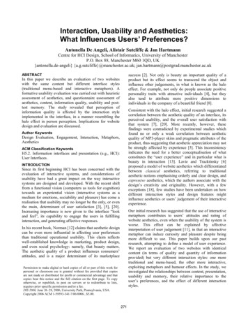
METHODreported a user-based evaluation run on small samples ofpupils, concentrating on self-reports and observations tocapture qualitative data. In contrast, in our study we reportan expert-based comparative evaluation, which followed amuch more structured approach, collecting and statisticallycomparing subjective and objective data.Two live websites (http://www.renaissanceconnection.org)were selected and adapted for the experiment. Theypresented exactly the same information on Renaissanceculture and history but with different user interface styles.One was a traditional menu-based style; the other exploitedanimated metaphors and more aesthetic features (metaphorbased). The metaphor-based website adopted a playful andengaging interaction style, with animated picture charactersproviding information by speech bubbles, and generatingother pictures and information from inside their head. Themenu-based style adopted a more serious interaction style,displaying a static picture instead of the animated head, andwith no humorous effects. Examples are shown in Figure 1.Websites architectureThe websites are structured in five sections, three of whichwere the object of our evaluation. The Innovation 14002020 section was the most different as regards interactionstyle (Figure 2) and was used to perform four of the eightinformation retrieval tasks. In the metaphor-based style, itopened with a Flash-based introduction where a headprovided subject matter and functional help. Theintroduction was controlled by the user and could beskipped. The information was then presented following themetaphor of a telescope: themes were selected by moving asequence of pictures at the bottom of the telescope (leadingto a change of the picture displayed in the lens) and the yearwas selected by moving a slide on the lens. This lastselection led to an update of the text displayed in the video.An example of the information presented on the Patronsand Lifestyles theme in 2000 is shown in Figure 2 (lower).In the menu-based style, the Innovation section begins witha list of all the themes and after selection the user is takento a web page with all the information listed inchronological order (Figure 2, upper).Figure 1. Menu-based (upper), and metaphor-based (lower)interfaces for the Renaissance Connection website.The original websites were designed by Eduweb for theAllentown Art Museum in Pennsylvania for use by middleschool students (10-14 years) and their teachers. Thesewebsites were subjected to a comparative usabilityevaluation, aimed at unveiling relative strengths andweaknesses of Flash and HTML [15]. The study addressedinformal behavioural observations and the comments ofmiddle school and college students. The major differencewith the current study is that the HTML version (which wecall the menu-based style) was a static equivalent of theFlash version (metaphor-based) and exploited the samelevel of playfulness without any animation effect. In thecurrent study, we removed most of the fun features from themenu-based interface, and replaced them with pictures of amore serious content. Other important methodologicaldifferences also need to be stressed. The original studyFigure 2. The Innovations 1400-2020 section in the menubased (upper) and metaphor-based (lower) interface272
“educational”. The second measure builds on the BernierInstructional Design Scale (BIDS), a psychometricinstrument developed to assess the quality of printededucation material. For our study we selected and adaptednine items, directly related to clarity of learning objectives,level of detail, quality of content, learning potential,delivery of up-to-date information. Engagement wasmeasured by a short scale, previously used in [18].The Be a Patron of the Arts section proposed an interactivegame requiring the user to commission a painting to‘glorify God, your city and yourself, and your family’. Toplay the game, the user had to make selections ofalternatives in a form of interactive narratives. Differentchoices led to different outcomes, with only one correctpath (one leading to the achievement of the desiredpainting). In the metaphor-based interface, the gameconsisted of vignettes, where comic-like characters talkedto the users with timed speech bubbles in a vignette. In themenu-based interface, the same dialogue appeared as textassociated to a character picture in a sequential fashion.One experimental task addressed this section. Performance analysis Self-report and severity rating ofusability problems (1 minor problem;5 major problem) 5-item usability scale on a 7-pointLikert scale [6]Memorabilty Free recall memory test and memoryrating (1 very negative, 5 verypositive)Aesthetics Heuristics for attractiveness [16], [17] 10-item perceived website aestheticscale on a 7-point Likert scale [6] Scale A: six items on a 7-point Likertscale adapted from [6] as servicequality measure Scale B: nine items on a 7-point Likertscale extracted and adapted from theBernier Instructional Design Scale(BIDS) [1]Engagement 3 items on a 7-point Likert scale(engaging, entertaining, pleasant)Overall preference Dichotomous choice on the UsabilityThe final section covered by the experiment was the Theartist’s life. It reported basic knowledge on famousRenaissance painters. In the metaphor-based condition, thisinformation was structured on individual web pagesthrough which the user navigated clicking on the icon of ahand and/or selecting a menu at the top of the screen. In themenu-based interface, the same information was displayedon a web page through which the user had to scroll.Information qualityIn an informal assessment of the aesthetic/user engagementdifferences between the two websites, we hypothesised thatthe variables that might influence users’ overall evaluationextended to the information quality assessment.Evaluation instrumentsThe websites were evaluated for usability, memorability ofcontent and interface features, aesthetics, informationquality, engagement and overall preferences. Severaltechniques and instruments were used to gather evidence onthese dimensions (Table 1).Table 1. Summary of the instruments and techniques usedduring the evaluation.Usability was assessed by objective measures (performanceand self-report of usability problems) and subjectivemeasures (questionnaire). Aesthetics was assessed by twodistinct yet complementary approaches. A questionnairecollected holistic impressions on two apparently separatedimensions, namely classical aesthetics and expressiveaesthetics. The first dimension includes items such aspleasant, clear, clean, symmetrical and aesthetic design.The dimension of expressive aesthetics is characterised byqualities that capture the user’s perception of creativity andoriginality of the site’s design. Relevant items in thisdimension are “creative”, “fascinating”, “original”,“sophisticated design”, “use of special effects”. In addition,we asked participants to evaluate the site applying theheuristics for attractiveness, proposed by Sutcliffe [16].These address the quality of individual design featureslinked to the perception of aesthetics (Table 3).Overall preferences were assessed directly by a postexperimental questionnaire, asking users to express theirchoice on a dichotomous question, for overall preferenceand individual dimensions, in a number of differentscenarios. Indirect measures of preference were obtained byquestionnaire comparisons.ParticipantsTwenty-eight undergraduate and postgraduate students (23male and 5 female) from the School of Informatics,University of Manchester participated in the experiment.They all had a basic knowledge of HCI, usability evaluationtechniques and the aesthetic heuristics used in theexperiment, from an advanced HCI course they hadrecently attended. All of the participants were expert webusers but none of them had any prior knowledge of the twowebsites.Information quality addressed the educational impact of thewebsite. Two measures were used. The first one buildsupon Lavie and Tractinksy’s [6] service quality construct(measured by the items “makes no mistakes”, “providesreliable information”, “reliable”), and localised to theevaluation of educational software by adding the followingitems: “provides enough details”, “informative”,ProcedureData were collected in a group setting, with each participantworking individually for almost 3 hours. At the beginningof the experimental session, participants received writtenand verbal instructions followed by a brief pre-test273
Several factors related to interaction design can be heldresponsible for the poorer performance of the metaphorbased interface. In this condition, the information wasprovided using an array of design elements, includingspeech bubbles and small pop-up windows, which couldeasily go unnoticed. Furthermore, information retrievaloften required physical manipulation of interface objects.For instance, in the telescope metaphor, the year had to beselected by moving a slider, and paintings needed to beclicked to retrieve details. These design solutions may havedisrupted participants’ performance by increasing thecognitive and physical load necessary for informationretrieval. On the contrary, the linear interaction stylesupported by the menu-based interface was better suited tothe experimental task.questionnaire recording personal data. Then, they wereassigned to one of the two websites and had to performeight information-retrieval tasks (e.g. finding events whichoccurred in specific years, finding artists’ names andpainting dates, engaging in on-line games, and reporting onspecific picture details). Answers were written in anexperiment booklet. Optimal task performance requiredvisiting three sections of the websites in both conditions(Innovations, Artist’s Life, Be a patron of the arts).During task execution, participants recorded the usabilityerrors they encountered and rated their severity. Once theyhad completed the tasks, they performed a free recallmemory test, listing ten facts/ issues they could rememberabout the website, and rating the quality of these memorieson a five-point scale (as favourable, neutral or adverse).Then, participants briefly revisited the site and completedthe attractiveness heuristics and the questionnairesaddressing the remaining measures. After a short break, thesame evaluation procedure was repeated with the otherwebsite and a new set of tasks. Experimental tasks weredesigned to be very similar in terms of cognitive workloadand navigation behaviour, but they addressed differenttopics to minimise learning effects (e.g. they had to retrieveinformation related to different themes, or to commission apainting for different targets). Finally, participants filled ina post-test questionnaire, which captured their overallpreference and the reasons behind it. They were also invitedto select the ideal interaction style for different targetpopulations and environments (e.g. children aged 7-10 athome; children aged 7-10 at school).Consistently, the usability evaluation clearly favoured themenu-based interface. On average, participants reportedsignificantly more problems when evaluating the metaphorbased website (mean 3.68; standard error .38) than whenevaluating the menu-based site (mean 1.68; standard error .37), t(27) - 4.49 p .001. The problems associated withthe metaphor-based site were also scored as more severe(mean/problem 3.85 on a 5-point scale; standard error .12) than those associated with the menu-based site(mean/problem 2.95; standard error .20). The differenceis significant (t(132) -3.94, p .001).Usability problems were clustered into four categoriesaccording to their cause. Poor menu/navigation includedcritical incidents [10], i.e. usability problems which causedoperational difficulties in finding the desired information.Poor graphical design covered adverse comments onaesthetic aspects of the site, including text layout and fonts,as well as animations and pictures. Poor informationreflected negative comments on clarity and completeness ofthe information architecture and content. The categoryother included not understandable statements, in addition tocomments reflecting unpredictable system behaviour andfunctionality failures. Table 2 reports frequencies andpercentages of these categories in the two experimentalconditions, along with their severity rating.Interaction style (2) was manipulated within-subjects, sothat each participant evaluated both the menu-based and themetaphor-based interfaces. Evaluation order and tasks werecounter-balanced among experimental conditions.RESULTSThe results are summarised in six main sections accordingto the type of data analysed: the usability evaluation,aesthetic appreciation, information quality, engagement, thememorability test, and finally the participants’ overallpreference; a model to predict overall preference issuggested. All scales showed high reliability (Cronbachalpha .78), therefore comparisons are based on theaverage of individual items.Menu-basedUsability evaluationIn each condition, participants were given eight questions toanswer, yielding a total of 224 tasks per condition. Overall,users were very accurate in information retrieval, with only3% of 448 tasks resulting in wrong information. Accuracywas significantly affected by the interaction style of thewebsite. Most of the errors occurred with the metaphorbased interface (N 10), whereas only 3 errors wereobserved in the menu-based interface, a significantdifference according to a Wilcoxon Signed Rank test Z 2.35 (N 12) p nu/navigation21452.9547473.87Poor graphicaldesign13272.9338383.977152.50993.67Poor .87Table 2. Statistics of usability problems classified by cause inthe two experimental conditions.Usability problems were homogeneously distributed in thefour categories independent of experimental conditions274
(χ2(3) 3.84, p n.s.). The most common cause of usabilityproblems was poor menu navigation, followed by poorgraphical design. Fewer problems addressed the quality ofthe information. Despite this apparent similarity, the detailsof the usability problems were very different in theexperimental conditions. This difference was reflected inthe severity ratings, which were higher in the metaphorbased interaction than in the menu-based one (F(5, 125) 15.11, p .001).Comparison of the usability index (average of individualitems) by a paired-samples t-test yielded significant results(t(24) 3.78 p .01). Usability of the metaphor-basedinterface was evaluated worse than the menu-based design.Consistently, 82% of the sample choosed the menu-basedstyle as the most usable in the post-test questionnaire(binomial test p .001).Aesthetic appreciationA questionnaire collected participants’ perception ofclassical and expressive aesthetics. A heuristic evaluationreported a more detailed insight into the evaluation ofspecific design features of the websites.Menu/navigation issues in the metaphor-based conditionsmainly occurred in the innovation section and the telescopemetaphor (N 20). Participants complained about the needfor direct manipulation of interface objects, and forscrolling down the information displayed in the small video(the backward arrow was always present, independent ofthe text length). In contrast, the menu/navigation issues inthe menu-based interface were more general anddifferentiated, such as broken or missing links (N 8) and tothe need for scrolling (N 6).Two indexes representing perception of classical andexpressive aesthetics were computed by averaging scores torelevant items. These indexes were entered as dependentvariables in a repeated-measure ANOVA with aestheticdimension (2) and interaction style (2) as within-subjectsfactors. Both the main effects and their interaction weresignificant, namely aesthetic dimension F(1, 24) 4.13, p .05; interaction style F(1, 24) 5.59, p .05; 2-wayinteraction F(1, 24) 50.34, p .001. These results indicatethat the effect of the interaction style on aesthetics ismodulated by the dimension considered Figure 4.For poor information design, most participants (N 16) inthe metaphor-based condition complained about theintroductory flash sequence which was displayed everytime they accessed specific sections allowing only limitedcontrol. Another frequent complaint addressed textreadability (N 11) which, in the telescope section, was poorbecause of the need to fit the information into a smallscreen (Figure 2). In the menu-based condition, the mostspecific complaint (N 3) was that the images were too bigand inconsistent. Other comments addressed general design(N 7), described as unattractive, and too simplistic. Typicalusability problems due to poor information concernedinformation architecture in the metaphor-based interface(N 6) and issues related to misleading titles or lack ofcaptions (N 3) in the menu-based style.7classicalaverage scoreFigure 4: Average scores for the two aesthetic factors as afunction of experimental conditionsThe metaphor-based interface was preferred on theexpressive aesthetic continuum (simple effects, p .001);whereas the menu-based interface was slightly preferred onthe classical aesthetic dimension (simple effects, p 06).average score5A more detailed analysis addressed individual designfeatures associated with the website look and feel via aheuristic evaluation. For each of the 16 heuristics, the userhad to quantify their relative importance in relation to theoverall quality of the website (1 not important, 7 veryimportant) and then evaluate the website based on thatheuristic. Table 3 reports descriptive statistics for the 11heuristics which had an average importance valuesignificantly superior to 4 (mid-point of the scale) asassessed by a one-sample t-test. The importance index wascomputed by averaging the scores given in the evaluation ofthe menu- and metaphor-based websites. Discarded4321has easyorientationmenu-basedwebsitemetaphor-basedeasy tonavigate3metaphor-basedmenu-basedeasy to use417clear52The subjective evaluation of usability closely mirrored theobjective analysis of performance and usability problems.Average scores and standard errors of the five usabilityitems in the Lavie and Tractinsky’s scale are illustrated inFigure 3.6expressive6convenientFigure 3: Usability ratings as a function of experimentalcondition275
heuristics addressed use of personality, logos, video, depthof field, and sound, which were not considered important.The remaining heuristics are listed in Table 3, in order ofimportance.question, 75% of the sample indicated the menu-based styleas their favourite interface for content.EngagementInteraction style significantly affected the perceived level ofengagement with the website (t(25) -2.95 p .01). Themetaphor-based site was perceived as more engaging(mean 4.80; std. error .27) than the menu-based interface(mean 3.78; std. error .24). Consistently, in the post-testquestionnaire 19 users picked the metaphor based interfaceas the most engaging (binomial test p .09).A series of repeated measures t-test were run to assess intersites differences. Significant results emerged only asregards to the heuristics addressing layout structure, andaccessibility of information, which were considered the 2most important design elements. In both cases the menubased interaction style was favoured. Note that these twoheuristics addressed design elements at the border betweenusability and classical all, participants reported 368 items in the free recallmemory of the two websites. No effect of interaction styleemerged on the number of items retrieved, but the memoryvalency of the menu-based interaction style was in generalmore positive (mean 4.57; std. error .15) than that of themetaphor-based style (mean 3.98; std. error .14), t(360) 2.93 p ed layout*6.17.203.75.3205.18.270Info. accessibility*6.12.233.21.3104.75.310Consistent 4Matching expectn5.22.224.08.3244.73.262Use of 3.74.341Identity4.58.274.50.2224.73.242Recalled items were categorised into reports relating to thecontent of the website (including reference to the subjectmatter and information architecture), to the user-interface(sub-divided into link and navigation, multimedia,labelling/feedback, graphical design), and others. A crosstabulation analysis (χ2(3) 33.20, p .001) indicated thatthe interaction style affected the content of these memories(Table 5). In particular, the menu-based style triggeredmemory related to the content of the website (40% withincondition); whereas the metaphor-based style inducedmemory related to multimedia elements (38% withincondition). No difference in valency for content andmultimedia emerged within the two websites. In contrast,the metaphor based interaction style elicited more negativememories on link and navigation, labelling and feedback,and graphical design than the menu-based style.Table 3. The 11 heuristics considered of importance in websiteevaluation. Significant results are marked with an asterisk; SE Standard Error, N/A not applicableWhen asked to indicate the most attractive interface in thepost-test questionnaire, 22 users selected the metaphorbased interface (binomial test p .01).Information qualityMenu-basedOverall, participants evaluated the information provided bythe menu-based system as more educational than theinformation provided by the metaphor-based interface. Theeffect consistently emerged in both scales analysed (scalesA and B; see Table 1).Menu-basedMetaphor-basedContentt-testUIMeanStd. ErrorMeanStd. ErrorScale AQual5.03.164.31.18t(24) 2.99 p .01Scale B4.87.214.35.20t(23) 11 p eqValencySE374.38.35174.59.39Info Architecture354.77.39184.56.39Link and 22Labelling/feedback94.89.7583.87.54Graphical al1804.57.151883.98.14Table 5. Cross-tabulation analysis of memory content and userinteraction style.Table 4. Results of the paired-sample t-test and descriptivestatistics of overall indexes.Overall preferenceResults of the paired-sample t-test and descriptive statisticsof overall indexes (average of individual items) are given inTable 4. Consistently, in the post-test forced choiceOverall preference was tied, with 14 subjects favouringeach interface. When asked to justify their decision,participants who expressed their preference for the menubased interface used almost twice as many words (N 298)276
exactly half of the sample preferred the metaphor-basedversion and the other half the menu-based one.as those who chose the metaphor-based interface (N 145).This seems to suggest that people choosing the lessengaging website felt the need to better justify theirdecision. In doing so, they often (N 9) explicitly referred tonegative features of the Flash website. In other words, theirpreference appeared to be the result of a general dislike forthe metaphor-based version. In contrast, only two peopleexplicitly referred to negative features of the menu-basedwebsite when stating their preference for the metaphorbased site.Menu-basedThe reasons driving participants’ preferences were verydifferent according to the selected website. The mostcommon reason for preferring the metaphor-based interfacemade explicit reference to a more engaging (N 8) and moreinteractive (N 7) style. Only two participants declared itwas easier to use. On the other hand, all but one of theparticipants who preferred the menu-based style madeexplicit reference to usability issues.Metaphor-basedUsability -Classical aesthetic Expressive aesthetic- Information quality -Engagement- Memory valency Overall preference Table 7. Summary of the differences between the twointeractive styles.The correlations between the main dimensions for the twointeraction styles are reported in Table 8. Correlation valuesfor the metaphor-based styles are reported in the upper partof the matrix, and menu values are in the lower part. Theoverall correlation trends demonstrate the interrelationships between the different evaluation dimensions.The most striking difference between the two interactionstyles is the correlation between usability and expressiveaesthetics, which is highly significant in the menu-basedinteraction styles but not in t
Memorabilty Free recall memory test and memory rating (1 very negative, 5 very positive) Aesthetics Heuristics for attractiveness [16], [17] 10-item perceived website aesthetic scale on a 7-point Likert scale [6] Information quality Scale A: six items on a 7-point Likert scale adapted from [6] as service quality measure