Transcription
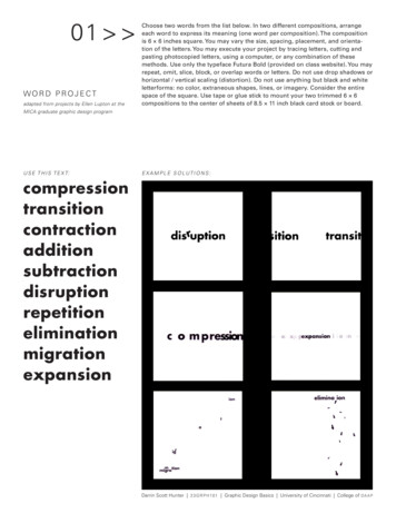
01 wo r d p r o j e c tadapted from projects by Ellen Lupton at theChoose two words from the list below. In two different compositions, arrangeeach word to express its meaning (one word per composition). The compositionis 6 6 inches square. You may vary the size, spacing, placement, and orientation of the letters. You may execute your project by tracing letters, cutting andpasting photocopied letters, using a computer, or any combination of thesemethods. Use only the typeface Futura Bold (provided on class website). You mayrepeat, omit, slice, block, or overlap words or letters. Do not use drop shadows orhorizontal / vertical scaling (distortion). Do not use anything but black and whiteletterforms: no color, extraneous shapes, lines, or imagery. Consider the entirespace of the square. Use tape or glue stick to mount your two trimmed 6 6compositions to the center of sheets of 8.5 11 inch black card stock or board.MICA graduate graphic design programU S E T H I S T E X T:E X A M P L E S O L UT I O N S nDarrin Scott Hunter 2 3 G RP H 101 Graphic Design Basics University of Cincinnati College of DA A P
02 text projectadapted from projects by Ellen Lupton at theMICA graduate graphic design programWithin a 6 6 inch square, compose the text provided below in a manner thatexpresses its meaning. Use only the roman, italic, and small caps of Sabon(provided on website). Vary only alignment, leading, line length, orientation,and spacing. Use no variations in weight or size. You may break the paragraphinto smaller elements and distribute them within the square. Be sure to have aconcept in mind before you work (sketch it!) as you will be asked to explain whattextual ideas you chose to illustrate and what methods you employed to do so.Use tape or glue stick to mount your trimmed 6 6 composition to the center ofa sheet of 8.5 11 inch black card stock or board.S AY S E L L E N L U P TO N :The most common problem students encounter with this project is what I call “swimming.” Thishappens when you start changing the size, style, spacing, or orientation of the type from wordto word or line to line without having a sense of structure that holds the composition together.Avoid swimming by sketching ideas before you start working on the computer. Read the text;understand its basic meaning; break it into parts. How do those parts relate to typographicforms and structures? Don’t just jump in: think first.U S E T H I S T E X T:E X A M P L E S O L UT I O N S :Print situates words in spacemore relentlessly than writingever did. Writing moves wordsfrom the sound world to aworld of visual space, but printlocks words into position in thisspace. Control of position iseverything in print. Printed textslook machine-made, as they are.In handwriting, control of spacetends to be ornamental, ornate,as in calligraphy. Typographiccontrol typically impressesmost by its tidiness and invisibility: the lines perfectly regular,all justified on the right side,everything coming out evenvisually, and without the aid ofguidelines or ruled borders thatoften occur in manuscripts. Thisis an insistent world of cold,non-human, facts.Quote adapted from Walter Ong, Orality andLiteracy: The Technologizing of the Word (Londonand New York: Methuen, 1982).Darrin Scott Hunter 2 3 G RP H 101 Graphic Design Basics University of Cincinnati College of DA A P
03 grid projectadapted from projects by Ellen Lupton at theMICA graduate graphic design programU S E T H I S T E X T:A typographic grid organizes text and images across the pages of a document. Agrid can consist of a single column framed by margins, or it may have multiplecolumns. When you design a grid, you typically begin with vertical divisions (columns), and then add horizontal divisions called flow lines that arrange elementsat consistent heights throughout a document.Create a new document in whatever software you choose, or simply complete theproject with a hand-drawn grid and cut paper blocks of text that you move andglue down (called mechanical paste-up). If you choose the software route, AdobeInDesign has built-in tools to help you construct a layout grid (see online help).Your page size is 8 8 inches. Create a grid with 1/4 inch margins all aroundand four vertical columns, 1/4 inch gutters. This grid must appear printed ordrawn in your final solution: do not turn it off! Arrange the provided text on thegrid. Create three different designs on three different pages, all using the sameunderlying grid. You must use only Helvetica Neue 55 Roman (provided on classwebsite). Do two layouts using 8-pt type only, and one layout that introduces oneadditional size of type. Use tape or glue stick to mount your three trimmed 8 8compositions to the center of sheets of 8.5 11 inch black card stock or board.E X A M P L E S O L UT I O N S :COMMON TYPOGRAPHIC DISORDERSVarious forms of dysfunction appear amongpopulations exposed to typography for longperiods of time. Listed here are a number offrequently observed afflictions.TypophiliaAn excessive attachment to and fascinationwith the shape of letters, often to the exclusion of other interests and object choices.Typophiliacs usually die penniless andalone.TypophobiaThe irrational dislike of letterforms, oftenmarked by a preference for icons, dingbats,and—in fatal cases—bullets and daggers.The fears of the typophobe can often bequieted (but not cured) by steady doses ofHelvetica and Times Roman.TypochondriaA persistent anxiety that one has selectedthe wrong typeface. This condition is oftenpaired with OKD (optical kerning disorder),the need to constantly adjust and readjustthe spaces between letters.TypothermiaThe promiscuous refusal to make a lifelongcommitment to a single typeface—or evento five or six, as some doctors recommend.The typothermiac is constantly tempted totest drive “hot” new fonts, often without aproper license.Darrin Scott Hunter 2 3 G RP H 101 Graphic Design Basics University of Cincinnati College of DA A P
04 specimen projectTypeface designers have a long-standing tradition of creating “specimen sheets”of their new fonts so printers and designers can see them in action. A goodspecimen sheet shows the flexibility and expressive range of the typeface familywhile capturing its distinct spirit and tone of voice. A good specimen sheet alsohighlights the most unique functional aspects of the face and displays its fullrange of weights, styles, characters, and special glyphs in a wide range of sizes.Create two 11 17 specimen sheets for one of the following typeface families:Gill Sans Std, Sabon LT Std, Helvetica Neue LT Std, Baskerville Ten OT, FuturaStd, Clarendon LT Std, or Bodoni Std (all provided). The first specimen sheetmust include: (1) the “style block” with many styles and weights representedand labeled. Keep in mind that the “style block” should utilize some kind ofrelated text, like a quotation or poem, or a set of words that surround a topicrelevant to the typeface’s character or purpose. It is a chance for the specimendesigner to show off personal style, topical knowledge, or aesthetic taste. Thesecond specimen sheet must include: (2) the full character set including ligatures,lining & oldstyle figures, small capitals, and (3) a sample text set at several sizes,weights, and line spacings (see examples below).E X A M P L E S O L UT I O N S :Darrin Scott Hunter 2 3 G RP H 101 Graphic Design Basics University of Cincinnati College of DA A P
05 poster projectCaveat: If you choose to execute the poster project, you must also complete allfour of the preliminary text design exercises! They build skills you will need toemploy in the creation of a more complex hierarchical relationship among elements where more variables are at play (color, scale, weight, style, etc.)Create a 16 20 inch poster for the MidPoint Music Festival 2009 in Cincinnati.The text and the MPMF graphic identity assets are provided on the class workspace. Carefully consider the typographic hierarchy of the information presented.A viewer should be able to easily understand the calendar of events and toquickly learn who the featured performing acts are. The poster must also conveythe excitement of contemporary indie and art rock to an audience of designersand students. The information itself must constitute the “imagery” of the poster.Your poster must be purely typographic. You may use colors, shapes, and linesas well as text, but no illustrations or photography. The poster must be trimmedto its edges, and “tiled” printing is acceptable, as long as the tiles are assembledneatly by taping on the back. The CGC also has affordable large-format printingoptions (see desk attendants for help on how to submit work).EXAMPLE TYPOGRAPHIC POSTERS:Darrin Scott Hunter 2 3 G RP H 101 Graphic Design Basics University of Cincinnati College of DA A P
MICA graduate graphic design program USE THIS TEXT: EXAMPLE SOLUTIONS: A typographic grid organizes text and images across the pages of a document. A grid can consist of a single column framed by margins, or it may have multiple columns. When you design a grid, you typically begin with vertical divisions (col-