Transcription
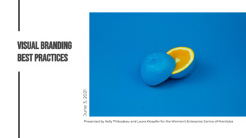
June 3, 2021VISUAL brandingbest practicesPresented by Kelly Thibodeau and Laura Kloepfer for the Women’s Enterprise Centre of Manitoba 1
Visual brand valuesThe psychology of colourChoosing fontsThe elements of good designPhotography and graphicsOutsourcing workQ&Aagenda 2
VisualizingBrand values0How can you take your brand core values and represent themvisually so consumers know exactly what you’re about? 3
brand QUIZYour brand’s ultimate goal inlife is to A)Do the right thing and nevercut corners.B)Rise to the top of the pack.C)Always be learning andgrowing.D)Have fun and bring peopletogether. 4
brand QUIZWhen interacting withcustomers, your brand will.A)Do the best possible job toearn their trust.B)Make them feel special andimportant.C)Help them lead a fulfilling life.D)Welcome them into yourcompany’s “family.” 5
brand QUIZYour friends describe yourbrand te. 6
brand QUIZYour brand springs into actionwhen.A)Customers want someonethey can count on.B)Customers want to stand outfrom the crowd.C)Customers want to lead amore meaningful life.D)Customers want to feel moreconnected to others. 7
MOSTLY A’s?You’re a sodalite — you connect throughquality and your personality is trustworthy,honest, and attentive.Mostly B’s?You’re a garnet — you connect throughexclusivity and your personality is proud,bold, and provocative. 8
MOSTLY C’s?You’re a amethyst — you connect throughself-improvement and your personality iscurious, wise, and generous.Mostly D’s?You’re a rhodocrosite — you connectthrough community and your personality ispersonable, welcoming, and fun. 9
Personality traitsQuality brands veDetailedConsistentExclusivity brands chievingChange orientedRebelliousSelf-improvementbrands cationalLiberatingEnrichingCommunity brands flessFamily-orientedPassionate 10
PSYCHOLOGYOF COLOUR0Colour is arguably the most important elements of design as itis usually the first thing that people notice about your brand. 11
COLOUR IS A POWER WHICH DIRECTLYINFLUENCES THE SOUL.Wassily Kandinsky,Artist 12
REDRed symbolizes life as well as the loss of life.Red has duality and can represent bothcupid and the devil. Red can alter yourbrand in positive and powerful ways.YELLOWYellow is the most luminous of all the coloursof the spectrum. It captures attention morethan any other colour. It’s the colour ofhappiness, and optimism, of enlightenmentand creativity, sunshine and spring. 13
GREENGreen signifies growth, rebirth, and fertility. Inpagan times, there was the "Green Man" - asymbol of fertility. In Muslim countries, it is a holycolor and in Ireland, a lucky color. It was the colorof the heavens in the Ming Dynasty.BLUEBlue is nature’s color for water and sky, but israrely found in fruits and vegetables.Blue is embraced as the color of heaven andauthority, denim jeans and corporate logos. 14
PurplePurple symbolizes magic, mystery,spirituality, the subconscious, creativity,dignity, royalty – and it evokes all of thesemeanings more so than any other colour.ORANGEOrange symbolizes energy, vitality, cheer,excitement, adventure, warmth, and goodhealth. However, pure orange can be brass;however, it may suggest a lack of seriousintellectual values and bad taste. 15
PINKPink is a popular colour for brands thatprimarily serve a female audience.Pink’s color meaning revolves aroundfemininity, playfulness, immaturity andunconditional love.BROWNBrown is an earthy colour. It’s the colour ofearth, wood and stone.Brown relates to comfort, security and adown to earth nature and is often used fornatural products and food. 16
WHITEWhite showcases innocence, goodness,cleanliness, and humility. Keep in mind, thatthis is the meaning in North Americanculture. In some parts of the world, whitehas the opposite meaning.BLACKBlack’s colour meaning is symbolic ofmystery, power, elegance, andsophistication. In contrast, the colourmeaning can also evoke emotions such assadness and anger. 17
choosingfonts0A good visual identity uses typography that functions in allsituations while equally conveying a specific emotion. 18
FONT TYPESSerif: Serifs refer to the small feet at the endof a stroke on a letter. Because they were oneof the original created font types, they oftencreate a classical feel and are recommendedfor large chunks of body copy.Sans Serif: Sans serifs refer to theabsence of small feet. Because thesefonts were developed later, they feelmore modern and contemporary.Depending on the sub-type of sansserif, it can be difficult to read in largeblocks and works better in headingsand large titles. 19
FONT TYPESScript: Script fonts are based on cursivehandwriting and are divided into twocategories: formal and casual. Scriptsgenerally have a fluid look and feel. Thesefonts are not considered suitable for body copyas they can become very illegible.Decorative: Decorative fonts are thelargest and most diverse category.The main characteristic these fontshave is that they are not suitable forbody copy and work best in logos andheadlines. Most of these fonts arevery expressive and created with aspecific goal in mind. 20
EXAMPLESUPHOUSE:Sans Serif modern, funTHE FORKS:Display bold, stable, directionalPENNYLOAF BAKERY:Serif traditional, welcoming, warm 21
BREAKOUT ROOM ACTIVITY: 10 minutes1.2.3.Introduce yourselves.Considering your business, what brand colours and fonts areimportant for your customers? What brands inspire you?Share your thoughts and ideas with your group. 22
ELEMENTS OFGOOD DESIGN0In the world of design, there are seven elements of gooddesign to consider. 23
THE ELEMENTSA solid understanding of the elements gives you the ability to visualize your brand and understand otherbrands you come across.LINECOLOURvalueshapetextureformSPACe 24
LINELines are the most basic elements of design. They come in allshapes, sizes, and colours. Lines have direction and help directthe eye to a certain spot. The thickness of a line can alsocommunicate emphasis or not. A simple line can carry so muchmeaning—for example, a squiggly line could be perceived asplayful and fun compared to a straight line, which converysrigidity and stability. 25
ColourColour is used to generate emotion, define importance, createvisual interest, and more. The use of colour is arguably the mostimportant aspect when creating your visual identity. 26
SHAPEWidth Height Shape. Shapes are two-dimensional and can bedescribed as geometric, natural, and abstract. Geometric shapes have structure and are oftenmathematically precise (squares, circles, triangles).Natural shapes lack well-defined edges and often feelorganic and smooth.Abstract shapes are a minimalist representation of reality.For example, a stick figure of a person is an abstract shape. 27
FORMForm is the positive element over the space. A line, or shape is aform when placed on a page, so often, form and shape are usedinterchangeably. However, a form can be either two-dimensionalor three-dimensional. To create a 3D look in visuals, you can addshadows, stack multiple elements, or play with colour shading. 28
VALUEValue is how dark or light an element can look. In visuals, usedifferent tonal values to create emphasis or create the illusion ofmovement. Value is also important in photography. You’ll noticethat high-value images have a light and airy feel to them, whiledark value images feel heavy and dramatic. 29
TextureTexture refers to the surface of an object. In visuals, texture adds atactile appearance to a brand. The goal of texture is to add depthby using patterns or photography. 30
SPACESpace is the area that surrounds an element; it creates its ownshape within the space. If you look at a logo, the negative space isthe area that is not occupied by any elements. Negative space isa very important aspect to consider as you are creating yourvisuals. 31
EXAMPLESFEDEX: Colour and space.FOLKLORAMA: Shape and form.PATENT 5: Value and texture. 32
photographyand graphics0Photography and graphics should compliment your brandvalues and work together to enhance each other and tella complete story. 33
IMAGESWhen choosing or creatingimagery for your brand, selectimages that have the samePOV, colours or subject matterso your brand looks consistenton all platforms. For example,for this presentation, we chooseto use bold colours and imageswith no people in them. 34
GRAPHICSSimilarly, when choosinggraphic elements for yourvisual identity, chooseconsistent elements. Maybeyou only use line icons for yourbrand with typography. Maybeyour brand is entirely graphicswith some images inlaid hereand there like the brandElementor. 35
EXAMPLE1.2.3.4.They use a combination ofimages and type often ongradient backgrounds.They have one main brandfont with a secondary font inthe same “font family.”Their images have a feelingof movement and ease.In the past the brand feltmasculine, but has moved toa more feminie approachusing softer colours, but alsofeeling fresh and modern. 36
outsourcingwork0When creating your brand, when should you outsource workand when should you do it yourself? 37
DESIGNCANVAPros: Affordable and userfriendly.Cons: Slight learning curve,higher potential for copyrightinfringement, unprofessional.FIVERR OR UPWORKPros: Affordable, easy to access.Cons: Potential for copyrightinfringement, difficult tocommunicate, you might end upspending more in the long run. 38
DESIGNAGENCYPros: Professional package,trained designers, in-depthresearch.Cons: Can be expensive,sometimes hard to conveyyour ideas, longer timelines andmany channels ofcommunication.FREELANCE DESIGNERPros: One on one relationship,flexibility, professional design.Cons: Can be expensive and hardto find the right fit. 39
KEYTAKEAWAYS0 40
Apply brand colours consistently onyour website, in social media or otherbrand collateral like presentations,reports or packaging.Look beyond trends and focus on fontreadability and legibility.takeawaysbrand colours & FONTSBe mindful that the fonts and coloursyou choose affect how your targetcustomers perceive your brand. 41
Your brand identity should be relatableto your target audience while at thesame time aspirational to them.Elements of good design includelines, colour, shape, form, value,texture and space.takeawaysELEMENTS OF GOOD DESIGNThe direction you take for the design ofyour brand can start with Canva, thougha consultation with a designer will helpyou achieve a visual identity you can feelconfident about. 42
questions ?0 43
what are your biggesttakeaways or most valuableinsights from the session? 44
what would you like to seecovered in the next session? 45
what’s next0 46
The Branding Your Business Workshop Series is designed to help you builda brand that attracts your ideal customers, aligns with your values, tells yourcustomers who you are and gets people talking.Personal branding fundamentals June 10 12:00pm - 1:00pmPersonal branding is about you, and whether you’re the face of your business orworking inside a company, it’s crucial in today’s online marketplace. In this workshop,you’ll learn what it takes to stand out, how to create a personal brand that gets peopletalking and keeps them talking whether you’re there or not. 47
thank you!Workshop en’s EnterpriseCentre of manitobaSquarely SocialLaura al.com@laura.kloepfer@squarelysocial 48
Brown relates to comfort, security and a down to earth nature and is often used for natural products and food. BROWN Pink is a popular colour for brands that primarily serve a female audience. Pink’s color meaning revolves around feminin


