Transcription
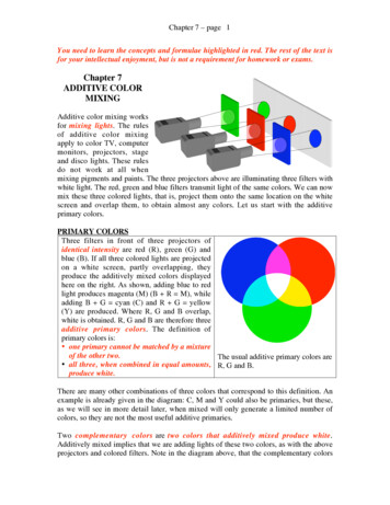
Chapter 7 – page 1You need to learn the concepts and formulae highlighted in red. The rest of the text isfor your intellectual enjoyment, but is not a requirement for homework or exams.Chapter 7ADDITIVE COLORMIXINGAdditive color mixing worksfor mixing lights. The rulesof additive color mixingapply to color TV, computermonitors, projectors, stageand disco lights. These rulesdo not work at all whenmixing pigments and paints. The three projectors above are illuminating three filters withwhite light. The red, green and blue filters transmit light of the same colors. We can nowmix these three colored lights, that is, project them onto the same location on the whitescreen and overlap them, to obtain almost any colors. Let us start with the additiveprimary colors.PRIMARY COLORSThree filters in front of three projectors ofidentical intensity are red (R), green (G) andblue (B). If all three colored lights are projectedon a white screen, partly overlapping, theyproduce the additively mixed colors displayedhere on the right. As shown, adding blue to redlight produces magenta (M) (B R M), whileadding B G cyan (C) and R G yellow(Y) are produced. Where R, G and B overlap,white is obtained. R, G and B are therefore threeadditive primary colors. The definition ofprimary colors is: one primary cannot be matched by a mixtureof the other two.The usual additive primary colors are all three, when combined in equal amounts, R, G and B.produce white.There are many other combinations of three colors that correspond to this definition. Anexample is already given in the diagram: C, M and Y could also be primaries, but these,as we will see in more detail later, when mixed will only generate a limited number ofcolors, so they are not the most useful additive primaries.Two complementary colors are two colors that additively mixed produce white.Additively mixed implies that we are adding lights of these two colors, as with the aboveprojectors and colored filters. Note in the diagram above, that the complementary colors
Chapter 7 – page 2appear opposite to each other, and that the complementary to each primary color is thecombination of the other two primaries.ADDING PRIMARY COLORSIt does not seem possible, at a first sight,to mix R, G and B to obtain the two colorsreported on the far right, chocolate brownand cyclamen pink. We will describe indetail how to do this quantitatively. Fornow, suffice it to say that there areaccurate combination of R, G and B thatproduces these two colors. These are: 2parts of R, 1 part of G, no B, anddecreasing the intensity to obtain brown;while pink is a mixture of approximately 2parts of R, 1 part of G and 1 part of B.In fact, almost any color can be obtained with a combination of R, G and B lights. Letus illuminate the left part of a white screen, in the figure above, with R, G and B lights.Let us now illuminate the right part of the screen using a projector with a light of anarbitrary color (stimulus S), brown or cyclamen pink in the example above. Alternativelywe can place on the screen a colored sheet of paper, and illuminate it with white light.We can now vary the intensities of the three lights on the left, until we obtain a match forbrown or pink. A match of the color can be represented by the equation:S aR bG cBWhere a, b, c are the intensities of R, G and B lights, respectively. Since the totalintensity is of no interest, we can calculate what fraction r of the light is red:r aa b cAnd similarly what fraction g is green:g ba b cThese two numbers, r and g, define the mixture of colors projected on the left spot.In the cyclamen pink example we have:S 250 R 170 G 200 BThe total Intensity I is the sum of the intensities for R, G and B (a, b and c):
Chapter 7 – page 3I a b c 250 170 200 620 units.The units in the intensity are irrelevant, because the only numbers that matter to definethe color are ratios, that is, the fractions of each color, which are unitless. On computers,in 8 bit color images, a, b and c vary between 0 and 255. There are therefore 256 ( 28)intensity levels for R, for G and for B. You may try on your computer the numbers above,and verify that you really obtain cyclamen pink. The ratios we need to calculate are:250 0.40620170The fraction of green g 0.28620200The fraction of blue b 0.32620The fraction of redr Notice that r g b 0.4 0.28 0.32 1This is always true: the sum of the fractions r, g, and b always adds up to 1. Wetherefore do not need to calculate all three fractions: calculating the fraction of red andthe fraction of green will always be sufficient, because the fraction of blue is thecomplement to 1 of the other two (b 1 – r – g).We can now plot the fraction of red on the horizontal axis and the fraction of green on thevertical axis of a diagram. This is the chromaticity diagram or color triangle.fraction of greenTHE COLOR TRIANGLEfraction of redThe color triangleThe fraction of red and green may varybetween 0 and 1, the fraction of blue doesnot need to be plotted because it is alwaysthe complement to 1 of the other twofractions. If the fraction of green is 0, onthe horizontal axis, we will have B for r 0, R for r 1 and M in the middle, wherer 0.5. On the vertical axis (r 0) wewill have G where g 1 and C in themiddle, where g 0.5. Y is between Rand G, that is, where r g 0.5. White isin the point where both r and g are 0.33.The color triangle on the left here showsall these points (R,G,B,C,M,Y,W) and thecorresponding colors.
Chapter 7 – page 4We can find the coordinates of anymixed color on the color triangle. Thecolor triangle rule is: mixing twocolors, the resulting color is always onthe line joining the two colors. That iswhy C is in the middle point between Band G, M between B and R, and Ybetween R and G. The color triangleprovides a simple way of mixingadditive primary colors to obtain thedesired color, or anticipating exactlywhat the resulting color will be, whentwo colors are mixed in action of green0.80.60.40.2000.20.40.60.81fraction of redAny mixed color is the sum of thecorresponding spectral color plus white. Ahigh purity color has no white, a low purity(pastel) color has lots of white. Along anyline starting from white and going towardsthe edges of the triangle, the color does notchange, only the purity changes. Pure colorsare at the edges of the triangle, while lowpurity ones at the center.Once the fractions of red and green of a color are identified, therefore, to work out whatcolor that is, all we need to do is report the point with coordinates r and g on the triangle,draw a line from white to that point, extend the line until it reaches the edge of thetriangle and identify what the color at the edge is. We then estimate how far the point isfrom the edge and from white, and identify its purity.10.8fraction of greenFor the example of cyclamen pink wefound that r 0.4 and g 0.28. We drawthe point with these coordinates on thetriangle (white circle in the diagram),extend a line from white to it and continueuntil we reach the edge: the color at theedge (the corner in this case) is red. Thepoint corresponding to our color is muchcloser to white than to red, we thereforeconclude that the color is a low purity red,or low saturation red: pink.pink0.60.40.2000.20.40.6fraction of red0.81
Chapter 7 – page 5When mixing two colors, we must first identify them on the color triangle, then draw aline between them and, if they were mixed in equal amounts, find the resulting color inthe mid-point between the two original colors. If there was more of one color than theother the resulting color will be closer to the most abundant.10.8fraction of greenAccording to the color triangle rule, whenmixing two colors the resulting color liesalong the line connecting the two. If forexample we mix 1 part of high purityorange and 2 parts of high purity green,the resulting color lies 1/3 of the way fromgreen and 2/3 of the way from orange, andthe resulting color is high purity limegreen (thicker white circle). If we mix 2parts of yellow and 1 part of C, we obtainlow purity lime green.0.60.40.2000.20.40.60.81fraction of red110.80.80.60.6fraction of greenfraction of greenIt should now be clear why R, G and B are usually chosen as the additive primarycolors: RGB give the largest mixing potential, that is, the largest number of colors canbe obtained when mixing them. All the colors in the color triangle can be obtained. Ifwe chose red, blue and yellow, for example, we could only obtain the colors within thetriangle delimited by the three points where these three colors are on the color triangle,that is, R, O (for orange), Y, W, B, M and the colors intermediate between these. Thesecolors are shown below, on the left. We could never obtain G or C, mixing only RBY.Even worse, if we chose C, M and Y, we could never obtain red, or blue, or green.This case is shown below, on the right.0.40.200.40.200.20.40.6fraction of red0.81000.20.40.60.81fraction of redLOW INTENSITY COLORSAre all colors represented on the color triangle? Where are the olive greens, the grays,browns, beige, black? These colors are indeed shown on the triangle, but since the colortriangle does not represent the color intensity, these low intensity colors are not
Chapter 7 – page 6immediately evident. Olive green is nothing but low intensity green, brown is lowintensity orange, gray is low intensity white, and black is lowest intensity white. Blackcan actually be lowest (or zero) intensity any color. Black could therefore be anywhereon the color triangle.1olive greenfraction of green0.80.60.4graybeigebrown0.2000.20.40.6fraction of red0.81Olive green, brown and grayare shown as dark points in thecolor triangle on the left. Theyare in the same positions asgreen, orange and white, sincethese are low intensity colors,and the color triangle does notshow intensities. Beige is lowpurity brown, and lies along theline between white and brown(orange).For the above colors the RGB intensities on a 0-255 level basis are:Green 0R 255G 0BOlive green 0R 100G 0BWhite 255R 255G 255BBlack 0R 0G 0BGray 123R 123G 123BOrange 255R 123G 0BBrown 123R 62G 0BBeige 223R 162G 100BThe colors chosen for typing the color names on the diagram above were obtained usingthese accurate values. Please try them on your own computer: any graphics program(Adobe Photoshop , Adobe Illustrator , PowerPoint , Canvas , etc.) will allow you toenter the RGB numeric values you desire, when you use the “color picker” to select acolor.SPECTRAL COLORSNot all the spectral colors can be matched by mixing RGB. The hues obtained mixingRGB primaries are less pure than their spectral corresponding colors (dominantwavelengths). This is particularly evident in the in the blue-green region, also calledcyan or turquoise.
Chapter 7 – page 7Let us project on a screen in spot #1 acombination of RGB and on spot #2 spectral cyan(470 nm), and try to match the color of spot #2 inspot #1. On spot #1 we project blue and green,with wavelengths 420 nm and 550 nm,respectively. We need to use our imaginationhere, because the color in spot #2 was producedon a computer that works additively, and istherefore not as pure as the spectral cyan with 470nm. Please imagine the cyan in spot #2 muchhigher saturation than the mixed cyan of spot #1.spot #1spot #2To obtain a perfect match we need to produce the same response in the cone cells of oureye. We will find that the only way to obtain a match is to shine some red light on spot #2and then match the new color with blue and green light on spot #1. The reason for this isclearer if we look again at the sensitivity curves for the cones.spot #2IntensityC1wavelength(nm)470type I1.0response of conestype II4type III1We want to match, that is, obtain the same responses for the three types of cones for amixture of RGB as we obtained for the spectral cyan in spot #2.sensitivity curves for cone cells20Type IIType I 1Type IIIType II 415Type III 1105410400Type I450500550600650700470 nmsensitivity (arbitrary units)sensitivity (arbitrary units)sensitivity curves for cone cells20 19.5Type IIType III15 14Type I 2Type II 19.5Type III 141052Type I0400450420500550550600650700wavelength (nm)wavelength (nm)Spot #2: spectral cyan with 470 nm Spot #1: a mixture of primary G and B withwavelength.550 and 420 nm wavelengths, respectively.The responses for the three types of cones are:wavelengthspot #1Intensity(nm)B1420G1550B G420&550type I202response of conestype II019.519.5type III01414
Chapter 7 – page 8A comparison of the above tables of responses obtained for spots #1 and #2 shows a largediscrepancy. Clearly, the intensities of B and G in spot #1 cannot be 1, to obtain a goodmatch with the responses to C in spot #2. Let us try with intensities of 0.5 for B and 0.2for green:spot #1IntensityBGB G0.50.2wavelength(nm)420550420&550response of conestype Itype IItype III2x0.5 100019.5x0.2 414x0.2 2.8142.8We are getting closer, but our mixture of G B, still does not generate the exact sameresponse as C: type I and II cones are now identical, but for type III cones we have 2.8 inB G and 1 in C.sensitivity (arbitrary units)sensitivity curves for cone cells20Type IIType III1510520400Type I450500550600wavelength (nm)new spot #2IntensityCRC R10.9650700The only way to obtain a perfect match is to addsome red to the spectral C in spot #2. Let us addsome red of 660 nm, which is not detected bytype I and type II cones. If we choose anintensity of 0.9 for this red light, we obtain theresponses for the three types of cones reportedin the table below. These are now identical tothe responses we obtained above for the mixtureof B G in spot #1.660wavelength(nm)470660470&660type I101response of conestype II404type III11.82.8Adding red to cyan meant to desaturate cyan. Since red is the complementary color tocyan, the addition of red is equivalent to adding some white, and produce a less pure, aless saturated color. Adding red to the spectral cyan we wished to match is equivalent toadding negative red to the mixed color. Now, this is physically impossible, because therewas no red to begin with in the B G mixture, so it is not conceivable to subtract red fromit. On the other hand, a negative fraction of red can be plotted on the color triangle, or,rather, outside the color triangle.
Chapter 7 – page 91spectral BG (cyan)0.8primary B primary Gfraction of green0.60.40.2000.20.40.60.81fraction of redThe spectral cyan lies outside the colortriangle. The color triangle delimits thecolors that can be matched by a mixture ofRGB, but there exist more colors, that can’tbe matched by RGB. Cyan is an example ofthese colors. Many other spectral and nonspectral colors lie outside the triangle.These colors have to be desaturated, ormade less pure, before they can be matchedby a mixture of RGB primaries. You willnever see an RGB mixed turquoise on TVor on your computer monitor that is as pureas the spectral turquoise.The area of human color vision510 nm1550 nm0.8490 nm580 nm0.60.4650 nm0.2440 nm0700nm00.2400 nm0.40.60.81The hues obtained mixingprimaries are less pure thantheir spectral correspondingcolors, to which is associateda single (dominant) wavelength. Most of the spectralcolors lie outside the colortriangle. Spectral red, greenand blue are at the edges ofthe triangle, while yellow,cyan and violet are outside.So are the purples.The horse-shoe shape in the figure above, describes the area of human color vision. Thisarea is delimited by the curved line along which all spectral colors lie (see correspondingwavelengths in the diagram), and the line between spectral violet and red. In summary,the color triangle includes only the colors that can be obtained mixing RGB, but theeye can see more colors, including spectral colors and purples.NON-SPECTRAL COLORSPurple and magenta, as well as all the magenta-purple hues are non-spectral colors.There is no single (dominant) wavelength associated with them. They are exclusivelymixed colors. Magenta is the mixture of spectral red (700 nm) and spectral blue (440nm), while purple is the mixture of spectral red (700 nm) with spectral violet (400 nm).The mixture of R B in different proportions generates all the magentas, the reddishmagentas and the bluish-magentas. These hues can be obtained mixing RGB primaries(R B), therefore you can see them on TV or on the computer monitor. The purple huecannot be mixed with RGB primaries.Now that we described the color triangle and the spectral colors, let us look at thecomplementary colors again. Two complementary colors must produce white when
Chapter 7 – page 10added. White must be on the line between them. For example, B and Y are complementsbecause when additively mixed they produce white. To be perfectly accurate, B andspectral Y are complementary colors, not B and Y, since the points B and Y are notequally distant from white, while SY and B are equidistant from W. B and Y arecomplementary hues. We would actually need to add a lower purity blue (sky blue, SB inthe figure below) to yellow, to obtain white. B and Y pigments, however do not producewhite when mixed, as will be explained in detail in Chapter 8. The line connecting blueand yellow passes through white. Other pairs of complements are shown below, such asbluish-cyan and orange (BBG and O), lime green and bluish magenta (YG and BM),green and magenta (G and M), but many more exist. Again, to be accurate, it isunsaturated green (UG) that complements magenta perfectly.110.80.80.6YGUG0.6SYfraction of greenfraction of fraction of red0.40.6M0.81fraction of redSUMMARYEvery color can be located on the color triangle by a three-step process. First match thecolor with three primaries R, G, and B. Second, find r and g.r fraction of red in the total intensity of light in the match;g fraction of green in the total intensity of light in the match.Third, plot r on the horizontal axis and g on the vertical axis.White falls at the point r 0.33, g 0.33, near the center of the triangle. The moresaturated a color (i.e. the greater its purity) the further it falls from white. Spectral colorsare the most saturated and fall on a curved line outside the triangle.When two colors are added the resulting color always falls on a line connecting the two.This idea is useful in the explanation of complementary colors--colors which producewhite when added. Complements always fall on opposite ends of a line through the whitepoint. The hue of a color can be specified by finding the dominant wavelength, or in thecase of purples, the complementary wavelength of the color. Every color can be matched
Chapter 7 – page 11by a spectral color or a purple, plus white. The smaller the amount of white, the higherthe purity.ADDITIVE COLOR MIXING IN PAINTINGWhen painting and mixing oil paints the rules of additive color mixing don’t usuallyapply. We will describe in Chapter 8 how to mix pigments and paints, with subtractivecolor mixing. Nevertheless, there have been extraordinary cases in art, in which paintersattempted painting additively.Post-impressionists used a revolutionary technique to enhance color brightness andcontrast, which was based on additive color mixing. Van Gogh wanted to achieve theeffects of art glass in the windows of gothic cathedrals. These windows have coloredpieces of glass adjacent to each other, and they transmit colored lights exactly as ourprojectors through colored filters.Van Gogh did not know aboutadditive color mixing and mixinglights, but he was striving to achievethe brightness and color contrasts thatonly mixing lights can achieve. Heinvented the “mélange solide”, Frenchfor “solid mixture”, in which insteadof mixing oil colors subtractively, hepainted adjacent brush strokes withcontrasting colors. He described itsaying “je cherche à exprimer avec lerouge et le vert les terribles passionshumaines”. The terrible humanpassions are expressed by red andgreen, not mixed but adjacent. Sincethe brush strokes in his mélangesolide are large, much larger than theeye’s resolution, the eye does notactually mix lights from adjacentcolors, it perceives the strikingcontrast of very different and verySelf portrait with hay hatbright colors, as in a gothic cathedralVincent Van Gogh (Dutch: 1853-1890)Post-Impressionistwindow!If the regions of two different colors are much smaller, lights from the two differentcolors side by side mix additively, and create a third color. This resulting color isoptically mixed, that is, it is mixed in the eye of the observer. When two colors are mixedin pigments they lose some of their intensity, while when those same two colors aremixed optically they retain their intensity and they may appear brighter. Two other NeoImpressionists, the pointillists Seurat and Signac, explored this possibility, with smallcolor regions: points or dots.
Chapter 7 – page 12Chenal de GravelinesGeorges Seurat (French: 1859-1891)Neo-ImpressionistSeurat studied the interactions of colors witheach other, and by reducing the number of colorson his palette and applying pigments in verysmall spots he tried to control their interactions.The Impressionists have often been interpretedas using “broken colors”, but a patch of yellowin an impressionist painting is almost alwaysyellow paint, not strokes of red and green laidside by side to achieve optical mixing. Seurat,however, did construct magenta from small spotsof blue and red, and with his system he couldalso vary the intensity of red, for example, nearan orange dot, and determine how much the redwill induce in the adjacent color a perception ofits complementary, cyan.Seurat called his techinquedivisionism because he had dividedthe colors into their physicalconstituents, but his theory andpractice, together with those of hisfollowers, were soon described asNeo-impressionism and Pointillism.The subject was still Impressionist –ordinary people seen in every dayactivities, atmospheric conditions,immediacy of the scene – butpresentation and technique were new.The Neo-impressionists had colortheory available to them — includingthe works of Herman von Helmholtz(whose Manual of PsychologicalOptics had by then appeared in French) and Wilhelm von Bezold's texts, which werepublished in French in 1876. Seurat and his colleagues had begun to feel that, if they didnot become more involved in the science that could explain the optical effects formingthe basis of visual arts, art itself would remain intellectually unsatisfying. His task wasmade easier by the work of the American physicist Nicholas Odgen Rood (N. O. Rood,Modern Chromatics with Application to Art and Industry, Chicago 1879) who was alsoan accomplished painter. Seurat was inspired by N. O. Rood’s writings and color theory,and he imitated the behavior of light itself, that is, performed additive color mixing whenactually optically mixing pigments. He, however, misunderstood when he thought that“adjacent dots of pure spectral colors could be mixed [in the eye of the observer] toobtain other spectral colors observed in nature, with a brilliance and luminosity [readpurity!] unattainable by conventional pigment mixtures”. Scientifically speaking, Seurat’sidea was flawed, but he has given us some of the most haunting images in European art.Another problem was with the contrast enhancement of adjacent complementary colors.St. Tropez, le portPaul Signac (French: 1863-1935)Neo-Impressionist
Chapter 7 – page 13We have now learned that lights of complementary colors, when mixed, produce white,not pure colors.The optical mixture of complementary colors kills color, as Signac himself lateradmitted: “Pointillage makes the surface more lively, but it does not guaranteeluminosity, intensity of color, or harmony. The complementary colors, which are alliesand enhance each other when juxtaposed, are enemies and destroy each other if mixed,even optically. A yellow and a blue, if juxtaposed, enliven each other, but yellow dotsand blue dots make an aggregate which is grey and colorless.” You may verify this effectvery simply, next time you go to the Art Institute of Chicago. If you stand in front ofSeurat’s “Dimanche après midi sur l’Isle de la Grande Jatte”, and are close enough to seethe individual dots, all colors appear very bright and luminous (pure). If you stand faraway they all blend together, and the overall effect is a hazy gray patina covering thewhole painting.Dimanche après midi sur l’Isle de la Grande JatteGeorges Seurat (French: 1859-1891)Neo-Impressionist
the resulting color lies 1/3 of the way from green and 2/3 of the way from orange, and the resulting color is high purity lime green (thicker white circle). If we mix 2 parts of yellow and 1 part of C, we obtain low purity lime green. It should now be clear why R, G and B ar