Transcription
American Journal of Business Education – First Quarter 2017Volume 10, Number 1Creating And WorkingWith Control Charts In ExcelPaul F. Schikora, Indiana State University, USAABSTRACTWith the growth in distance education offerings, instructors who now teach quantitative material via the web havebeen faced with many challenges. Foremost has been the need to develop appropriate methods for teaching suchmaterial to students who are not physically in the classroom. Methodologies that have traditionally been taught in ahighly interactive mode in the classroom must now be presented effectively in a far more asynchronous environment.Tutorials and detailed handouts are one way to accomplish this.We present a written tutorial for creating quality control charts using Excel. The tutorial guides students throughthe process of creating X-bar and R charts in such a way as to reinforce the theoretical basis of quality controlalready taught. Students apply their knowledge in hands-on activity, learn how to improve Excel’s default charts tocreate visually effective control charts, and learn to reuse/recycle their work to easily create additional charts fordifferent sets of problem data.Keywords: Control Charts; Spreadsheets; Distance Education; TutorialINTRODUCTIONAs the growth of the Internet has led to a similar increase in the availability of courses to distancestudents, instructors who now teach quantitative material via the web have been faced with manychallenges. Foremost has been the need to develop appropriate methods for teaching such materialto students who are not physically in the classroom. For a many quantitative topics, traditionalpedagogy has depended heavily on direct and interactive demonstrations in the classroom. Indeveloping web-based courses, instructors have to face the fact that such direct, synchronous interaction is notpossible. They must develop alternative, but effective methods to replace the classroom experience. This can befurther complicated when the instructor has typically relied on specialized software, such as statistical packages, toteach certain topics. While this software may be readily available and fully supported on campus, distance studentswill often not have ready access to the specific package. When that is the case, not only does the instructor have todevelop a distance-appropriate methodology, but that methodology must be built around a readily available softwaresolution.MotivationWe have faced this challenge in developing courses on statistical quality control for web delivery. Specifically,teaching the theory and development of quality control charts has, in the past, typically relied heavily on directinteractive demonstrations with students in a university computer lab. There, various statistical software packagescan be demonstrated by the instructor, and the students can practice their new art with the guidance of the everpresent instructor. The teaching of the methodology can be done fairly quickly, with much of the learning cominghands-on as the students work on creating control charts from sample data. Student questions can be answeredimmediately, averting frustration on the students’ parts, and quickly reinforcing the learning experience. Indeveloping pedagogy for the new web courses, we realized we had been taking that direct interaction for granted.We quickly realized that a new model for teaching control charts had to be developed. Without the interactiveexercises, we realized that the web-based approach would have to be a more complete, detailed, and self-containedpackage. We would have to anticipate common student questions or uncertainty, and find alternative methods toCopyright by author(s); CC-BY23The Clute Institute
American Journal of Business Education – First Quarter 2017Volume 10, Number 1somehow show what could not be directly demonstrated. We also could no longer rely on specialized softwarepackages, such as Minitab or SPSS, because we could not expect all distance students to have such packages readilyavailable for their use. So the new instructional methodology would have to include the use of a widely availablesoftware solution.ApproachResearch has shown that the availability of various learning resources in a web class is directly related to studentperformance in the class (Murray, et al., 2012). Rather than relying on any existing resource to bridge the distancegap, we decided to develop a tutorial to teach students how to develop control charts from a set of sample data. Thetutorial was intended to directly replace classroom demonstration, so it was designed in such a way that it could leada reasonably prepared student through the necessary steps to create (and revise if necessary) common control charts.When faced with the choice of an appropriate software package to do so, spreadsheets seemed an obvious choice.We developed the tutorial around the ubiquitous Microsoft Excel spreadsheet package, one to which most anystudent would have reasonably easy access. The exact method of creating charts in Excel varies based on theversion of Excel being used – we use Excel 2013 in this tutorial.The choice of Excel as a software package also presented us with a couple of side benefits. When demonstratinghow to develop control charts in a typical statistical package, the student does not gain much experience in applyingthe underlying theory and methodology, as the statistical packages typically do all the work. The same is typicallytrue even if using an Excel add-in to create the charts (e.g. Buttrey, 2009). They also tend to leave the student withlittle control over the final appearance of the control charts. The use of Excel addresses both those shortfalls. Whenbuilding control charts in Excel, students are forced to work directly with sample statistics and control chartformulas, thus reinforcing earlier learning on the theoretical and statistical bases of control charts. Also, through theuse of Excel’s drawing tools, we could teach students a bit of the art of making good business presentations of theirwork. Both of these benefits add value for the student.We had several primary goals for the tutorial: It should provide sufficiently detailed steps to lead an average student through the steps necessary tobuild control charts on his own, without necessarily being a complete technical manual.To minimize “busy work” on the part of the students, it should borrow some environmental concepts:reduce, reuse, and recycle. While developing control charts in Excel reinforces earlier learning, it canbe a bit tedious to repeat the process from scratch for numerous example problem data sets. Wewanted to present a method that would let students reapply their earlier work on later data sets.It should provide some ideas on how to format the charts to make them better visual tools for use inactual quality control situations.Research has shown that the availability of various learning resources in a web class is directly related to studentperformance in the class (Murray, et al., 2012). While there are several resources available on using spreadsheets tobuild control charts (e.g. “Control Chart in Excel”, n.d; “How to Create ”, n.d.), none sufficiently met our goals tobe used as-is for our courses. There are also texts dedicated to quality control with spreadsheets [e.g. Zimmermanand Icenogle], but we desired ancillary material that would not add to the cost of taking the course and could beupdated in-house for new releases of Excel.TutorialThe tutorial we developed has been a work in progress, and is currently fully functional as plug-and-play pedagogyfor many courses. It has several features that have helped us accomplish the goals previously stated. The tutorial demonstrates all of the steps needed to take a set of sample data and create standard X-Barand R charts. It assumes the student has a basic understanding of the theory, so focuses on the stepsneeded to develop the charts in Excel. Understanding of basic Excel concepts is assumed.Because direct demonstration is not possible, screen captures are used throughout to take the place ofCopyright by author(s); CC-BY24The Clute Institute
American Journal of Business Education – First Quarter 2017 Volume 10, Number 1classroom demonstration. These images show the students how to perform certain steps, and also whatthey should see if they are proceeding correctly.It is written in an informal, conversational style. Feedback from our students indicate they prefer thisapproach over “technical manual” style writing.Tips on formatting the default chart to make it a good TQM visual tool are presented.Instructions on how to reuse already developed charts to create revised charts for the current data set,or new charts for additional data sets are provided. This is especially important in our courses, wherethe students must turn in both trial and revised control charts for homework and exam problems.Reusing charts can help cut down the tedium of working multiple problems.The tutorial can easily be supplemented by a screen-capture video recording with instructor voiceoverif desired.The tutorial, as used in our courses, is presented in the following section. It can be used as-is in most courses, ormodified for specific needs. Comments and feedback are welcomed by the authors.Copyright by author(s); CC-BY25The Clute Institute
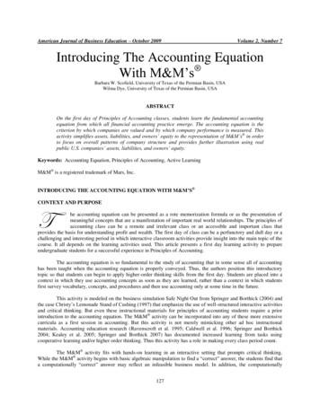
American Journal of Business Education – First Quarter 2017Volume 10, Number 1CREATING AND WORKING WITH CONTROL CHARTS IN EXCELIntroductionThere are many software packages that can create and update control charts for you. Some are specific to qualitycontrol, and most generalized statistical packages also have this capability. However, this course is not designed totrain you in the use of any particular software program. Instead, the aim is to provide you with a solidunderstanding of the statistical basis for the construction and use of control charts. As such, you will be buildingand working with control charts from scratch, using Microsoft Excel or another similar spreadsheet program. Thistutorial is designed to provide a reasonable approach to doing so for this class.It is assumed that students have basic capabilities for working in Excel – meaning you know how to copy/paste data,use functions, select and manipulate cells, format how cells display, use absolute references, etc.Set It UpThe first step of course is to enter the data you have collected (or have been given) into the spreadsheet -- we use thedata in Appendix A. Enter your data in rows, one row for each sample. Each sample observation will be entered asa separate cell in the sample’s row. Headings should also be used to help you keep track of what everything is.Parameters/factors necessary for creating the control chart need also be entered somewhere. We recommend youenter them below your sample data as shown in Figure 1 – the reason for this will become apparent later on. In thisexample, I have the control chart factors entered in cells B28 to B31. Finally, note that we have included columnsfor the sample statistics. (Figure 1).Copyright by author(s); CC-BY26The Clute Institute
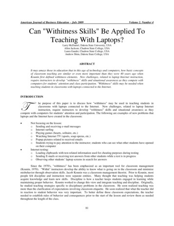
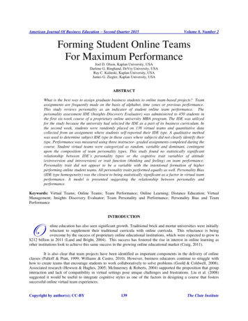
American Journal of Business Education – First Quarter 2017Volume 10, Number 1Figure 1. Initial SetupCompute Sample StatisticsFor every control chart, you will compute sample statistics to be plotted on the control. These statistics should becomputed on the same row as the relevant sample, using standard Excel formulas. In our example, X-bar iscomputed using the average () function, and the sample range (R) is computed using the max() and min() functions.See the formula bar in the Figure 2 for an example of the latter.To save time and effort, you should enter the formulas only once, and then copy and paste them into the other cellsfor the remaining samples.Compute Control Limits and Center LineThe next step is to compute these key components of the control chart. We recommend computing them at thebottom of your sample data, again using standard Excel formulas. In computing these values, do not enter thevalues of any parameters/factors directly – rather, reference the cell that contains the value. For example (as can beseen in the formula bar in Figure 3), when computing the UCL for the X-bar chart, the value of factor A2 is notentered, but the cell containing its value, C29, is. Likewise, the value of X-double-bar is not entered, but rather cellCopyright by author(s); CC-BY27The Clute Institute
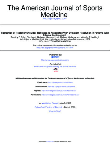
American Journal of Business Education – First Quarter 2017Volume 10, Number 1F27 is, and so on. The reason for using cell references instead of direct values will become apparent when we lookat modifying the control chart later on in this tutorial.Figure 2. Sample StatisticsFigure 2. Calculating Center Line and Control LimitsCreate and Populate Columns for the Center Line and Control Limits: These horizontal lines can be manuallydrawn on a control chart, but it is much better to have Excel draw them. To do so, we’ll create a column of identicalnumbers for each of these lines. To fill in the values, just make an absolute reference to the cell where you earliercomputed the value for each line (the formula bar in Figure 4 gives an example – cell F27 contains the value of thecenter line for our chart). Do this for each of the control chart lines on the first row of sample data, and then copythe row to all the other rows. When these values are included in the control chart, they will be plotted as straighthorizontal lines – just what we want!Copyright by author(s); CC-BY28The Clute Institute
American Journal of Business Education – First Quarter 2017Volume 10, Number 1Figure 3. Columns for Center Line and Control LimitsCreate the ChartsAt this point, the spreadsheet has all the data needed to draw the control chart. We will use the built-in chartingcapabilities of Excel to do this. Just follow a few steps, and your control chart will be created. The exact methoddepends on what versio
true even if using an Excel add-in to create the charts (e.g. Buttrey, 2009). They also tend to leave the student with little control over the final appearance of the control charts. The use of Excel addresses both those shortfalls. When building control charts in Excel, students are forced to work directly with sample statistics and control chart formulas, thus reinforcing earlier learning on .