Transcription
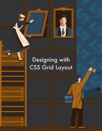
CONTENT MANAGEMENTCSS GRID LAYOUTBASIC CONCEPTS OF GRID LAYOUTMA Web Design and Content PlanningVanessa A CostaFeb 2018
CSS GRID LAYOUT Introduces a two-dimensional grid system to CSS; The grid is the intersecting set of horizontal and vertical lines, where elements are placed respectingthese column and row lines; It can be used to layout major page areas or smaller user interface elements; After defining a grid on the parent element, all direct children become grid items; Grid is a powerful specification and when combined with other parts of CSS such as flexbox, can helpyou to create layouts that were previously impossible to build in CSS.It all starts by creating a grid in your grid container.
TERMINOLOGYThe Grid
Grid ContainerTo create a grid container just declaredisplay: grid or display: inline-grid on an element.All direct children of that element will become grid items.
Grid CellsIs the smallest unit on a grid. Conceptually it is like a tablecell. When the grid is defined as a parent the child items willlay themselves out in one cell each of the defined grid.
Grid TracksTo define rows and columns on the grid, it is used thegrid-template-columns and the grid-template-rowsproperties. These define grid tracks. A grid track is thespace between any two lines on the grid. There arecolumn tracks and row tracks.
Grid LinesWhen we define a grid we define the grid tracks.Grid then gives us numbered lines to use when positioningitems.In our five column, three row grid we have six column linesand 4 row lines (number of columns or rows 1).
Grid AreasItems can span one or more cells both by row or bycolumn, and this creates a grid area.Grid areas must be rectangular.Example: grid area spans two row and two column tracks.
Gutters (grid-gap)Gutters or alleys between grid cells can be created using theshorthand grid-gap, or grid-column-gap and grid-row-gapproperties.grid-column-gap: 10px;grid-row-gap: 1em;grid-gap:10px (shortcut for both)
The fr UnitFixed and Flexible Track Sizes A grid can be created with fixed track sizes, using pixels forexample. This sets the grid to the specified pixel which fits tothe desired layout; But is also possible to create a grid using flexible sizes withpercentages or with the newfr unitdesigned for this purpose,the creation of flexible grid tracks; The unit fr – fraction of the available space in the gridcontainer; Using the fr unit allows to create flexible grids, which is greatfor a responsive web; The fr unit grows and shrinks in proportion of the availablespace; It can be combined with fixed sizes;
Track Listings with Repeat () NotationIn case of a grid with many tracks use the repeat() notation, to repeat all or a section of the track listing.3 columns each with 1 fraction of theavailable space8 columns: 1st with 20 px, 6 x 1fr , 8th with 20px10 columns: 5 x (1 column 1 fr and 1 column 2fr)
The Implicit and Explicit GridExplicit GridIs the grid which you define number of columns and rows with grid-template-columns and grid-templaterows.Implicit Grid When you create a grid defining just the column tracks with the grid-template-columns property,thegrid will create automatically rows for content. If you place something outside of that defined grid, or due to the amount of content more grid tracksare needed, then the grid creates rows and columns. These tracks will be auto-sized by default,resulting in their size being based on the content that is inside them. But you can also define a set size for tracks created in the implicit grid with the grid-auto-rows andgrid-auto-columns properties.
Track Sizing and Minmax()When you are using an explicit grid or defining the size for automatically creating rows or columns andwant to give tracks a minimum size, but also ensure they expand to fit any content that is added, use theminmax() function.Example:Automatically created rows will be a minimum of 100 pixels tall, and a maximum of auto.Using auto means that the size will look at the content size and will stretch to give spacefor the tallest item in a cell, in this row.
Positioning Items Against LinesRemember the grid lines.that is our target when we want to place items! The properties we need: grid-column-start, grid-column-end, grid-row-start, grid-row-end; Items can me placed into a precise location on the grid using line numbers, names or bytargeting an area of the grid.
Layering Items with Z-Index Grid items can occupy the same cell.box2 is now overlapping box1, it displays on top as it comes later in the source order.
THIS PROPERTY ALLOWS US TO MAKES DESIGNED LAYOUTS LIKE THIS:
Controlling the Order We can control the order in which items stack up by using the z-index property - just like positioneditems. If we give box2 a lower z-index than box1 it will display below box1 in the stack.
NESTING GRIDS A grid item can become a grid container. The nested grid has no relationship to theparent. The grid-gap of the parent and the lines in thenested grid do not align
FLEXBOX OR CSS GRIDLearn both and use accordingly to your goal!When to use what.depends in what you want to do.FlexboxCSS Grid Unidimensional (row or column) Bi-dimensional; Starts from the content defining the spacecontent out; Starts from the space, when you define thegrid; Calculations done in each row, one at the time,with no regard to the other rows; Allocating the content to the grid; Possibility of overlapping elements; Grid aligns everything into two directions: rowand columns; Things don't line up;
FLEX AND GRID
CAN I USEhttps://caniuse.com/#feat css-grid
MAKEYOURLIFEEASY!
USE CSS GRID.THANK YOU!
S/gridhttps://www.w3schools.com/css/css tps://caniuse.com/#feat rncssgrid.com/http://griddy.io/
REFERENCES – YOU TUBEhttps://www.youtube.com/watch?v N5Lt1SLqBmQ (You Tube: Grid by Example, by Rachel Andrew)https://www.youtube.com/watch?v FEnRpy9Xfes (You Tube: Layout Land, by Jen Simmons)
CSS GRID LAYOUT Introduces a two-dimensional grid system to CSS; The grid is the intersecting set of horizontal and vertical lines, where elements are placed respecting these column and row lines; It can be used to layout major page areas or smaller user interface elements; After defining a grid on t