Transcription
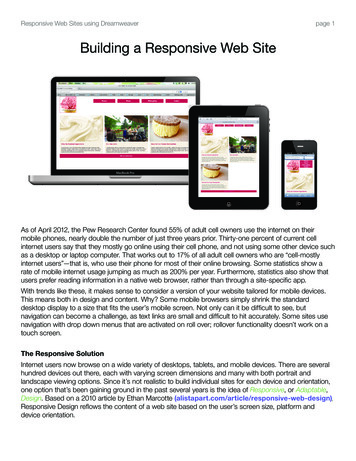
Responsive Web Sites using Dreamweaverpage 1Building a Responsive Web SiteiPadMacBook ProAs of April 2012, the Pew Research Center found 55% of adult cell owners use the internet on theirmobile phones, nearly double the number of just three years prior. Thirty-one percent of current cellinternet users say that they mostly go online using their cell phone, and not using some other device suchas a desktop or laptop computer. That works out to 17% of all adult cell owners who are “cell-mostlyinternet users”—that is, who use their phone for most of their online browsing. Some statistics show arate of mobile internet usage jumping as much as 200% per year. Furthermore, statistics also show thatusers prefer reading information in a native web browser, rather than through a site-specific app.With trends like these, it makes sense to consider a version of your website tailored for mobile devices.This means both in design and content. Why? Some mobile browsers simply shrink the standarddesktop display to a size that fits the user’s mobile screen. Not only can it be difficult to see, butnavigation can become a challenge, as text links are small and difficult to hit accurately. Some sites usenavigation with drop down menus that are activated on roll over; rollover functionality doesn’t work on atouch screen.The Responsive SolutionInternet users now browse on a wide variety of desktops, tablets, and mobile devices. There are severalhundred devices out there, each with varying screen dimensions and many with both portrait andlandscape viewing options. Since it’s not realistic to build individual sites for each device and orientation,one option that’s been gaining ground in the past several years is the idea of Responsive, or Adaptable,Design. Based on a 2010 article by Ethan Marcotte ponsive Design reflows the content of a web site based on the user’s screen size, platform anddevice orientation.illustration by kristen n. br
Responsive Web Sites using Dreamweaverpage 2How does it know?CSS2 introduced the @media rule, allowing designers and developers to target style sheets for variousmedia types, such as screen, print, tty, and even handheld. But with the explosion of mobile devices onthe market (over 400 different types were introduced between 2005 and 2008), a single set of handheldstyles wasn’t enough. Additionally, many mobile browsers bypassed the handheld styles to display themore recognizable and familiar screen styles.With the introduction of CSS3, the media attribute has new values that can test the device’s screen size,orientation, even its resolution, by asking a series of true or false questions. These types of true/falsequestions are called queries, so we refer to these as media queries. These are written into the CSS as@media rules.For example, is the media type a screen? Is the screen at least 480px in width? Based on the “response”to the query, the browser will display the corresponding set of styles. The adaptations can include almostanything, but typical adaptations are to layout, text sizes, image sizes, and sometimes hiding contentblocks on smaller screens.@media screen (min-width: 481px, max-width: 768px, orientation: portrait) { styles }While media queries can be broken down in multiple ways, Adobe’s Dreamweaver CS6 sets up 3 basicstyle sheets for responsive sites — mobile, tablet, and desktop.Fluid GridsOne of the best ways to reliably reformat layouts for various formats is to use something called Fluid Grids.A lot of graphic design is based on grids — newspapers, magazines, websites, brochures, catalogs, etc.The concept is that underlying a layout, there is a grid of evenly spaced columns. The space between thecolumns is called a gutter. Layout elements line up with the horizontal and vertical rules in the grid. Thishelps to create a coherent and organized structure, even if the grid is invisible to the viewer.
Responsive Web Sites using Dreamweaverpage 3Go to 960.gs/demo.html to view a standard web design grid. Go to goldengridsystem.com/ orprofoundgrid.com/examples/fluidresponsive.html to see how this concept works when it’s flexible.Things are elastic; they change width, height and even move around, depending on how far you openyour browser window.Stationarylayout gridFluidlayout grid:DESKTOPFluidlayout grid:MOBILEFluidlayout grid:TABLET
Responsive Web Sites using Dreamweaverpage 4The Math PartFluid grids define the width of columns and gutters by percentages, rather than by a fixed width ornumber. The key: the grid is resized based on whatever 100% of the device width is.This concept is very similar to font size written in ems. Rather that being a set pixel height, the size isproportional, with 1em being determined by whatever the user sets as the default browser size.Example: A user sets the browser’s default text size to 16px. That’s ourcontext. With paragraph text at 16px, we want the h1 tag to be 24px, sothat’s the target size. Divide 24 by 16 and the result is 1.5, or 150%.24 16 1.5To make that more generic, let’s use the words instead.target context resultThis same formula is what Dreamweaver’s Fluid Grids apply to columns. Taking the 960 grid example(which is the context), we want to determine the percentage of the 780px space (which is the target) inthis grid, use the same formula:780 960 0.8125, or 81.25%The same number of columns on a 1024px wide screen is 832.Creating a New Document1. Define a site and images folder, like any other site.2. There are three ways to start a new Fluid Grid Layout:a. Welcome Screen, choose Fluid Grid Layout from the Create New column in the centerb. File New Fluid Grid Layoutc. File New New Fluid Grid LayoutThree sizes appear in this New Document window. These correspond to the 3 CSS media queriesDreamweaver will automatically set up:a. Layout intended for Mobile, which will be screen sizes up to 480pxb. Layout intended for Tablets, which is 481px to 768pxc. Layout intended for Desktop, which is 769px or larger
Responsive Web Sites using Dreamweaverpage 5The number in the center of the screen icons for each size of the number of columns for each layout.a. Below the mobile one is the percentage of column width. This applies to ALL layouts, notjust mobile. For this layout, change column #s for desktop to 12, mobile to 4, and gutter width to15%. These are more easily divisible into even columns.b. Percentages below each screen icon is the percentage of the whole screen the layout will take.3. Click Create.Before you can even view the layout, you’re forced to save a CSS file, which will include the mediaqueries and any additional CSS I create relating to different sizes of divs on the page.a. Default opens to the mobile layout, because this is the first media query it uses.b. M any in the design and development community believe you should test for and design formobile first, as it’s a rapidly increasingplatform. A March 2013 article noted mobilebrowser usage tripled in three yearsand jumped 26% in the first threemonths of 2013.4. Save your page as index.html. You’ll be asked tosave the related files. Make sure these save to yoursite root folder.a. boilerplate.css acts like a “reset” CSS, inthat it tried to level set everything to a neutralfield in all browsersb. r espond.min.js is a minified javascript file which helps provide the flexible response.5. Be sure to give the page a title!
Responsive Web Sites using Dreamweaverpage 6Adding DivsFor the sake of showing the difference in divs, for the purposes of this lesson, switch to the desktop view.1. Making sure to select after the default #LayoutDiv1, but inside the container div with the class“gridContainer clearfix”, you can insert a Fluid Grid div two ways:a. Menu Bar Insert Layout Objects Fluid Grid Layout Divb. Insert Panel Layout mode Insert Fluid Grid Layout Div2. Name the div logo (this is an ID). Default is checked forStart new row. Leave this checked for the logo div.a. New rows have a margin-left value of 0 and a clear propertyof both.3. Using the tag selector, select, then delete the default #LayoutDiv1.4. Open CSS panel and notice that each of our divs is in thealamode styles.css three times! This happens every time you adda new Fluid Grid Layout Div.a. Once for mobile section, which is first in the CSS codeb. Once for tablet sectionc. Once for desktop section.A Pause to Review the Fluid CSSUsing the related files panel, open the alamode styles.css and review the code, including the comments.The first thing the CSS does is set the max-width to 100% for image, object, embed, and video tags.Later you’ll see that because we’ve defined this as a fluid grid page, Dreamweaver automatically brings inthese items without pixel dimensions. This allows these items to scale proportionally with the rest of thesite.Notice that the number of columns and the gutter percentage are listed in the comments, so if you’reworking on a site someone else developed, you’ll know what grid this is based on, even without openingup the files in Dreamweaver. If you scroll down, you can see various percentages that Dreamweaver hascalculated for the various elements.Next you’ll see styles, beginning with the mobile size, in keeping with the concept that mobile designcomes first. Notice there isn’t even an @media rule applied. Whatever styles we set here will be carriedon throughout the other variations unless we override them, based on specificity OR simply that theycome later in the CSS document, which you can see by scrolling down to find the @media sets for tabletand desktop.
Responsive Web Sites using Dreamweaverpage 7Back to the Layout1. Delete all three CSS instances of the #Layout 1 div you deleted earlier in the design. (You may have toright click or use the trash can icon at the bottom of the CSS panel to delete these.)2. Insert a new Fluid Grid div, but this time uncheck the Start new row box. Name this nav.a. Notice if I uncheck start new row, the div is slightly indented and the outline color is yellow.b. I f divs don’t start a new row, they have a percentage applied to the left margin, which is a gutterand the clear property is removed. These can act as columns, once we resize them.3. Insert a new Fluid Grid div with Start new row checked. Name it ingredients.4. Insert two more Fluid Grid div with Start new row unchecked. Name them patio and sandwiches.5. Insert one last Fluid Grid div with Start new row checked. Name it footer.6. Save your work.Resizing Divs for the Desktop View1. S elect the logo div. In Design View, select the handlebars ON THERIGHT, and resize by pulling the right edge to the left until the pop uphint box says 3 columns.a. Notice that the div will snap to the grid!b. T o select from the left and pull right increases the margin-leftproperty, rather than changing the size of the div.2. Select the nav div. Grabbing the right side, resize this down to 9 columns. The div automatically popsup beside the logo div, since they are now small enough to float side-by-side.a. If you’ve mistakenly made your new divs to start a new row, you can change thediv to an indented one by clicking the “up” arrow on the top, right corner.b. C onversely, if you need a div to start its own row, then the arrow will be a “down”arrow. Dreamweaver will automatically show you the arrow for the opposite choice.3. Resize the ingredients, patio, and sandwiches divs to 4 columns each. The shouldsnap up to make a single row in the desktop version. The footer div will remain on its own,across the bottom of the entire site.4. Save your work.5. Tips:a. If you make a mistake, clicking undo doesn’t work if you’re in the source code. Switch over tothe alamode styles.css. It may seem counter intuitive, but that’s where you’re making changes.b. T o view without the background grid, go to the Visual Aids (The eyeball icon) and turn off FluidGrid Layout Guides.
Responsive Web Sites using Dreamweaverpage 8Resizing Divs for the Tablet ViewOnce I resize the divs for one display size, click on the size selector (mobile/tablet/desktop) down at thebottom of the document window to select the next size. Notice the divs are still as they were entered.This provides a “fresh” palette for each size, since one isn’t necessarily based on the other. Also notice that the sizes you haven’t viewed have an asterisk by them in thatsame size selector location.1. Resize divs to the following:a. logo – 2 columnsb. nav – 6 columnsc. ingredients, patio, and sandwiches — 4 columnsd. footer – leave this at 8 columns2. Notice that the sandwiches div will start a new row, so it no longer needs themargin-left indent. Click on the arrow that appears on the left-hand side of the div.a. Tool tip says: Click to align div with gridResizing Divs for the Mobile View1. Resize divs to the following:a. logo – 2 columnsb. nav – 2 columnsc. ingredients, patio, and sandwiches — 4 columnsd. footer – leave this at 4 columns2. Click the arrows to align the patio and sandwiches div with the grid.2. Save your work.Inserting ContentMost content will be just the same as before. Text is just the same. Special things to note: Remember that images and video are imported with NO sizes, as a default. This is so they canresize with the layout, similar to the text in ems of the percentages of the columns and gutters. If you need to override this, click on the international cross-outsymbol next to the height/width locking icon.
Responsive Web Sites using Dreamweaverpage 91. I n any view, select the placeholder text inside the logo div; delete it and insert the ala mode logo.pngfile, being sure to fill in the alternate text.2. Select the placeholder text inside the nav div and delete it.a. Open the alamode text.txt file in Dreamweaver.b. Copy the unordered list.c. In Code View, or in the code section of Split View, paste the unordered list inside the nav div.3. Select the placeholder text inside the ingredients div. Place the ingredients.png image, addingalternate text.a. Go to the alamode text.txt and select the first set of h3 and p tags.b. In the code section, paste this after the ingredients.png image.b. If there’s an empty p before the h3 , delete it.4. Select the placeholder text inside the patio div. Place the patio.jpg image, adding alternate text.a. Go to the alamode text.txt and select the second set of h3 and p tags.b. In the code section, paste this after the patio.jpg image.b. If there’s an empty p before the h3 , delete it.5. Select the placeholder text inside the sandwiches div. Place the ice cream sand.jpg image, addingalternate text.a. Go to the alamode text.txt and select the last set of h3 and p tags.b. In the code section, paste this after the ice cream sand.jpg image.b. If there’s an empty p before the h3 , delete it.6. Select the placeholder text inside the footer div and delete it.a. Insert the text 2013 a la mode ice cream.b. T he copyright symbol is under Menu Bar Insert HTML Special Characters in CS6. InCreative Cloud, it’s under Menu Bar Insert Character.7. Save your work!Linking Additional StylesThere are still a few things to do to our site before we can start testing it.1. U sing the link icon at the bottom of the CSS panel, link to thealamode extra styles.css. You’ll notice color and text changes immediately, but upontesting in Live View or previewing in a browser, it’s still not quiteright. Looking at the new CSS style sheet, there’s a class of .featurethat we haven’t applied anywhere.2. Using the tag selector, select the ingredients div, then use theProperty Inspector to add the .feature class.3. Check the page in various browsers, reviewing your code if you seeproblems.
Responsive Web Sites using Dreamweaver page 7 Back to the Layout 1. Delete all three CSS instances of the #Layout 1 div you deleted earlier in the design. (You may have to right click or use the trash can icon at the bottom of the CSS panel to delete these.) 2. Insert a new Fluid Grid div, b