Transcription
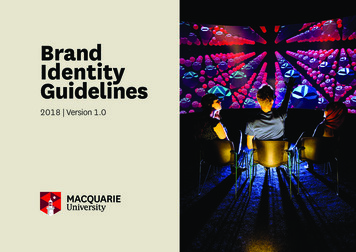
JOHN CARROLL UNIVERSITY /// IDENTITY STANDARDSVISUAL IDENTITYStandardsaa guideto photographyat JohnCarroll Universityguidelineto the John CarrollUniversitybrand3.20.181
2
JOHN CARROLL UNIVERSITY /// IDENTITY STANDARDSWELCOME4INTRODUCTION6LOGO IDENTITY14COLOR PALETTE20TYPOGRAPHY30MIXING FONTS36GRAPHIC AL3
INTRODUCTIONThe John Carroll University Brand Standards is a collection ofguidelines and visual resources to reflect the values, missionand strategy of the university. The visual standards outline thefundamental visual elements of our brand and proper usage.Consistent visuals benefits all aspects of the institution.Adherenceto these guidelines will ensure consistency,strengthen our recognition and increase brand effectiveness.4
JOHN CARROLL UNIVERSITY /// IDENTITY STANDARDSHOW TO USE THIS GUIDEThis guide contains many of the visual resources necessary forpreparing marketing and communications materials includingproper use of colors, logos, fonts and photography. If you areworking with outside designers or agencies, please providethem with a copy of this guide as a reference.This guide cannot cover all situations. If you have questionsabout content included here or our brand, please contact IMC.Integrated Marketing & CommunicationsRodman Hall Room 304x-4321 imc@jcu.edu5
our logo builds one identityand connects us to the worldLOGO IDENTITY6
JOHN CARROLL UNIVERSITY /// IDENTITY STANDARDSOur logo is the signature of the university.The John Carroll University identity system includes our primary brandmarkalong with a typographic treatments, symbols, and identifiers. We are auniversity that is vibrant in today’s world and dedicated to faith, to learning,to service for the greater good; supported by intellectual excellence steepedin Jesuit traditions of higher education.Our brandmark logo is a descendant of that brand essence. The moderntypeface combines two progressive fonts: “John Carroll” in Baskervilleand “University” in Trajan. Both are innovative and modern type fontsdemonstrating that John carroll is moving forward in today’s world andleading the way.The blue and gold colors reflect our legacy – current interpretations of ourtraditional John Carroll colors of the past; yet presented in a contemporarypalette that will stand the test of time.7
8
JOHN CARROLL UNIVERSITY /// IDENTITY STANDARDSBOTANY CROSSThe prominent bottony cross is a latin cross and in christian tradition the threeclover-leafed end caps represent the Trinity and the teachings of 1 Corinthians 13:“Faith, Hope, Love; the greatest of these is Love.” Also, since there are four armsof the bottony cross - each with three buds - the cross is also known as theapostles’ cross, with each bud representing one of the twelve original christianapostles. The cross symbolizes Jesuit traditions in the purest form.*The botany cross IS NOT PERMITTED to be used alone as a graphic elementor logo without permission from IMC. Please contact IMC before any use.0.5"0.5"The clear space around logo must be equal toor greater than the height and width of botany cross9
LOGO USAGE2 spot colors on white background1 color on white background (Black)4 color process on white background1 color on white background (JCU Blue)Reversed 4 color processBlack and white reversedWORDMARK (LOGOTYPE) - IN PROGRESSTLOGO IDENTITYOutside of the primary logo, our visual identity system allows the use of the John Carroll University into10a uniquely styled type font treatment. Our word mark treatments have been designed in such a way tointrigue the eye and capture the interest while maintaining the strength and character of our institution.Images can also be integrated into a logotype, often to great visual effect. Of prime consideration whenselecting a logotype or wordmark is legibility and ease of recognition, even when reduced to the sizerequired for printing your business cards.JOHN CARROLL UNIVERSITYJOHN CARROLLU N I V E R S I T Y
JOHN CARROLL UNIVERSITY /// IDENTITY STANDARDSDO NOT remove elements from the logo.DO NOT add additional copy/text below the logo.DO NOT distort the shape and size of the logo.DO NOT rotate the logoCAMPUS ACTIVITIESDO NOT add drop shadows or effects to the logoDO NOT change logo colors. Refrence color usage.11
TLOGO IDENTITYUniversity Seal12The seal may be used in a one color treatment.Colors should stay within primary color palette.
JOHN CARROLL UNIVERSITY /// IDENTITY STANDARDSUNIVERSITY SEALThe official emblem of the University, the seal, is commonly used on official and formaldocuments, ceremonial materials, apparel, and primarily used by the Office of the President.The University seal has historical significance and is rooted in the Jesuit tradition.HISTORY OF THE SEALJohn Carroll University, one of 28 colleges and universities operated in the United States by theSociety of Jesus, was founded as Saint Ignatius College in 1886. It has been in continuous operationas a degree-granting institution since that time. In 1923, the college was renamed John CarrollUniversity, after the first archbishop of the Catholic Church in the United States.Early versions of the seal date back as far as 1901, when it was first used on the cover of the AnnualReport of the Meteorological Observatory 1901-1902 for Saint Ignatius College. It appears again inthe following year’s report on the student publication Lumina from 1915-1919 and in the CollegeCatalogue for 1919-1920. Between 1920 and 1979, a number of versions of the seal were used andultimately discarded. A similar version of the seal used today was adopted in 1980.DESCRIPTION OF SEALThe seal is composed of two shields, one with two wolves and a kettle, and the other with sevenoriginally red bars on a field of gold. It is thought that the words, “lobo y olla,” are the Spanish forwolf and kettle or pot. However, since Ignatius Loyola came from the Basque country, there is somequestion as to the translation. In the Basque language, the translation of those words would indicatean abundance of land. Another translation of the same phrase also indicates wealth to the extent ofbeing able to feed the people and the wolves. According to Fr. James Broderick, S.J., in Saint IgnatiusLoyola, the “two wolves rampant on either side of a hanging cauldron was the adopted escutcheon(heraldry of the shield) of the Loyolas.” Very possibly, also, the presence of the wolves could bereferenced to the constant battle these animals faced by the farmers of Guipuzcoa (Ignatius’homeland).The boiling cauldron symbolized hospitality, a virtue the Basques were known for. Theseven originally red bars represented the seven brothers of the Onaz family, the paternal family ofSaint Ignatius.The basic shield of the Loyolas has been a customary base for the seal of most Jesuit collegesand universities. John Carroll University’s seal still retains the Spanish words for wolves and kettle.The seal and the logo/tag are two distinct graphic identity elements but can be combinedas necessary for specific communications. The University seal should not be altered in any way.13
ATHLETICS LOGO USAGEMAIN LOGOS (OUTLINED VERSION)1 Color - BLACK1 Color - NAVY1 Color - JCU GOLD1 Color -JCU BLUEMAIN LOGOS (SOLID VERSION)141 Color - BLACK1 Color - NAVY1 Color - JCU GOLD1 Color -JCU BLUE
JOHN CARROLL UNIVERSITY /// IDENTITY STANDARDSMAIN LOGOS (SOLID REVERSED)1 Color - WHITE1 Color - JCU GOLDMAIN LOGOS (SOLID OUTLINE REVERSED)1 Color - BLACK1 Color - NAVY1 Color - JCU GOLD1 Color -JCU BLUE15
16
JOHN CARROLL UNIVERSITY /// IDENTITY STANDARDSFONTS COLORSFONT FAMILIESMAIN COLORSGotham LightGotham Light ItalicGotham BookGotham Book ItalicGotham MediumGotham Medium ItalicGotham BoldGotham Bold ItalicGotham BlackGotham UltraJCU GOLD(PMS 7406)JCU NAVY(PMS 289)9, 27. 100. 0100. 85. 46. 61R 233 G 184 B 32R 10 G 35 B 63#E9B820#0A223FJCU BLUE(PMS 2955)WHITEUsesHeadlines Subheads Body CopyWeb AlternativeOpen Sans100, 77. 33. 24R 10 G 64 B 104#0A4068Tungsten LightTungsten Extra LightTungsten LightTungsten BookTungsten MediumTungsten SemiboldTungsten BoldTungsten BlackUsesHeadlines SubheadsTungsten Condensed ThinTungsten Condensed Extra LightTungsten Condensed LightTungsten Condensed BookTungsten Condensed MediumTungsten Condensed SemiboldTungsten Condensed BoldTungsten Condensed Black0, 0. 0. 0R 255 G 255 B 255#FFFFFFACCENT COLORS (LIMITED USE)PMS COOL GRAY 10C61. 53. 48. 19R 100 G 101 B 105#646469Web AlternativeOswald17
BOTTONYCROSSLOCKUP0.5"Bottony LockupThe bottony lockup is designed togive greater flexibility for brandingyour materials while maintaining aconsistent use of the cross.The bottony cross should be used ineither a tab or box when possible.Bottony Extended LockupThe bottony extended lockup isdesigned for instances when the tabcan be extended beyond the edge(top, bottom, left, right) and providea branded mark of JCU.Only one side may extended beyonda trim to allow proper white space.ABCThe botany lockup colors are flexible and can be usedaccording to the official JCU color palette.The lockup may be used in 3 variations:1. 1 color (Example A)2. 2 color w/botany cross variation (Example B)3. 2 color w/botany cross and line variation (Example C)18
JOHN CARROLL UNIVERSITY /// IDENTITY STANDARDSThe botany cross and the solid tab can provide a graphic element to our marketing materials.Use the guide below to understand how and how not to use the botany cross in a tab.19
COLOR PALETTE20
JOHN CARROLL UNIVERSITY /// IDENTITY STANDARDSOur colors say a lot about who we are.Using an indentifiable set of university colors speaks to ourcommitment to maintaining a powerful and consistent visualidentity. By following our color guidelines, you can help maintaina strong, professional and consistent visual identity for our brand.John Carroll University has a comprehensive color palette featuringour primary colors of blue and gold as well as a set of appropriateaccent colors for use in communication and marketing materials.For more information regarding our official colors and to downloada JCU color palette, visit brand.jcu.edu. You will be required to entera password to gain access.21
TPRIMARY COLORS22JCU Blue (PMS 2955)C 100 M 77 Y 33 K 24R 10 G 64 B 104#0A4068
JOHN CARROLL UNIVERSITY /// IDENTITY STANDARDSJCU Gold (PMS 7406)C 9 M 27 Y 100 K 0R 233 G 184 B 32#E9B82023
24TSECONDARY COLORS
JOHN CARROLL UNIVERSITY /// IDENTITY STANDARDS39, 6, 4, 04, 13, 77, 0R 149 G 204 B 231R 247 G 214 B 90#96CBE5#F7D65A88, 33, 63, 16R 1 G 116 B 103#007467JCU NavyPMS 289C100, 85, 46, 61R 0 G 22 B 53#0518344, 94, 69, 04, 4, 20, 0R 230 G 52 B 74R 244 G 236 B 208#E6344A#F3EBCFUsesPrimary use on enrollment/admissions materials.Usage on web and digital advertising to evoke acasual and fun tone in marketing communications.25
26TNEUTRAL ACCENT COLORS
JOHN CARROLL UNIVERSITY /// IDENTITY STANDARDS24, 28, 54, 2725, 25, 40, 0R 152 G 137 B 102R 194 G 181 B 15#988865#C2B49A5PMS 428CCool Gray 6C23, 23, 17, 035, 29, 28, 0R 195 G 198 B 200R 169 G 168 B 169#C3C5C7#A9A8A9UsesNeutral colors are used as a compliment to theprimary color palette.Used to communicate high level academic tone(i.e. Presidential and Board communications)Cool Gray 10C61, 53, 48, 19R 100 G 101 B 105#646469ATHLETICSCool Gray 10C is used only Athleticsas an accent color for main colors.27
TYPOGRAPHY28
JOHN CARROLL UNIVERSITY /// IDENTITY STANDARDSTypography tells a story through words.Typography plays a crucial role in the university visual identity. Fonts addemphasis to our brand by helping to convey the proper mood and emotionfor your marketing and communication needs.John Carroll University utlizes three main typefaces broken into 3 categories:Serif - characterized with a small line attached to the end of a strokeSans Serif - characterized without decorative linesSlab - characterized by thick, block-like serifs.Our primary typefaces (fonts) include: Surveyor, Gotham and Archer.29
SurveyorJohn Carroll University’s official serif typeface.Designed for print and screen, and for sizes large and small. The style oflettering is an invention of the early nineteenth century, born of the materialproperties of copperplate engraving and the informational needs ofcartography (map creation).TTYPOGRAPHYSurveyor LightSurveyor Light ItalicSurveyor BookSurveyor Book ItalicSurveyor MediumSurveyor Medium ItalicSurveyor BoldSurveyor Bold ItalicSurveyor BlackSurveyor Black Italic30UsesHeadlines Subheads Body CopyWeb AlternativeNotoSerif
JOHN CARROLL UNIVERSITY /// IDENTITY STANDARDSengagetheWORLD31
JESUIT CATHOLICUNIVERSITYdedicated to developingWOMEN AND MENwith theknowledge andCHARACTER32
JOHN CARROLL UNIVERSITY /// IDENTITY STANDARDSGothamJohn Carroll University’s official sans serif typeface.Gotham’s letterforms are inspired architectural signage and a definite nod to city lifein particular New York City in the 1930s through 1960s. It’s geometric, strong, boldbut also friendly and confident.Gotham LightGotham Light ItalicGotham BookGotham Book ItalicGotham MediumGotham Medium ItalicGotham BoldGotham Bold ItalicGotham BlackGotham UltraUsesHeadlines Subheads Body CopyWeb AlternativeOpen Sans33
TungstenJohn Carroll University’s alternate sans serif typeface.Compact, bold and sporty. This high impact font that celebrates a modern,industrial and zealous nature when used as a headline or subhead.Tungsten LightTungsten Extra LightTungsten LightTungsten BookTungsten MediumTungsten SemiboldTungsten BoldTungsten BlackUsesHeadlines SubheadsTTYPOGRAPHYWeb Alternative34OswaldTungsten Condensed ThinTungsten Condensed Extra LightTungsten Condensed LightTungsten Condensed BookTungsten Condensed MediumTungsten Condensed SemiboldTungsten Condensed BoldTungsten Condensed Black
JOHN CARROLL UNIVERSITY /// IDENTITY STANDARDSGOBLUESTREAKS35
a placewhere you belong36
JOHN CARROLL UNIVERSITY /// IDENTITY STANDARDSITC Lubalin StdJohn Carroll University’s official slab serif typeface.ITC Lubalin Graph is geometric, simple yet full of confidence and style. Best whenpaired with an old face serif font or a combination of two weights light vs heavy.ITC Lubalin BoldITC Lubalin Bold ObliqueITC Lubalin DemiITC Lubalin Demi ObliqueITC Lubalin MediumITC Lubalin Medium ObliqueITC Lubalin BookITC Lubalin Book ObliqueITC Lubalin Extra LightITC Lubalin Extra Light ObliqueITC Lubalin Bold CondensedITC Lubalin Demi Bold CondensedITC Lubalin Medium CondensedITC Lubalin Book CondensedUsesHeadlines Body Advertising37
Experienceg EXPERIENCEExperienceK38
JOHN CARROLL UNIVERSITY /// IDENTITY STANDARDSJohn Carroll University’s accent typefacesIn addition to our primary fonts, supplementary fonts are available forlimited use. Traditionally reserved for display only. These are best used astitles used to evoke a more ‘fun and friendly’ tone.Recommended subjects includes: Admissions, student activities and eventsLavanderiaAIRBAGKg Eyes Wide OpenKg Eyes WUsesDisplay Only Titles Accents39
Mix and matching ourtypefaces is a great wayto add strong visualinterest creating anemotional connection.MIXING FONTS40
JOHN CARROLL UNIVERSITY /// IDENTITY STANDARDSSAMPLE HEADLINE:LOREM IPSUM DOLORamet CONSECTETURSuspendisse eget est mollis,pulvinar est non, finibus arcu.Lorem ipsum dolor sit amet,consectetur adipiscing elit. Donecin consectetur lacus, pellentesquepretium erat. Pellentesque vestibulumimperdiet nibh, eget ultrices magnascelerisque vitae. Pellentesque atsagittis enim, sed hendrerit neque.Mauris interdum mi vel accumsanconsequat. Integer vitae liberomauris. Quisque ultricies ornaremassa ut tincidunt. Nulla feugiatcommodo enim quis porta. Donecurna nibh, venenatis quis.Aliquam pretium dui id luctusgravida. Nullam in vestibulummetus. In iaculis quis orci non finibus.Sed a lobortis dui. Praesent noncommodo quam. Duis orci augue,feugiat ac est sit amet, dapibuspharetra nibh. Nulla facilisi. Utultricies tincidunt pretium. Nam arcutortor, accumsan eget imperdiet at,feugiat ut dolor. Aliquam pharetramollis neque ac venenatis.NOTE:These examples are included for inspiration only and to serve as a startingpoint, they are not meant to limit design. Our fonts can be mixedin various weights and styles depending on the subject matter.41
SAMPLE HEADLINE: BOLDLOREM IPSUM DOLORamet CONSECTETURSuspendisse eget est mollis,pulvinar est non, finibus arcu.Lorem ipsum dolor sit amet, consectetur adipiscing elit. Donecin consectetur lacus, pellentesque pretium erat. Pellentesquevestibulum imperdiet nibh, eget ultrices magna scelerisquevitae. Pellentesque at sagittis enim, sed hendrerit neque. Maurisinterdum mi vel accumsan consequat. Integer vitae liberomauris. Quisque ultricies ornare massa ut tincidunt. Nulla feugiatcommodo enim quis porta. Donec urna nibh, venenatis quis.Aliquam pretium dui id luctus gravida. Nullam in vestibulummetus. In iaculis quis orci non finibus. Sed a lobortis dui. Praesentnon commodo quam. Duis orci augue, feugiat ac est sit amet,dapibus pharetra nibh. Nulla facilisi. Ut ultricies tincidunt pretium.Nam arcu tortor, accumsan eget imperdiet at, feugiat ut dolor.Aliquam pharetra mollis neque ac venenatis.TMIXING FONTSSuspendisse eget est mollis42
JOHN CARROLL UNIVERSITY /// IDENTITY STANDARDSSAMPLE HEADLINE: SUBTLENULLAM INVESTIBULUMPellentesque at sagittis enim,sed hendrerit neque.Lorem ipsum dolor sit amet, consectetur adipiscing elit. Donecin consectetur lacus, pellentesque pretium erat. Pellentesquevestibulum imperdiet nibh, eget ultrices magna scelerisquevitae. Pellentesque at sagittis enim, sed hendrerit neque. Maurisinterdum mi vel accumsan consequat. Integer vitae liberomauris. Quisque ultricies ornare massa ut tincidunt. Nulla feugiatcommodo enim quis porta. Donec urna nibh, venenatis quis.Aliquam pretium dui id luctus gravida. Nullam in vestibulummetus. In iaculis quis orci non finibus. Sed a lobortis dui. Praesentnon commodo quam. Duis orci augue, feugiat ac est sit amet,dapibus pharetra nibh. Nulla facilisi. Ut ultricies tincidunt pretium.Nam arcu tortor, accumsan eget imperdiet at, feugiat ut dolor.Aliquam pharetra mollis neque ac venenatis.Sed a lobortis dui43
LEADINGLeading is the line spacing or amount of verticalspace between lines of text. It is a critical part oftypography and our visual identity.TYPE EMOTIONThis is an example of leading that is too tightwhich makes the text difficult to read.Size: 10 pt Leading 8 ptThis is an example of balanced leadingwhich has proper spacing to breathe.Size: 10 pt Leading 14 ptFORMALColors should be used whendesigning for all formal materialssuch as presidential and boardannoucements, official universitydocuments, academic ceremoniesand high profile communications.INFORMALThis color palette is designedfor more casual marketingcommunications including campusevents and student recruitment. Itis friendly and engaging.TRACKINGTracking is the spacing between words ratherthan individual characters. It affects the overalldensity of the copy.This is an example of usingtoo much tracking. It causesthere to be too much spacebetween letters.Tracking: 200This is an example of too tight of tracking.It causes there to be too little space between letters.Tracking: -100This is an example of a balancedamount of tracking. It adds nicespacing between characters.Tracking: 1044
JOHN CARROLL UNIVERSITY /// IDENTITY STANDARDS Overall design aesthetic should be clean and simple;not busy, cluttered or overdesigned.gTIPSFORDESIGN White space is an important brand element. Designers are encouraged to lift typography and design elementsfrom other marketing pieces. Designers are encouraged to make content suggestions that mayimprove the overall visual message. Watch line breaks. Try not to break location or people’s names.Rebreak lines to avoid widows.Avoid widows a
The prominent bottony cross is a latin cross and in christian tradition the three . was founded as Saint Ignatius College in 1886. It has been in continuous operation as a degree-granting institution since that time. In 1923, the college was renamed John Carroll . MAIN LOGOS (SOLID VERSION) 1 Color - BLACK 1 Color - NAVY .

