Transcription
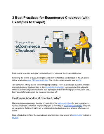
3 Best Practices for Ecommerce Checkout (withExamples to Swipe!)Ecommerce promises a simple, convenient path to purchase for modern customers.Following the events of 2020, the digital sales environment has skyrocketed. In the UK alone,online retail sales grew 74% year-over-year. The US ecommerce sector saw a 44%.The consumer affinity toward online shopping is strong. That’s a good sign. But other e-tailersare capitalizing on this trend too. In this competitive landscape, you’re constantly working toattract customers to your website and lead a prospect to the checkout page to make that sale.But instead of checking out, the customer bounces off.Customers Abandon at Checkout, Why?Many businesses are overly focused on optimizing the path-to-purchase for their customer —running advanced CRO tests for product pages or investing in ecommerce marketing and paidad campaigns. But then they forget to optimize the checkout page and all early effort goes towaste.Data reflects that; in fact, the average cart abandonment rate among all ecommerce verticals is69.80%.
So what’s stopping customers from checking out? Here are the most common reasons:1. Unexpected charges.No one wants to get to the checkout thinking they’re paying one price, then discover theyactually have to shell out for some extras. Be transparent about extra charges such as taxes,handling, or shipping fees from the get-go. If you can get rid of the extra costs, do so. Forexample, 79% of consumers say they are more likely to buy from a brand offering a reasonablefree shipping threshold.2. Forced account creation.Per Baymard Institute, the second most common reason for cart abandonment is imposedaccount creation. This is particularly true for mobile users who don’t have the time or patients forfilling an array of forms. Don’t place extra work at the consumer during checkout. Instead, offerthem the option to create an account post-checkout.3. Long, complex checkout process.Simplicity is key for any ecommerce checkout. The faster a customer can complete a purchase— the less likely they are to abandon it. A multi-step checkout process builds up friction andannoyance. Plus, it makes a customer more likely to reconsider their purchase. Apart fromreducing the number of required forms, also test your checkout page for usability and speed.3 Best Practices to Perfect Ecommerce Checkout ProcessSo, how do you simplify the checkout process to reduce cart abandonment? Here are severaltested ecommerce checkout page optimization tips from popular e-tailers:1. Make the checkout process fast.Speed is key to a good ecommerce shopping experience. A happy customer should be able tozoom through your checkout page. Thus, remove any blockers on their way.Allow for Guest Checkout.Signing up for an account with your site might be good for your business (if you want to collectemail addresses and customer data for marketing), but it can be a nuance for the consumer.Some may not have the time to create an account or would rather not share their personaldetails yet. So give them the option to checkout as a guest instead — as 59% of online retailersin the US do.Take a page from Skullcandy. Their checkout process is wonderfully simple. You can add youremail address (so you can get a receipt of purchase) and then checkout as a guest without
creating an account. There’s also the option to come back and create an account later if youlike.Source: Skullcandy.Autofill addresses.Filling out your address can be time-consuming, especially when you're using a smartphone.Save your customers some time with “auto-fill”. You can implement this into your store within acouple of seconds. Just ask your customers to enter their zip code, then they can choose theiraddress from a drop-down list.Auto-filling addresses will also reduce the risks of customers making mistakes when providingshipping information.
Source: Skullcandy.Allow social sign-in.Do you want to simplify things for your customers while also finding out more about them? Allowshoppers to sign in with a social account, like Google or Facebook.In this case, the customers are happy because they don’t need to fill out additional forms.Whereas, you can collect extra information about them (with permission!). So it’s a win-win forboth!Social sign-ins also open the door for some awesome social proof options. For example, youcan ask the happy consumer to check out your social media profiles or share their feedback sousing a branded hashtag.2. Design checkout pages that are enticing to buyers.You’ve got the speed thing down, now it’s time to create checkout pages that make youraudience want to buy from you. Your checkout pages should provide all of the information youraudience needs to make a confident purchasing decision.Summarize cart details.Provide a summary of your customer’s order before prompting them to pay. Doing so is a simpleway to avoid mistakes and minimize subsequent customer support calls. Specifically display: Product name with imageQuantity
Size (if applicable)PriceDiscounts/couponsShipping feesShipping timelineWant to increase the average order value? Pitch some personalized upsells and cross-sellsduring this step. You can showcase seasonal promos, special discounts, or bundle deals.See how Bliss elegantly does this. They entice shoppers to add more products to the cart toreceive special freebies.Source: Bliss.Simplify the checkout process.You can simplify the checkout process for your audience in several ways.First, reduce the number of mandatory forms at checkout. The current UX benchmark forecommerce websites is having around 12 fields for a checkout flow. Use auto-fill where you can.For instance, you can request a zip code and use a free lookup table widget to preventcustomers from having to enter too much information manually.Secondly, simplify your password requirements. Yes, online security is important, but over68% of ecommerce websites have too complex password requirements. Those alone can causean 18.75% checkout abandonment rate for returning users.
Finally, provide different payment options at the checkout. For example, instead of askingthe shopper to type their credit card details, you can offer PayPal checkout. This allowscustomers to simply enter an email address and password and they’re ready to go. Shippinginformation and payment information will be pulled from PayPal.Source: Bliss.Optimize for mobile.In 2021, 72.9% of all ecommerce sales will be via mobile. If you aren’t optimized for mobilecheckout, you run the risk of losing a lot of new business.A mobile device often makes it difficult to fill out complex fields. Small buttons that might bedifficult to tap. Pop-ups can block access to important areas. Thus, make sure to triple-test howyour checkout experience works on mobile.3. Prevent customers from leaving at the last minute.You know that your check-out flow is flawless from the UX perspective. So work on conversionoptimization next. Here’s how you can stop the doubtful consumer in their tracks:Use call to action.A call-to-action (CTA) is a short marketing pitch. Snappy, succinct and personalized, awell-placed CTA can sway the shopper’s decisions.Consider this:
Do you provide tooltips for explaining certain field requirements or buttons (e.g.password strengths requirements)?Does your button text explain what happens if the user clicks it?Are you providing your customers with sufficient information on ordering and deliveryoptions?For example, Davidoff of Geneva lets customers choose between one-time and subscriptionpurchases — a nice AOV booster!Source: Davidoff of Geneva.Use error notifications.You know how frustrating it is when you get stuck in a checkout when you can’t move to the nextpage. It’s even worse when the retailer’s website does not explicitly say what is wrong. Thus,always provide appropriate error notifications with form instructions. It can be a red message atthe top of the page or a pop-up box.
Source: Davidoff of Geneva.Offer multiple payment options.The preferences of customers vary when it comes to making payments. Some will want tocheckout with their credit or debit card. Others may prefer PayPal or a buy now pay latersolution, such as Klarna.Offering various payment options shows your customers that you’re putting their preferencesfirst.
Source: Bliss.Display trust signals.Many customers feel comfortable shopping online, but there is still a level of anxiety floatingaround in the digital world. First-time customers may not immediately trust your brand with theirpersonal details, such as credit card information.Give them extra assurance by displaying trust signals — secure checkout badges, SSLcertificate protection, and microcopy explaining how you treat the provided data. Also, considerusing two-factor authentication (2FA) when processing card payments.Offer easy access to support.Finally, if you’ve created a super simple and intuitive checkout experience, your customershouldn’t have too much trouble finalizing the purchase. However, there’s always a risk thatthey’ll have a last-minute question or concern.Keep visible access to customer support — use live chat tools such as a sticky live-chat badgeat the bottom right corner or visible phone numbers. Also, after several minutes of inactivity, youcan auto-activate the chat bar and prompt the customer to ask any questions or look upinformation.Source: Davidoff of Geneva.
Executive SummaryConverting customers is challenging, but doable. Minimize the friction happening at every stageof the checkout process. Keep the number of forms minimal, be transparent about costs,shipping times and possible delays.Success relies on your ability to offer a fast, consistent and secure checkout experience at everystep — from adding products to the cart to receiving a “thanks for your order!” message.
t est ed ecommerce checkout page opt i mi zat i on t i ps f rom popul ar e-t ai l ers: 1. Make t he checkout process f ast . S peed i s key t o a good ecommerce shoppi ng experi ence. A happy cust omer shoul d be abl e t o zoom t hrough your checkout page. T hus, remove any bl ockers on t hei r way.