Transcription
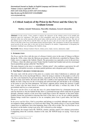
Towards a Theory of Bullshit VisualizationMichael Correll*Tableau ResearchA BSTRACTIn this unhinged rant, I lay out my suspicion that a lot of visualizations are bullshit: charts that do not have even the common decencyto intentionally lie but are totally unconcerned about the state of theworld or any practical utility. I suspect that bullshit charts take up alarge fraction of the time and attention of actual visualization producers and consumers, and yet are seemingly absent from academicresearch into visualization design.1I NTRODUCTIONOur field heaps much of its scorn on two major categories of visualizations failures. The first are visualizations that are illegible orotherwise hard to read, such as the much maligned rainbow colormap [3] or 3D pie chart [26]. The second are visualizations thatare purported to be deceptive, for instance those that exaggerateeffect sizes (such as by truncating the y-axis of a bar chart to startfrom something zero [7], or flip the y-axes such that lower valuesare higher up [27]). But these two categories are such a small partof what makes a visualization work (or, more interestingly, fail towork) as to be absurd: I can produce lots of things that are legibleand not intentionally misleading and yet still fail to reflect genuine findings [24] or do anything useful. To me what is potentiallymore dangerous than the handful of “black hat” visualization designers [10] is the vast amount of bullshit charts we generate. Forevery intentionally misleading line graph created in earnest I have nodoubt that there are several orders of magnitude more charts createdthat are just utter bullshit.I use “bullshit” here in the technical sense, cribbed from HarryFrankfurt’s On Bullshit [16]. Per Frankfurt, both an honest personand a liar are at least interested in the truth. The honest person wantsto tell you the truth, so they have to know what the truth is, whereasthe liar wants to convince you of something that they know is nottrue, which also entails that they know what is actually true and arejust choosing to say the opposite. They are both at least playing thesame game of having to engage with reality. The “bullshit artist,”by contrast, could not care less about what is true or false: theirrhetorical goal is just to say whatever will accomplish their aim, andthey don’t much care if what they are saying is true or not. It isthis disregard for reality that becomes, per Frankfurt, pernicious andcorrupting. Graeber extends the notion of bullshit-related alienationto the increasing prevalence of “bullshit jobs” [19]: work “that isso completely pointless, unnecessary, or pernicious that even theemployee cannot justice its existence”. As a result, bullshit jobsperform “profound psychological violence” [18] upon the peoplewho work at them. Graeber’s typology of “bullshit jobs” containscategories like flunkies—“jobs that are just there to make someoneelse (generally immediate superior) look good or feel good aboutthemselves” and “box-tickers”—jobs that “are just there to make anorganization feel it’s doing something it really isn’t,” and occur inall sorts of work environments, even private sector employers thatpride themselves on efficiency or productivity.* e-mail:mcorrell@tableau.comIt is my contention that many (most?) visualizations are bullshitin either the Frankfurt sense of attempting to persuade while beingtotally disconnected from notions of truths about the world, or inthe Graeber sense of being created for no readily apparent purposeand to no real useful end. When they inform, these bullshit chartsdo so in the most superficial and unsatisfying ways— for instance,a bar chart might tell me that so-and-so many widgets were soldduring a particular period of time (Fig. 1), but the CEO of the widgetcompany will make widget-related business decisions based on somehalf-remembered self-help book called something like “WidgetingYour Way To Wealth” rather than by looking at the data, the widgetsalespeople are not foolish enough to blindly trust their widget-salestracking data no matter how nicely it is visualized on a PowerPointslide, and you and I don’t care about widgets anyway, except ifwe get really desperate for anecdotes at a party (“did you read thatarticle about widgets? as I recall, sales are going up”). So the barchart of widget sales is mostly or entirely useless: it would nothave mattered if the numbers in it reflected any sort of reality aboutwidgets. And because of this uselessness, existing design principlesabout what makes a visualization “good” fail to apply either: I don’tcare about the data, so I don’t care the “data-ink ratio” or presenceor absence of “chart junk” either.I focus on bullshit charts here because the limitation of bad chartsto the deceptive and the illegible is an easy way for visualizationdesigners and researchers to fall victim to what DeMarco calls “TheFatal Premise” [11]: “Evil is done by evil people; I am not an evilperson and therefore I cannot do evil.” If we assume that all badvisualizations are either the work of propagandists cackling as theytry to convince you that no, widget sales are really going down, orthe work of hapless newcomers who just need to read a Tufte bookor two to figure out that people would see those widget sales muchmore clearly if they took out the axis gridlines from their bar chart,then we feel no need to question our field or ourselves (maybe we’llthrow a sop to “shucks, if only people had more data literacy” or“shucks, if only our charting libraries had better defaults”). After all,we (and all of our friends) aren’t evil or hapless! But we have allmade bullshit charts, with bullshit data, for bullshit ends, and so wehave no excuses to run from our responsibilities here.To illustrate the pervasiveness of bullshit charts, I will spendmuch of this paper enumerating some of examples of bullshit charts,vaguely gesture towards a taxonomy or other categorization schemafor bullshit charts, and end with a perfunctory call to do somethingabout all the bullshit.2T HIS C HART C OULD H AVE B EEN A N E MAILIn describing the potential pitfalls in industry-led data visualization,Stefaner [30] refers to the phenomena of “number decoration”:Simple KPIs (key performance indicators) are decoratedwith visual elements to look sexy in dashboard or reports,but you never get access to the full texture and varietyof the data underlying those numbers. It’s like you wereinterested in the forest, but you only get a beautiful littlestick. This is not harnessing the power of visualization—this is dressing up numbers.Stefaner was referring specifically here to dashboards that augment their KPIs with unneccessary little donut charts or bars with
Sales (Millions of Widgets)1086420Widgets Sold by WidgetCo in Q1Figure 1: An example of “number decoration.” This chart couldbe entirely replaced by a sentence on the order of “WidgetCo soldapproximately 9 million widgets in Q1” and work just as well— thebar chart adds nothing. In fact, since WidgetCo does not exist, andI pulled that number out of thin air, this chart could fail to existentirely and I wouldn’t lose any sleep over it.arrows or what have you, but I think there is a wide range of scenarios where a visualization could have been just a table, or a just anumber, or just a sentence, or even failed to exist entirely, withoutcausing anybody any grief (see Fig. 1). While I like the concept, Imust admit “decoration” is a bit of a red herring: I am not referringhere to “chart junk” in the Tufte-ist sense, of annotations to graphsthat do not strictly encode data— a picture of a happy bird next to mychart might at least do something useful like remind me that my datais about birds [2] or draw the bird-liking audience to my chart in asea of birdless alternatives: decorate your chart all you want, I don’tcare. Rather, my focus here is on charts whose sole purpose seems tobe to lend an air of authority to the data, to make it look “science-y”or “statistics-y” because it can’t be totally nonsense if there’s a barchart next to things, right? Although n.b. that it’s unclear if thesesorts of attempts to use charts for these sorts of ethical appeals evenwork [12, 29]. My rule of thumb here is that if your visualizationcould be replaced by, say, a stock photo of an arrow going up (ordown) without changing the intended message or use of what you’vebuilt, then it’s probably a bullshit visualization, or at the very leasta tendril in the ever-expanding octopus of what I term “PotemkinData Science” [6]— data-related work that is performed for largelyno real purpose and to no useful effect.This mismatch between the stated goals of visualization (communicating nuanced and important information to wide audiences) andthe goal of number decoration (to make some numbers look pretty)infects our abstractions around visualization as an abstract discipline.For instance, our conception of what makes a “good” visualization isoften limited by thinking about the efficient extraction of individualvalues [1], producing a kneejerk academic reaction against chartsthat encourage deeper thought, engagement, or analysis.A related genre of valueless visualization is the more perniciousnotion of what Froehlich and I have called the “spectacular dashboard” [8]: a dashboard that exists mostly as a “spectacle” or (occasionally more nefariously) as “decision-laundering”: to convinceyou that, yes there is all of this big and complex data somewhere,and yes, you can maybe see interesting trends, but where you, theviewer, have no apparent way to actually do anything with the numbers you are looking at: you are just supposed to look at the bigcomplicated dashboard, maybe root for the “home team” (“I hopewidget sales go up next year too!”) and be soothed or numbed orotherwise dissuaded from deviating from a status quo set by others.It’s designed to make you think less, not more.3 L ET A H UNDRED S HARPIEGATES B LOOMMeeks [25] points to events like Sharpiegate (Fig. 3) as representingpart of a turning point in the modern history of data visualization:“the United States has never had a president that cared more about(a) A graph used to claim that “Countries with more economic freedomhave less racist attitudes” [23].(b) A graph used to claim that “States where physicians are highly paidhave lower COVID-19 mortality per capita” [17].Figure 2: Two entries in the emerging genre of “plot some points,draw an arbitrary line, and then say whatever you want.” Both authors of these charts were challenged about the poor fits in their dataand the lack of an obvious strong correlation. The first responded“Yeah it’s r2 0.14366. So clearly lots more going on across societies. But the point stands.”, while the second said “The ubiquitousmisuse and tyranny of SST [statistical significance testing] threatensscientific discoveries and may even impede scientific progress.” Myresponse to both is “lol.”Figure 3: An inset of the inciting chart in “Sharpiegate” [34], wherea map of hurricane predictions was altered with a marker to includepotential impact on Alabama in order to align with then-presidentTrump’s claim that Alabama was likely to be impacted by HurricaneDorian. Other parts of this affair were probably more serious (likeallegedly threatening the senior staff of NOAA with termination ifthey didn’t release an unsigned statement backing up the president),but this amateurish visual manipulation was the part that was thefunniest, in a fatalist mirthless chuckle sort of way.
the appearance of data than the data itself, until now.” Caring abouthow the data look in a chart, rather than the underlying truth orfalsity of the data, is about as straightforward of a definition ofFrankfurt-style bullshit as you can ask for. People are starting tocotton on to the idea that charts have rhetorical force in and ofthemselves: they are showing “the data,” and it is so tempting toconflate “the data” with “the truth.” And so charts are taken moreseriously than anecdotes or other claims that we investigate withmore scrutiny, and people perform less of the epistemic hygiene anddue diligence that they might do with, say, a written statement (Ithink a lot about the participants in a survey by Peck et al. [28] whowere reluctant to consider the source of a chart when assessing itstrustworthiness, connected with quotes like “I think that informationis information no matter from where it comes from”). In the termsof the Drucker [14] quote that I seem to be unable to avoid using inabout half the things I write these days, when people look at a chartit is “as if all critical thought had been precipitously and completelyjettisoned”— the chart is a picture of the world as it is, and thedataset within it unalterable truth.Given the pride of place that charts have (or, again, are perceivedas having; it’s not clear to me empirically that people seem to putundue weight on visualizations per se over other ways of communicating data), there is now an emerging genre of dumb chart whereyou just plot data that look random, throw a trend line or confidenceinterval on top of all the mess, and declare victory for whatever pointyou want to make (Fig. 2).There is so much complexity you can hide in a chart (the data collection process, the uncertainty, the model assumptions, the outliers—whatever is inconvenient), and it’s so much easier to share a jpg thanan jupyter notebook or what have you, that just using an arbitrarychart as a backdrop to make an arbitrary claim and hoping that nobody checks too closely is a temptation to which I’m surprised morebullshit artists haven’t succumbed.I would like the reader to recall the fatal premise. I chose examples of bullshit like Sharpiegate because the manipulation is obvious(and a bit humorous). But we don’t get an excuse for ignoring thisissue just because we aren’t directly mentioned in the rogue’s gallery.Do we check to make sure that the conclusions from our visualization are sensitive to different choices of methods [13]? Do we thinkwe’re free from all of the self-serving bits of the replication crisis [22], like the file drawer problem (we publish the visualizationsthat support a belief but ignore the ones that don’t) or the multiplecomparisons problem [35] (we’ve made so many different graphsthat at least some of them, by chance alone, have a pattern we think isinteresting), or any of the whole host of visualization “mirages” [24]that mean that what you see is not what you get? Our sharpiesare a little bit more subtle, but if we think we don’t sometimes usevisualizations to fool ourselves, we’re fooling ourselves.4T HE DATA -I NK R ATIOIS THEF IRST C ASUALTYOFWARNo description of bullshit charts would be complete without a givingpride of place to the efforts of the U.S. military-industrial complex.Hwang’s [20] @DefenseCharts Twitter account, “dedicated to thepresentational aesthetics of the defense-industrial complex,” collects some of the more interesting examples: flow charts filled withseemingly arbitrary nouns (the word “Cyber” usually appears atleast once, see Fig. 4) and sharing space with color gradients and 3Dshapes and clip art of soldiers or vehicles to contribute to an instantlyrecognizable and totally baffling style of information design. Thesecharts serve a purpose, but you would have to be charitable in theextreme to claim that this purpose was primarily to inform. Indeed,the “Afghanistan Papers” [32], the cache of documents connectedto the American invasion of Afghanistan, shows that bullshit charts(and their close cousin, the bullshit slide deck [4]) were at the heartof the effort to convince external audiences that the war was goingwell while the realities on the ground were quite different:Figure 4: An example from Hwang’s [20] @DefenseCharts Twitteraccount. No idea of the provenance on this one, but also no ideaabout many things that have to do with this chart. The word “cyber”only appears five times by my count, which is on the low end forthis particular genre.John Garofano, a Naval War College strategist who advised Marines in Helmand province in 2011, said militaryofficials in the field devoted an inordinate amount of resources to churning out color-coded charts that heraldedpositive results.“They had a really expensive machine that would printthe really large pieces of paper like in a print shop,” hetold government interviewers. “There would be a caveatthat these are not actually scientific figures, or this is nota scientific process behind this.”But Garofano said nobody dared to question whether thecharts and numbers were credible or meaningful.“There was not a willingness to answer questions such as,what is the meaning of this number of schools that youhave built? How has that progressed you towards yourgoal?” he said. “How do you show this as evidence ofsuccess and not just evidence of effort or evidence of justdoing a good thing?”These bullshit visualizations, since they impart no clear information, “relieve the briefer of the need to polish writing to conveyan analytic, persuasive point” [16], and have been used to diluteresponsibility or agency for decision-making. For instance, if I issueyou a direct order and it ends poorly, I could conceivably be to blame.But if I give you a vague and complex slide deck instead of explicitinstructions (as U.S. leaders were accused of doing [16]), then I canalways blame you for not understanding me, or for acting againstmy intentions.In short, this brand of bullshit chart serves as a way to distractpeople from bad news with irrelevant metrics, bore the audienceinto complacency or indifference, or convince the audience of thepresenter’s intelligence or depth or knowledge (while at the sametime removing the burden of making explicit falsifiable or actionablestatements) through sheer overwhelming visual complexity. Bringing in a visualization designer to “fix” these designs would arguablymake them less effective for these purposes, because their purposeis not to communicate clearly.
Figure 5: A graph used in a video [15] by American conservativemedia company Prager U showing the nefarious impact of modernart. This graph uses a noisy line to make it look like there is acomplex metric being measured precisely over time, when in factthere is not (and even if there were somebody claiming to have an“objective” measure of artistic standards, would you trust them?). Itis a chart largely uninterested in underlying reality at the expenseof looking “data-y” and authoritative for a predetermined argument(viz., that modern and contemporary art is bad).5D ISCUSSIONTime, space, and reader patience limited me to a handful of examples,but I hope you get the general idea: there is a class of visualizationfailures I call bullshit visualizations. These are visualizations thateither, as per Frankfurt [16], are unconcerned with the actual truth orfalsity of the world or, as per Graeber [19], are generated for no realpurpose other than keeping up appearances. Whenever you make achart of whatever data you have on hand without checking to see ifit is relevant, useful, or accurate for the goals you have in mind, abullshit visualization is sure to follow. Bullshit visualizations are alltoo often a symptom of bullshit existing elsewhere (in society, in anorganization, in the individual), and so fighting them often meansfighting institutional battles at the scale beyond recommending a barchart instead of a pie chart. And bullshit does not tend to limit itselfto just a few bad eggs at the ends of particular bell curves, but actsas an insidious or corrupting force even for the well-intentioned.I am reluctant to present a full taxonomy of types of visualizationbullshit for several reasons. Firstly, I think it’s a problem that awaitsfurther empiricism (although I think efforts like Cairo’s “VisualTrumpery” lecture series [5] are reasonable attempts to convincepeople of the scale and extent of certain kinds of chart bullshit).Second, once again I feel the fatal premise is breathing down ourneck. A taxonomy is a temptation to say “a ha, my chart isn’t on thislist, so it must not be bullshit” or alternatively “this chart has one ofthe qualities on this list, so it must be bullshit and so can be entirelyignored.” So, with those caveats in mind, here are a few patterns thatare at least strongly correlated with bullshit:Decorative Chart: Again, I am less concerned with decorativeelements in charts that Tufte seems to care so much about, but thescenario where the charts themselves are decoration. You’ve got tohave charts in a paper or a slideshow in order to be taken seriously.“Lack of colorful figures” was a strongly diagnostic characteristicof a paper likely to be rejected in a (granted, somewhat tongue-incheek) attempt to model “good” and “bad” CVPR papers [31]. Ifthere’s no (or not enough) data to make a useful chart, you just makeone that looks nice and put it in anyway.Stock Footage Chart: A chart that exists mostly so you canhave something on in the background to set the scene. It just needsto be vaguely related to the matter at hand. An example is allof the computer science talks that begin with a chart showing theexponential growth of data or computer users or processing power orsome other vaguely computer science-y topic that serves only to setthe scene for a topic that is really not about exponential growth at all.But you need a chart for visual interest at the beginning, otherwiseyour audience won’t see another one for another few dozen slidesand might decide to check their phones during your talk.Novocaine Chart: If the stock footage charts as supposed toperk you up in an otherwise boring talk, Novocaine charts are theopposite. As with the previously discussed “spectacular dashboards,”these charts are supposed to numb you to the scale and complexityof the data. It is supposed to make the presenter look smart (afterall, look at how complex of a chart they had to generate in orderto present the data!) and/or the audience feel stupid or powerless(there’s no way we could do anything about this problem). Thisappeal to complexity and nuance is also meant to diffuse any needto make an actual decision or state an actual opinion.Texas Sharpshooter Chart: When you draw your “bullseye”chart after you’ve already decided what your conclusion is going tobe. If the resulting chart manages somehow to surprise or contradictyou, it’s the data that are wrong, and so you start looking for othertools in your toolkit to avoid being surprised. If the data don’tsupport your conclusion, then you just get different data, or take outyour sharpie, or otherwise minimize or alter the information in yourdataset. While a lot of overtly deceptive techniques can be employedhere, there are lots of other data habits that we generally assume arelaudatory (like “building skepticism” or “adding nuance”) that canbe a cover for this sort of behavior.Charts can and do cross these boundaries: for instance, Fig. 5 is achart that decorates a small amount of data (in this case absolutelyno data whatsoever) in an attempt to make it seem more “data-y,”does so in support of a pre-selected empirical conclusion, as part ofa brand exercise designed to make it fit in. One thing it doesn’t dois clearly and accurately present data about the real world, but thenagain that wasn’t really the point, was it?I have conceptual and pragmatic concerns about anything likean automatic bullshit detection, but in the meantime here’s ruleof thumb vaguely connected with a notion of “surprise” (in theBayesian sense [9], but also the notion of Algebraic VisualizationDesign [21], or graphical inference sense [33]). My untested visualization first-pass approximation visualization bullshit detector is: ifthe phenomena behind the data in your chart were completelydifferent from what they are now, would your audience notice?And if they did notice, would they care? If your weather chartperforms about the same persuasive work in a world where hot snowfalls up, then you might be in trouble.I will inject a little bit of nuance here at the end and say that justbecause a visualization fails my test, or falls into one of my bucketsof bullshit above (sorry for the imagery here) doesn’t mean that itis necessarily bullshit, and certainly doesn’t mean it is necessarily“bad”. I can make a chart out of idle interest, artistic drive, pedagogical intent, or just as a test of my chart-making skills withoutbeing too worked up about whether the resulting chart is truthfulor useful— it think it’s something about a shared communicativeact where the bullshit happens. And a chart can of course show usnothing (for instance, present a negative statistical result) withouttelling us nothing (negative results are results too!): it’s about beingunconcerned with reality rather than reflecting data that are noisieror less interesting than we had hoped.I would like to end by asking how academic visualization practices contributes to bullshit (either through the charts or systems wegenerate, the techniques we champion, or the data culture we build),and ask us to stop. To put it as bluntly as possible, as academics wehave certain perverse incentives: to publish or perish, to develop andpromote novel techniques, to be perceived as doing complex andsophisticated work, and all sorts of bullshit. The charts we designfor others to use, create to communicate our own results, or use asexamples in our teaching, all have the potential to be bullshit, andin fact exist within structures that push them towards being bullshit.The fight against bullshit should begin with self-critique.
R EFERENCES[1] E. Bertini, M. Correll, and S. Franconeri. Why shouldn’t all chartsbe scatter plots? beyond precision-driven visualizations. In 2020IEEE Visualization Conference (VIS), pp. 206–210. IEEE ComputerSociety, Los Alamitos, CA, USA, oct 2020. doi: 10.1109/VIS47514.2020.00048[2] M. A. Borkin, A. A. Vo, Z. Bylinskii, P. Isola, S. Sunkavalli, A. Oliva,and H. Pfister. What makes a visualization memorable? IEEE transactions on visualization and computer graphics, 19(12):2306–2315,2013.[3] D. Borland and R. M. Taylor II. Rainbow color map (still) consideredharmful. IEEE Computer Architecture Letters, 27(02):14–17, 2007.[4] E. Bumiller. We Have Met the Enemy and He is PowerPoint. TheNew York Times, 2010. int.html.[5] A. Cairo. Visual trumpery: Fighting against fake data and visualizations— from the left and from the right. https://www.youtube.com/watch?v tgbJVmMQZfk, 2017.[6] M. Correll.Potemkin data com/potemkin-data-sciencefba2b5ba5cc6.[7] M. Correll, E. Bertini, and S. Franconeri. Truncating the y-axis: Threator menace? In Proceedings of the 2020 CHI Conference on HumanFactors in Computing Systems, pp. 1–12, 2020.The spectacular dash[8] M. Correll and H. ectaculardashboard-dcb190ed8529, 2020.[9] M. Correll and J. Heer. Surprise! bayesian weighting for de-biasingthematic maps. IEEE transactions on visualization and computergraphics, 23(1):651–660, 2016.[10] M. Correll and J. Heer. Black hat visualization. In Workshop onDealing with Cognitive Biases in Visualisations (DECISIVe), IEEE VIS,2017.[11] T. DeMarco. Forward. In C. Myers, T. Hall, and D. Pitt, eds., Theresponsible software engineer: selected readings in IT professionalism.Springer Science & Business Media, 2012.[12] P. Dragicevic and Y. Jansen. Blinded with science or informed bycharts? a replication study. IEEE transactions on visualization andcomputer graphics, 24(1):781–790, 2017.[13] P. Dragicevic, Y. Jansen, A. Sarma, M. Kay, and F. Chevalier. Increasing the transparency of research papers with explorable multiverseanalyses. In Proceedings of the 2019 CHI Conference on HumanFactors in Computing Systems, pp. 1–15, 2019.[14] J. Drucker. Humanistic theory and digital scholarship. Debates in thedigital humanities, pp. 85–95, 2012.[15] R. Florczak and Prager U. Why is modern art so bad? https://www.youtube.com/watch?v lNI07egoefc, 2014.[16] H. Frankfurt. On Bullshit. Princeton University Press, 2005.[17] A. Glazer. States where physicians are highly paid have lower covid19 mortality per capita. 855235072, 2020.[18] D. Graeber. On the phenomenon of bullshit jobs: A work rant. StrikeMagazine, 3:1–5, 2013.[19] D. Graeber. Bullshit Jobs. Simon & Schuster, 2018.[20] T. Hwang.Defense charts.https://twitter.com/DefenseCharts, 2021.[21] G. Kindlmann and C. Scheidegger. An algebraic process for visualization design. IEEE transactions on visualization and computer graphics,20(12):2181–2190, 2014.[22] R. Kosara and S. Haroz. Skipping the replication crisis in visualization:Threats to study validity and how to address them: Position paper. In2018 IEEE Evaluation and Beyond-Methodological Approaches forVisualization (BELIV), pp. 102–107. IEEE, 2018.[23] M. Lesh.Fact check: Countries with more economic freedom have less racist attitudes, according to the world values 896138047188993, 2021.[24] A. McNutt, G. Kindlmann, and M. Correll. Surfacing 34][35]mirages. In Proceedings of the 2020 CHI Conference on HumanFactors in Computing Systems, pp. 1–16, 2020.E. Meeks. 2019 was the year data visualization hit the mainstream.Nightingale, 2019. ta-visualization-hit-the-mainstreamd97685856ec.S. O’Brien and C. Lauer. Testing the susceptibility of users to deceptivedata visualizations when paired with explanatory text. In Proceedingsof the 36th ACM International Conference on the Design of Communication, pp. 1–8, 2018.A. V. Pandey, K. Rall, M. L. Satterthwaite, O. Nov, and E. Bertini.How deceptive are deceptive visualizations? an empirical a
Tableau Research ABSTRACT In this unhinged rant, I lay out my suspicion that a lot of visualiza-tions are bullshit: charts that do not have even the common decency to intentionally lie but are totally unconcerned about the state of the world or any pr