Transcription
CHAPTER 16Use of data mining to examine an outreach callcenter’s effectiveness and build a predictivemodel for classifying future marketing targetsJ. Luan, C. Summa & M. WielandCabrillo College, USA.AbstractData mining is demonstrated through the evaluation of an enrollment managementcall center at a community college in the US with predictive modeling of data miningbeing the dominant tool for the key research questions. In responding to the threeresearch questions, the study found a statistically significant 5% higher registrationrate in a four way post facto control and experimental analysis. Through examiningthe applicants by the manner in which they were reached by the call center, thestudy found that those who spoke directly with the call center staff had at least a10% increase in registering for classes compared to those who had no contact withthe call center. After removing the applicants who interacted with the call centerdirectly, data mining analysis identified six rules for applicants who would registerfor classes and another six for those who would not. Further, the data mining analysisbuilt a predictive model with an 85% accuracy to predict those who would be lesslikely to register in a future semester. In conclusion, there is enough evidence tosuggest that data mining has a place in enrollment management.1 BackgroundA call center is a medium through which organizations communicate with theirmembers and with which service providers keep in touch with their customers,mostly through the use of telephones staffed by trained personnel. In higher education in America, call centers have been used to perform similar functions, withactual tasks varying from fund raising, to enrollment follow-up, to survey research,WIT Transactions on State of the Art in Science and Engineering, Vol 2, 2006 WIT Presswww.witpress.com, ISSN 1755-8336 (on-line)doi:10.2495/1-84564-152-3/16
280 Data Mining in E-Learningsuch as those at Piedmont and Sinclair Community Colleges. Sometimes call centers are named ‘phone banks’. If done well, call centers may provide a positiveimpact on college enrollment.Personal touch in an era of a fast-paced, impersonal lifestyle can leave a personreached by the call center with a lasting impression, not the least of which is thepower of persuasion inherently present in a call from a college representative compared to receiving a piece of mail. To reinforce this concept, in the March 2005issue of Campus Technologies [1], an article entitled ‘Getting Personal’ discussedstrategies being implemented at various institutions to boost their enrollment. FerrisState, for example, attributed the increase of 2327 students up from 9495 a coupleof years ago to customized recruiting. After providing many examples, the articlestated that ‘Campuses to interact with potential students have reported successin meeting their enrollment goals’. In the University Business [2] magazine published in the same month, the article ‘A New Definition of Marketing’ discussedthe concept of engaging students through organizational as well as departmentalmarketing efforts.Students enroll and leave college without graduation for many reasons [3].Hossler in 1984 [4] systematically identified several factors influencing students’enrollment. College reputation, cost, financial aid, all played certain roles. Activeoutreach, or customer relationship management concepts borrowing a modern term,did not receive significant mention in Hossler’s work. Neither was informationdriven analytical approaches, such as data mining. Rounds [5] in 1984 discussedseveral promising practices in attrition and retention of community college students, which helped shed light on establishing a focal point on interpreting someof the behaviors of students, such as peer influence and inertia. Luan and severalscholars [6, 7] in 2004 and 2005 presented case studies to demonstrate the use ofdata mining in managing applicants’ yield, outreach, and predictive modeling forboth registration and attrition. Their work helped with designing the data miningapproach.Spring 2005 marked another round of California community college fee increasesenacted by the California legislature. Past fee increases had proven to negativelyimpact enrollment. For example, one study conducted by Borden [8] showed thatfor every fee increase, there had been a corresponding drop in enrollment. A S13increase would effect a 6% drop in headcounts, which translates into hundreds ofstudents not enrolling. In confirmation of this, in 2004 the Chancellor’s Office forthe 109 California’s community colleges estimated that system-wide annually atotal of 142,500 students would be ‘lost’ due to such an increase [9].In anticipation of a potential enrollment dip, Cabrillo College’s Marketing &Communications department, with assistance from several areas of the college,helped form the enrollment fee task force with the goal to maintain, if not increase,the spring 2005 enrollment. Among many areas identified as worthy of improvement, the issue of low registration rate from a large pool of applicants rose to the top.Although a majority of the applicants would register, thousands may never proceedbeyond turning in their applications. Back in spring 2004, a total of 1836 applicantsout of 7137 did not register for classes. Therefore, one of the strategies identified byWIT Transactions on State of the Art in Science and Engineering, Vol 2, 2006 WIT Presswww.witpress.com, ISSN 1755-8336 (on-line)
Data Mining and Outreach Call Center Effectiveness281the taskforce was to direct call center outreach activities to those who have applied,but have not registered in spring 2005. As of January 18, 2005, roughly a monthbefore the spring census day, a total of 2649 applicants were identified. BetweenJanuary 10 and January 30, 2005, Cabrillo College, with the generous donation oftime from 50 volunteers, made calls to a list of applicants at the beginning of thespring 2005 semester.The purpose of the call center was to maintain or increase enrollment for spring2005. The specific objectives of the call center effort were the following: Primary: to remind and encourage students to register.Secondary: to help students resolve problems stopping them from registering.Tertiary: to gather data about registration problems and identify any trends.2 Three key questions addressedThis study addresses three key questions in evaluating the spring 2005 call centereffectiveness. The general term of effectiveness used here means to include yieldrate and productivity. Yield refers to the number of applicants who have becomeregistrants as a result of the call center’s efforts. Productivity refers to the averageunits taken by these registrants. An additional question for designing a predictivemodel by pre-classifying future applicants into groups scaled according to theirlikelihood to register is also explored by the study. A predictive model would reducethe cost of call center by identifying those who are less or least likely to register,so that calls are more focused and targeted.Specifically, this study addresses three questions: Question one (yield): How many of the applied-but-not-registered applicantsbecame registrants as a result of being reached by the call center?Question two (productivity): What are the average units taken by the registrantsas compared to other registrants who were not directly reached by the call center?Question three (predictive modeling): How many applicants can be predictedto be less likely to register so that the call center can concentrate on theseapplicants?For the sake of saving space, answers to the productivity question are not statedin this chapter.3 Data sourcesCabrillo College’s Computing Resources (CR) department provided lists of applicants who applied, but had not registered, for select dates based on request from thecall center volunteers. CR also provided summary counts of applicants for both thecurrent semester and the historical spring 2004 semester. The call center providedfeedback data in the form of notes taken by the call center volunteers. The Planning and Research Office (PRO) conducted data matching where possible prior toconducting statistical analyses.WIT Transactions on State of the Art in Science and Engineering, Vol 2, 2006 WIT Presswww.witpress.com, ISSN 1755-8336 (on-line)
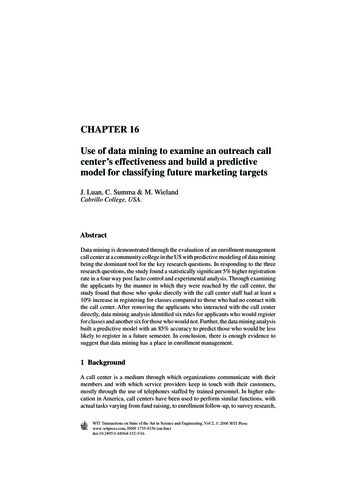
282 Data Mining in E-Learning4 Design and methodIn order to answer all three questions, this study employed a variety of methods andtools. The study adopted a post facto control and experimental design for seekinganswers to question one. Chi-square statistics was used for question one. Regression equations, neural networks, and classification and regression tree (C&RT)were used for algorithm bias analysis for question three. Also, data were split intotraining and test sets for empirical accuracy validation. Data warehousing and SQL(structured query language) technologies directly supported the datasets mergingand querying tasks.The results of the call center were hand coded into an Excel worksheet thatwas imported into Brio Query, a business intelligence (BI) tool for the purpose ofquerying and pivoting variables (building various reports). Most of the answers toquestion one and question two are provided by Brio Query, assisted by Excel andSPSS (another statistical analysis tool). For question three of predicative modeling,the study utilized data mining and a tool called Clementine, a leading industrialstrength business analytics (BA) application.The study chose Clementine as the data mining tool because of its ability todirectly interface with static or live relational databases, to calculate new fieldsusing GUI (graphical user interface) guided nodes, to convert transactional datafiles into analytical data files, and to allow infinite number of scenarios to be builtand examined using its 16 modeling algorithms. All analyses are conducted insideone data stream, which makes it much easier for cross-validation, interpretation,replication and documentation. The screenshot in Fig. 1 illustrates the ‘data stream’built within Clementine for the entire study, including the nodes used for calculatingnew fields (variables).Figure 1: Screenshot of Clementine data stream on design canvas.WIT Transactions on State of the Art in Science and Engineering, Vol 2, 2006 WIT Presswww.witpress.com, ISSN 1755-8336 (on-line)
Data Mining and Outreach Call Center Effectiveness283Since Brio Query queried the datasets and produced a data cube containing mostof the needed data elements that lent themselves readily as input variables for thedata mining tasks, Clementine directly imported a tab delimited text files from BrioQuery as its data source.5 Findings5.1 YieldThe answer to question one was obtained through two separate steps. The firststep examined the differences in registration rates between a control group andan experimental group. The experimental group would be the group that had thepresence of a call center and the control group had not. To compute specific yieldrates, which was the second step, required those in the experimental group whowere identified to be those who applied but had not yet registered for classes forthe call center to contact. Not all applicants could be contacted by the call center.5.1.1 Step one for answering question one: overall effect of thepresence of call centerAs the first step in addressing question one, the study made refinement to theoriginal pair of a control group and an experimental group by splitting them further.The rationale is as follows. As mentioned earlier, all those who turned in theirapplications as of spring 2004 semester census date (February 23, 2004) became apseudo-control group because no call center activities took place in that semester.All those who had their applications on file as of spring 2005 semester census date(February 22, 2005) were the experimental group. The call center only functionedfor a brief period of time, a month before the start of the spring 2005 semester and thecollege continued to receive applicants since the lists of applicants were extractedfor the calls. This has provided a good opportunity to examine the registration rateswith and without the call center in the same semester. Therefore, applicants in bothgroups were then split by a specific date. For spring 2005, the date of January 19was chosen because none of the applicants who turned in their applications after19 January were contacted. This group is called ‘Pool A’. January 19, 2005, was 31days before the census day of spring 2005. For spring 2004, the date of January 20,2004, was chosen (31 days before spring 2004 census date). This group is called‘Pool B’. Hypothetically speaking, if call center had no effect, then the rates forPools A and Pools B in their respective semesters should be very similar.The following table presents the rates of registration for the control (PoolsA & B) and experimental groups (Pools A & B).Table 1 shows that those spring 2005 students in Pool A had a higher registrationrate than Pool B. The difference is 5%. Both the equivalent pools of students inspring 2004 showed no change in their registration rate.Is the observed 5% difference statistically significant? The study turned to chisquare analysis for answers. The following output from chi-square analysis showeda high level of significance.WIT Transactions on State of the Art in Science and Engineering, Vol 2, 2006 WIT Presswww.witpress.com, ISSN 1755-8336 (on-line)
284 Data Mining in E-LearningTable 1: Registration rates by treatment and control groups.Spring 2005Pool APool BCall CenterAvailableNo Call CenterSpring 200471%No Call Center74%66%Difference 5%No Call Center74%Difference 0%Note:1. Pool A contain all applicants who turned in their applications as of spring census date.For Pool A from spring 2005, a sub-group of the applicants, namely those who appliedbut had not registered as of the date of January 19, 2005, was the group contacted bythe call center and consequently discussed in detail in the study.2. Online application was made available for the first time in spring 2005. A great numberof students utilized it to apply online. This is a key difference other than a call centeravailable to both Pool A and Pool B in spring 2005.22 (O-E) /E 24.52degrees of freedom 1p 0.000001Figure 2: Chi-square output.The chi-square analysis indicates that the observed 5% difference was statistically a significant event for the registration rate for those who applied but had notregistered in spring 2005. The occurrence of a difference of 5% purely by chanceis deemed to be one in 100,000, or very unlikely.Although the 5% difference is considered statistically significant, in order tocompletely answer the question on the yield rate the next step is to look at theactual number of yields.5.1.2 Step two for answering question one: computing specific yield ratesThe applicants under study have been categorized into several distinct groups.Those who spoke with the call center staff directly and said they were going toregister were in the Promised group. Those who received a voice mail messagefrom the call center volunteers were in the Left Msg. group. Those whose phonesnever answered were in the Not Accessible group. Those who spoke Spanish onlywere in the Spanish Spk group. Those who provided a wrong number on theirapplications were in the Wrong No. group. Those whose phone numbers had anarea code other than 831 were in the Out of Area group. Table 2 contains detailedinformation on these groups.In Table 2, of the applicants who had not registered by January 19, 2005, 370of them spoke with the call center staff directly and said they would register.Eventually, 194 of them were found to have registered as of spring 2005 semestercensus day, thus producing a yield rate of 52% for the Promised group. Across allWIT Transactions on State of the Art in Science and Engineering, Vol 2, 2006 WIT Presswww.witpress.com, ISSN 1755-8336 (on-line)
Data Mining and Outreach Call Center Effectiveness285Table 2: Yield rates by all applicant types.PromisedLeft Msg.Not AccessibleSpanish SpkWrong No.Out of 051152652%48%46%42%40%30%*Applicants column has been revised by removing those whohad already registered by January 19, 2005.**Rate refers to the number of actual registrants (yields) fromwithin each category of the applicants. This way the rate canbe clearly computed to indicate the yield.categories of applicants in Table 2, this is by far the highest yield rate. The nextgroup that had the highest yield rate (48%) was those who received a voice mailmessage from the callers.The study removed all cases from all categories if they were found to have aregistration date prior to January 19, 2005. This will help with making sure thatthe subjects under study have not been included in error. Secondly, the researcherswent through the actual survey forms filled out by the call center volunteers andpaid particular attention to those in the Promised group. The purpose of examiningthe actual feedback from the applicants was to get a sense of the reasons behindthose 194 direct yields. Many of them stated reasons such as ‘not clear on what todo next’, ‘have not gotten the time’, or ‘procrastinating’. Many were thankful thatthey got the call. It was clear that they indeed may not have registered if they hadnot receive the calls.Apart from those who received a voice mail message from the callers, those whoregistered without speaking directly with the call center volunteers (or withoutbeing reached by the callers) can be regarded as those who enrolled in classes oftheir own volition; therefore, subjects with no contact from call center (withoutreceiving any treatment). They were the groups of Not Accessible, Wrong No. andOut of Area. After collapsing the above six application types (Table 3) into onlythree, the yield rate of the applicants for the Promised group is ranked 11% higherthan the All Other group and is still 3% higher than all others after it is combinedwith the Left Msg. group (Promised & Msg) (Fig. 3).5.2 Predictive modelingQuestion three: How would predictive modeling help with identifying among thefuture applicants those who are less likely to register to help better focus on callsmade by the call center?.WIT Transactions on State of the Art in Science and Engineering, Vol 2, 2006 WIT Presswww.witpress.com, ISSN 1755-8336 (on-line)
286 Data Mining in E-LearningTable 3: Yield rates by collapsed applicants types.PromisedPromised & MsgAll 41%Promised denotes those who spoke to the callers directlyand promised to register. Promised & Msg denotes those ofthe Promised group as well as those who received a voicemail message. All Other denotes those who were not reachable, wrong number, and out of the area (who are likely distantor non-residents).*Applicants column has been revised by removing those whohad already registered by January 19, 2005.60%50%40%30%20%10%0%PromisedPromised &Msg.All OtherFigure 3: Yield rates by collapsed applicant types.To answer this question, the study first used a Venn diagram to group the 2949applicants based on their presence in the college’s MIS data warehouse and thespring 2005 census database. A Venn diagram, developed by John Venn, a logician,is an effective way to visually identify subgroups (also called sets in algebra) ofany populations, particularly when there is a large amount of overlapping. Venndiagrams have found use in many fields, such as database design, combinatorics[10], and assessment of learning [11].The following Venn diagram (Fig. 4) indicates the overlapping of the populationof 2949 applicants with the colleges’ MIS historical data warehouse and the spring2005 census database. Four distinct groups are therefore clearly visible. They are:WIT Transactions on State of the Art in Science and Engineering, Vol 2, 2006 WIT Presswww.witpress.com, ISSN 1755-8336 (on-line)
Data Mining and Outreach Call Center Effectiveness287MISHistorySpring20052n 1,0941n 521Fall 2005Applicants*4n 597* A total of 2,950 applicants whohad not registered by January 19,2005.3n 737Groups1. Those who applied for spring 2005, hadenrolled at Cabrillo before, but didn’t enrollin spring 2005;2. Those who applied, enrolled, and hadenrolled at Cabrillo before;3. Those who applied, enrolled in spring2005, but had no prior enrollment; and4. Those who applied for spring 2005, didnot enroll, and had no prior history.Figure 4: Venn diagram of four groups of the 2949 applicants.Group 1: Those who applied for spring 2005, had enrolled at Cabrillo before, butdid not enroll in spring 2005 (n 521);Group 2: Those who applied, enrolled, and had enrolled at Cabrillo before(n 1094);Group 3: Those who applied, enrolled in spring 2005, but had no prior enrollment(n 737); andGroup 4: Those who applied for spring 2005, did not enroll, and had no priorhistory (n 597).These groups helped the rest of the analysis by making it possible to focus on eachof them while drilling down to its population details. They guided the rest of thestudy and are frequently referenced.Since Venn diagrams do not display data in proportion to their distributions ina dataset, a pie chart below will correct that by making the distributions adjustedto their appropriate scale. First, for those who eventually registered, the majority(62%, Groups 2 and 3) of the 2949 applicants eventually registered as of spring2005 census time. At least a quarter (25%) of the applicants was new to CabrilloCollege because no prior academic records existed for them in the college MIShistorical data warehouse going back 15 years.For those who never registered, regardless of being reached by the call center ornot, over a third (38%, Groups 1 and 4) of the 2,949 applicants on the call list didnot eventually register, but half of them (Group 1) had attended Cabrillo Collegebefore. The other half, or 20% of the 2949 applicants, had never been to CabrilloCollege.WIT Transactions on State of the Art in Science and Engineering, Vol 2, 2006 WIT Presswww.witpress.com, ISSN 1755-8336 (on-line)
288 Data Mining in E-LearningGroup 3,25%Group 2,37%Group 4,20%Group 1,18%Figure 5: Registration percent distribution of applicants to be called (n 2949).Overall, 45% (Groups 3 and 4, n 1334) of the 2949 applicants had never been toCabrillo College before. It is unique to have so many of the potential ‘new’ studentsamong the 2949 applicants to be called by the call center. Was there a reason for adisproportionate number of applicants who had never been to Cabrillo College tobe slow in registering for classes? Spring 2005 enrollment statistics showed thata total of 2741 students enrolled were new students. Hypothetically, the numberof new students could have been 3338 (2741 597 of Group 4). In other words,17.8% (597/3338) were missing from the new students pool.The pie chart (Fig. 5) also seems to indicate that the 2949 applicants almost hadan equal 25% chance in falling into any of the four groups. Overall, having beento Cabrillo College seemed to increase the chance of registering for classes (37%,Group 2). For those who had never been to Cabrillo, their chances of registrationwere about 50/50. This means that the outcomes of the applicants are really a set offour: those who had been to Cabrillo but did not register and those who did register;those who were new to Cabrillo and registered; and those who did not register andtheir prior background information is unknown.The following five charts (figures) and tables display background characteristicsof the groups identified in the Venn diagram. However, Group 4 is not in any of theanalysis due to lack of data.Figure 6 above shows the distribution of age ranges across the three Venn diagramgroups.Overall, the age of students in Group 1 (those applicants who had been at Cabrillobefore but did not eventually register) was higher than the other two groups. Compared to Groups 2 and 3, Group 1 had fewer students younger than 20. The reverseis true for Groups 2 and 3.Students ages 17 and below or 19 and below as shown in Fig. 5 are likelyconcurrently enrolled students. For Group 2 (the group of applicants who hadtaken classes at Cabrillo College and registered), there were fewer students in theage range of a recent high school graduate (18–19) compared to Group 3 (newapplicants who had never been to Cabrillo). Comparing Group 2 to Group 3, fewerWIT Transactions on State of the Art in Science and Engineering, Vol 2, 2006 WIT Presswww.witpress.com, ISSN 1755-8336 (on-line)
Data Mining and Outreach Call Center Effectiveness28925%Group 1Group 2Group 320%15%10%5%0%14 - 17 18 - 19 20 - 24 25 - 29 30 - 34 35 - 39 40 - 49 50 - 6060 Figure 6: Age distribution by Venn diagram groups.70%60%Group 1Group 2Group 350%40%30%20%10%0%FemalesMalesUndeclaredFigure 7: Gender distribution by Venn diagram groups.students in Group 2 were from the age range of 18 to 19. The missing ones mayhave been recent high school graduates who had decided to move on followingtheir study at Cabrillo College.Figure 7 above shows the distribution of gender across the three Venn diagramgroups. Across the three groups, gender seemed to have an opposing trend. Morefemales were in Group 1, less in Group 2 and much less in Group 3, but the reverseis true for males. New applicants (Group 3) tended to be male. Applicants who hadbeen to Cabrillo College and had not registered tended to be female.Figure 8 above shows the distribution of ethnicities across the three Venn diagramgroups. There is no major difference across major ethnic minorities among all threegroups of applicants. There appeared to be fewer white students in Group 3 (newapplicants without Cabrillo College experience) while there is an increase in theUnknown category in Group 3. Research has shown that most of the students in‘unknown’ or ‘unreported’ categories tend to be White students.Figure 9 above shows the distribution of education background across the threeVenn diagram groups. There were fewer concurrently enrolled students in Group 1(those applicants who had been to Cabrillo College, but never registered) comparedWIT Transactions on State of the Art in Science and Engineering, Vol 2, 2006 WIT Presswww.witpress.com, ISSN 1755-8336 (on-line)
290 Data Mining in E-Learning80%70%60%Group 1Group 2Group 350%40%30%20%10%0%AAAsianFilipino HispanicNAOtherP/ISLND UnknownWhiteFigure 8: Ethnicity distribution by Venn diagram groups.60%50%40%Group 1Group 2Group DRGSHGONHWOKNNNUCFigure 9: Education background distribution by Venn diagram groups.to other groups. This is a validation of the observations made about their age.More of them in Group 1, on the other hand, were high school graduates, but notnecessarily recent high school graduates.Figure 10 above shows the distribution of enrollment status across the three Venndiagram groups.The largest portion of Group 1 was those who were continuing students whenthey applied. The largest portion of applicants in Group 2 was those who were new.The largest portion of applicants for Group 3 was those who were new, too.Distributions of enrollment status for the three groups of applicants were generally very diverse. Very few in Group 1 were concurrently enrolled students. Veryfew in Group 2 were continuing students when they applied.WIT Transactions on State of the Art in Science and Engineering, Vol 2, 2006 WIT Presswww.witpress.com, ISSN 1755-8336 (on-line)
Data Mining and Outreach Call Center Effectiveness29170%Group 160%Group 2Group onCConcurrentuing0%Figure 10: Enrollment status by venn diagram groups.5.2.1 Data mining rationale and discoveriesThe above visual analysis by five select background variables of demographicsand academic status help develop an impression of the different characteristics ofthe applicants in Groups 1, 2 and 3. However, the impression is at best a fuzzyone, not accurate or evidential to help classify individual future applicants intorespective groups. Plus, should one decide to cross tabulate the groups by two ormore variables, the examination of these background variables using the methodabove can go on forever and there can be infinite number of tables and charts.A 3-dimensional environment with multiple variables intermingled in a myriad ofways is impossible for the human eyes to quickly spot trends or monitor changes. Itis precisely such a spatial sphere in which hidden patterns exist that can lead to newinformation on how the applicants become a registrant. Conventional tools maystart to show inadequacies in handling the infinite number of coordinates in such aspatial sphere. Even the traditional regression analysis, which computes the residualstatistics of multiple variables around a mean to determine their contribution toexplain the variance of a phenomenon, is not entire adequate.For example, there may be a dozen variables going into a regression analysis toidentify the key ones that would determine whether or not an applicant would register. The regression analysis may find that among these variables gender, ethnicity,age, location, and GPA would be significant. It then provides a specific value (oddsratio) associated with each variable to determine the likelihood of an applicant’sregistration status. The equation typically functions as a polynomial model: if thevalue of a variable changes by one unit, such as one year of age increase for anapplicant, the likelihood of registration would change by an X amount. Pluggingin an applicant whose age is 18, gender is male, and ethnicity is Asian, out comesthe likelihood of his registering for classes.This likelihood is essentially a quadratic equation following a Sigm
(structured query language) technologies directly supported the datasets merging and querying tasks. The results of the call center were hand coded into an Excel worksheet that was imported into Brio Query, a business intelligence (BI) tool for the purpose of querying and pivoting variables (building various reports). Most of the answers to