Transcription
Narrative Visualization: Telling Stories with DataEdward Segel and Jeffrey HeerAbstract—Data visualization is regularly promoted for its ability to reveal stories within data, yet these “data stories” differ in importantways from traditional forms of storytelling. Storytellers, especially online journalists, have increasingly been integrating visualizationsinto their narratives, in some cases allowing the visualization to function in place of a written story. In this paper, we systematicallyreview the design space of this emerging class of visualizations. Drawing on case studies from news media to visualization research,we identify distinct genres of narrative visualization. We characterize these design differences, together with interactivity and messaging, in terms of the balance between the narrative flow intended by the author (imposed by graphical elements and the interface)and story discovery on the part of the reader (often through interactive exploration). Our framework suggests design strategies fornarrative visualization, including promising under-explored approaches to journalistic storytelling and educational media.Index Terms—Narrative visualization, storytelling, design methods, case study, journalism, social data analysis.1I NTRODUCTIONIn recent years, many have commented on the storytelling potentialof data visualization. News organizations including the New YorkTimes, Washington Post, and the Guardian regularly incorporate dynamic graphics into their journalism. Politicians, activists, and television reporters use interactive visualizations as a backdrop for storiesabout global health and economics [10] and election results [9]. A recent feature in The Economist [6] explores the proliferation of digitaldata and notes that visualization designers are “melding the skills ofcomputer science, statistics, artistic design and storytelling.”Static visualizations have long been used to support storytelling,usually in the form of diagrams and charts embedded in a larger bodyof text. In this format, the text conveys the story, and the image typically provides supporting evidence or related details. An emergingclass of visualizations attempts to combine narratives with interactivegraphics. Storytellers, especially online journalists, are increasinglyintegrating complex visualizations into their narratives.Crafting successful “data stories” requires a diverse set of skills.Gershon and Page [12] note that effective story-telling “require[s]skills like those familiar to movie directors, beyond a technical expert’sknowledge of computer engineering and science.” While techniquesfrom oration, prose, comic books, video games, and film productionare applicable to narrative visualization, we should also expect thisemerging medium to possess unique attributes. Data stories differ inimportant ways from traditional storytelling. Stories in text and filmtypically present a set of events in a tightly controlled progression.While tours through visualized data similarly can be organized in alinear sequence, they can also be interactive, inviting verification, newquestions, and alternative explanations.Currently, most sophisticated visualization tools focus on data exploration and analysis. Applications such as spreadsheets and visualization tools support an array of analysis routines and visual encodings, but beyond exporting images for presentation typically providescant support for crafting stories with analysis results. As such, theyprovide powerful vehicles for discovering “stories”, but do little to aidnarrative communication of these findings to others. As tools matureand more richly integrate with the web (e.g., Many Eyes [25], TableauPublic [22], GeoTime Stories [8]), they are enabling the publicationof dynamic graphics with variably constrained levels of interactivity.It remains an open question how the design of such tools might beevolved to support richer and more diverse forms of storytelling. The authors are with Stanford University, Stanford, CA 94305.E-mail: {esegel, jheer}@stanford.edu.Manuscript received 31 March 2010; accepted 1 August 2010; posted online24 October 2010; mailed on 16 October 2010.For information on obtaining reprints of this article, please sendemail to: tvcg@computer.org.In this paper, we investigate the design of narrative visualizationsand identify techniques for telling stories with data graphics. We takean empirical approach, analyzing visualizations from online journalism, blogs, instructional videos, and visualization research. After reviewing related work, we share five selected case studies which highlight varied design strategies and illustrate our analytic approach. Wethen formulate a design space constructed from an analysis of 58 examples. Our analysis identifies salient dimensions of visual storytelling, including how graphical techniques and interactivity can enforce various levels of structure and narrative flow. We describe sevengenres of narrative visualization: magazine style, annotated chart, partitioned poster, flow chart, comic strip, slide show, and video. Thesegenres can be combined with interactivity and messaging to producevarying balances of author-driven and reader-driven experiences. Finally, we discuss the implications of our framework, noting recurringdesign strategies, promising yet under-utilized approaches to integrating visualization with other media, and the potential for improved userinterfaces for crafting data stories. By focusing on the graphical andinteractive elements of narrative visualization, our approach gives lessattention to the cognitive and emotional experience of the reader. Werecognize the importance of these elements, however, and describe directions for future reader-centric research in our conclusion.2 R ELATED W ORKStorytelling and visual expression are integral parts of human culture;storytelling has even been referred to as “the world’s second-oldestprofession” [12]. Without summarizing millennia of achievement, wedescribe a few of the key concepts informing narrative visualization.2.1 Narrative StructureThe Oxford English Dictionary defines narrative as “an account of aseries of events, facts, etc., given in order and with the establishing ofconnections between them.” Central to this definition is the notion ofa chain of causally related events. Stories of this form often have abeginning, middle, and end [3, 24]: an introduction to the situation, aseries of events often involving tension or conflict, and a resolution.Since ancient times, people have tried to understand and formalizethe elements of storytelling. For example, writers (e.g., [5, 19, 21])have developed typologies of dramatic situations and identified plotlines common to many narratives, such as the “hero’s journey” [5].This research typically distinguishes between the content of the storyand the form in which it is told. While stories often concern interactingcharacters, they may also present a sequence of facts and observationslinked together by a unifying theme or argument.Storytelling strategies vary among media and genre. For instance,stories told through writing have access to a different set of formalmechanisms and narrative structures (e.g., stream of consciousness)than stories told through film (e.g., split-screen sequences [3]). Blundell [2] describes narrative devices for journalism such as the anecdo-
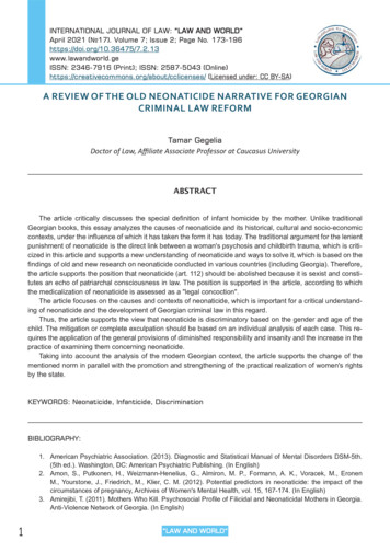
tal lead—an initial story, often involving dialogue and characters, thatpresents a microcosm of the larger news story—and the nut graf—aparagraph explicitly describing the news value of an article. These devices are largely unique to journalism, as opposed to literary fiction orfilm. Visualizations themselves may incorporate a variety of media,including text, images and video, and can also be interactive, enablingstories whose telling relies as much on the reader as on the author.2.2Visual NarrativesArtists, designers, and psychologists have all explored ways in whichvisual media can be organized to engender a narrative experience.They have developed nuanced techniques for sequentially directinga viewer’s attention and keeping viewers oriented across transitions.While a full treatment of these devices is beyond the scope of thispaper, we present some salient principles here.Many narratives are rooted in a clear starting point. In visual media,an establishing shot or overview [3, 19] is often used to introduce thescene. Of course, not all elements in a scene are of equal importancethroughout a story, and so authors often manipulate a scene to directattention to a point of interest. Psychologists have extensively studied phenomena of visual salience [11, 17, 23], showing that outliersamong visual features such as color, size, and orientation preferentiallyattract one’s attention. The strength of this attraction is modulated bymultiple factors [17], including the scene itself (e.g., a brightly coloredobject is less salient when surrounded by other brightly colored objects) and by the viewer’s task (e.g., expectations and top-down searchcan affect what is perceived as most salient).Cultural factors, particularly reading order (e.g., left-to-right) naturally bias where people look first and how they scan an image [19].Visual techniques can further establish the order in which the eyevisits elements in the scene. For example, gestalt grouping [26] viafeatures such as spatial proximity, containment, or connection maybias one towards first perceiving the grouped content. Vectorial reference [18, 24], most commonly in the form of arrows, is a powerfultechnique for sequentially directing attention.Visual media often involve changes of scene, such as between thepanels of a comic or across cuts in edited film. A number of deviceshave been developed to orient a viewer during transitions. Continuity editing techniques in film [3], such as matching on objects or actions, suggest the connection between scenes and may sustain a focus of attention. Similarly, animation design [14, 24] often relies onobject constancy and de-emphasizes secondary details to keep viewers oriented; animators may also subdivide a transition into stagesto facilitate apprehension. Within comics, McCloud [19] proposes ataxonomy of transition types consisting of moment-to-moment (onesubject, short time period), action-to-action (one subject, longer timeperiod), subject-to-subject (different subjects, same scene), scene-toscene (change of scene), aspect-to-aspect (“aspects of a place, idea, ormood”), and non-sequitur (logically unconnected) transitions. In addition to continuity of objects or actions, extra-pictorial elements [24]such as callouts (e.g., insets or lines to denote zooming) and annotations are used to enrich a narrative. Not surprisingly, we will see thatmany of these techniques are also applicable to narrative visualization.2.3Storytelling with Data VisualizationThough data visualization often evokes comparisons to storytelling [6,7], the relationship between the two is rarely articulated clearly.Jonathan Harris, the creator of We Feel Fine and Whale Hunt, considers himself a storyteller first and a visualization designer second: “Ithink people have begun to forget how powerful human stories are, exchanging their sense of empathy for a fetishistic fascination with data,networks, patterns, and total information. Really, the data is just partof the story. The human stuff is the main stuff, and the data shouldenrich it.” Yet when pressed to describe what he means by “story,”he responds with only a rough approximation: “I define ‘story’ quiteloosely. To me, a story can be as small as a gesture or as large as alife. But the basic elements of a story can probably be summed up withthe well-worn Who / What / Where / When / Why / How.”Others have tried to articulate the connection more concretely. Gershon and Page [12] observe that stories communicate information ina psychologically-efficient format, also a central goal of visualizationdesign. Using the script of a fictional military scenario as a case study,they examine tactics used to communicate narrative events, includingcontinuity editing, highlighting (e.g., flashing), and redundant messaging across media (e.g., audio and video). Still, a deeper understandingof narrative visualization remains elusive, as “we need to further understand the characteristic interactions of each genre with each particular audience, its advantages and disadvantages, and how it mightaffect content and learning.” Wojtkowski and Wojtkowski [27] furtherargue that what makes data visualization different from other types ofvisual storytelling is the complexity of the content that needs to becommunicated. They conclude that “visual storytelling, in turn, mightbe of critical importance in providing intuitive and fast explorationof very large data resources,” but again stop short of detailing how wemight best “tailor visualization systems to accommodate storytelling.”Some visualization systems have begun to incorporate storytellinginto their design. For example, GeoTime Stories [8] enables analyststo create annotated stories within visualizations using a text editor andbookmarking interface. The sense.us [15] system allowed users to create trails of visualization bookmarks that were regularly used for storytelling. Tableau’s graphical histories [13] lets users review, collate,and export key points of their visual analysis. More recently, TableauPublic [22] supports the construction and web-based publication of interactive visualizations, supporting storytelling in data-rich domainssuch as finance and sports journalism. Such systems provide the firststeps toward making richer storytelling capabilities accessible.In short, many have observed the storytelling potential of data visualization and drawn parallels to more traditional media. However,a thorough understanding of the design space for narrative visualization has yet to emerge. In the meantime, practitioners such as artistsand journalists have been forging paths through this space, and wemight hope to gain insight from their explorations. Here we seek tofurther our understanding of narrative visualization by analyzing andcontrasting examples of visualizations with a story-telling component.We then generalize from these examples to identify salient design dimensions. In the process, we hope to clarify how narrative visualization differs from other storytelling forms, and how these differencesintroduce both opportunities and pitfalls for its narrative potential.3C ASE S TUDIESOFN ARRATIVE V ISUALIZATIONWe collected visualizations with narrative components, and then attempted to identify and categorize the design features that effectivelytell stories with data. We gathered examples from sources such as online journalism, blogs, visualization books, research papers, and software packages. Our primary source was online journalism, includingvisualizations produced by the New York Times, the Guardian, theFinancial Times, the Washington Post, and Slate. Additional visualizations were found through visualization blogs such as Flowing Data,Infosthetics, and Visual Complexity. For completeness, we also examined visualizations that do not explicitly tell stories but nonethelesscontain relevant storytelling components. We analyzed the narrativeand interactive devices used in each example. The accumulated datareveals recurring patterns, leading to our analysis in Section 4.In this section, we present five selected case studies of narrativevisualization. Our goal is to highlight both exemplary and problematic approaches, as well as give the reader a sense of our method ofanalysis. Throughout, recurrent design strategies are marked in boldface. The examples were chosen to provide a diverse sample of pointsin the design space of narrative visualization. These case studies alsohighlight the potential application of narrative visualization in fieldsranging across journalism, sports, public policy, and finance.3.1Steroids or Not, the Pursuit is OnBaseball star Barry Bonds points to the sky; his goal, 755 home runs,hovers over his head—“Steroids or Not, the Pursuit is On” [A36].Shadowing Bonds’ attempt were allegations of steroid use, and manysports statisticians turned to the numbers to investigate these claims.
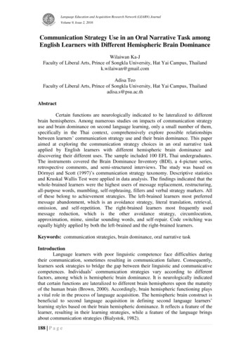
Fig. 2. Budget Forecasts, Compared With Reality. New York Times.3.2Fig. 1. Steroids Or Not, the Pursuit is On. New York Times.Sized prominently and placed in the upper left corner of the page, theimage of Bonds grabs the eye and points the viewer towards the title,establishing the topic for the rest of the graphic. A legend consisting ofphotos and text introduce Hank Aaron and Babe Ruth, previous homerun leaders whose careers provide points of comparison for Bonds’career. A line-chart of accumulated home runs shows the three hitters’careers in alignment, with Bonds’ home runs accelerating at a timewhen the other hitters slow down. A shaded annotation notes that theacceleration coincides with the first reports of steroid use in Bonds’14th season, accompanied by a second annotation just two years laterwhen Bond takes the lead over Ruth and Aaron. The shaded path thenflows to a similarly-colored inset to the right containing a comparisonof each player’s home run pace after age 34, emphasizing the suspicious acceleration in Bonds’ hitting so late in his career.The viewer may then move to other sections. On the right, the eyeis invited by a large image of a swinging Alex Rodriguez and a boldcaption noting “Others Taking Aim.” Here we see the other currentplayers who are chasing the career home run record. The bottom section (“Differing Paths to the Top of the Charts”), devoid of color andconsisting of smaller plots, is given minimum visual priority but completes the story. Small multiples show the home runs per season fortop players on the career home run list, each captioned by a factoid.The visualization resembles a poster one might see at a science fair,with the space subdivided into smaller sections, each telling its ownsub-story with charts, pictures, and text. The three sections are linkedtogether graphically through the use of color, shape, and text. For example, the largest section introduces the hitters according to their orderon the career home run list: Hank Aaron (black line), Babe Ruth (greenline), and Barry Bonds (red line). Subtly matching on content, the inset in this section maintains this same scheme, presenting the playersin the same order with their associated colors. This allows the viewerto immediately discern the reference to the larger image. The section below also begins in the same order (Aaron, Ruth, Bonds) beforeproceeding to the other players. This order not only carries informational content (i.e., who has the most home runs) but also prevents theviewer from having to reorient while switching between sections. Finally, the section to the right charts the performance of current playersover a shadow of the initial chart, a shape we immediately identify asbelonging to Aaron, Ruth, and Bonds.While these elements provide seamless transitions between sections, they do not dictate the order in which the viewer explores thevisualization. Rather, a path is accomplished through the use of visualhighlighting (color, size, boldness) and connecting elements such asarrows and shaded trails. When looking at the visualization, the viewerbegins with the largest image, in part because of its size, central positioning, and coloring, but also because it is capped with a large headline and a picture of Bonds himself telling the viewer where to look.Budget Forecasts, Compared With RealityWhen deteriorating economic conditions forced a downward revisionin the 2010 White House budget forecast, the New York Times published this visualization [A53] to explore the accuracy of past budgets’predictions. A large headline is followed by a brief prompt introducing the visualization. Below are two panels side by side. The leftpanel contains another bold headline accompanied by a short paragraph of text, while the right panel contains a line chart showing budget surpluses and deficits between 1980-2020, with the estimates distinguished from actual data using annotations and coloring. Just abovethese panels is a progress bar indicating the length of the visualizationand providing the user with a mechanism to navigate between slides.As the user steps through the presentation, the visualization maintains a consistent visual platform, changing only the content withineach panel while leaving the general layout of the visual elements intact. Each new slide alters the text in the left panel, while updating thechart in the right panel with animated transitions. A narrative is communicated clearly through the interaction of the text in the left panelwith the annotations and graphic elements in the right panel, each enriching the narrative through multi-messaging, providing related butdifferent information [20]. In this way, the presentation guides theviewer through historical budget forecasts, explaining patterns in thedata (80% of deficit forecasts have been too optimistic) and highlighting key events (surpluses under Clinton were generated in part bya stock market bubble). Users can discover additional statistics bymousing-over the chart, revealing details-on-demand with the yearsand estimates of past forecasts. Halfway through the presentation, atimeline slider appears above the dates on the horizontal axis, with theslider position updating along with the chart above. Text on the fifthslide explicitly encourages the user to interact with this slider to isolate forecasts for a single year. The presentation ends with the currentbudget forecasts for 2012, letting the user see how these predictionschange under different economic assumptions.At its core, this visualization is a typical slide-show presentationaugmented by two important features. First, it allows the user to determine the pace of the presentation by using the provided progressbar. And second, it allows the user to interact with the presentation bymousing-over areas of interest and by using the slider to explore different time windows. We call this structure an interactive slideshowthat uses single-frame interactivity, meaning that interaction manipulates items within a single-frame without taking the user to new visualscenes. These devices encourage the user to explore the data within thestructure of an overarching narrative. The narrative functions in twoways, both communicating key observations from the data, as wellas cleverly providing a tacit tutorial of the available interactions byanimating each component along with the presentation. By the timethe presentation encourages the user to investigate budget forecasts forspecific years, it is already clear to the user how to do this.This presentation style can be compared to a narrative pattern calledthe martini glass structure [4], following a tight narrative path earlyon (the stem of the glass) and then opening up later for free exploration (the body of the glass). Different features of the visualization
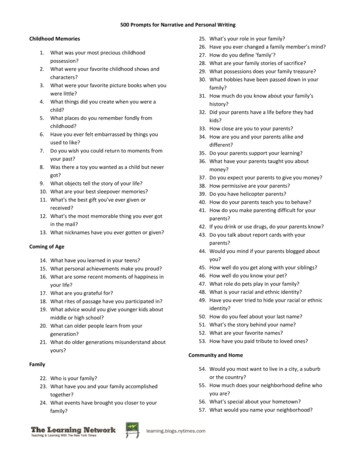
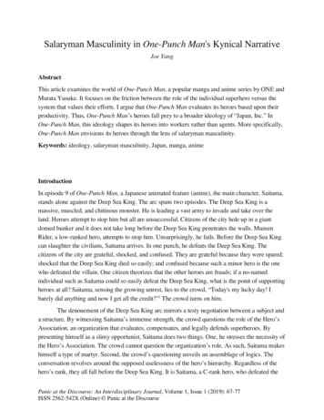
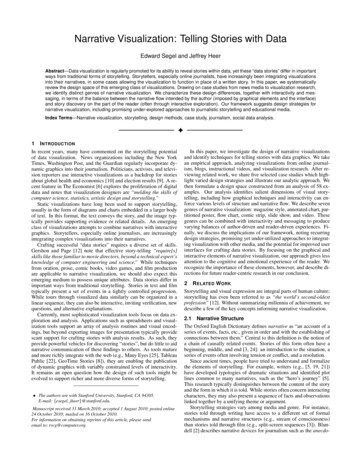
Fig. 3. Afghanistan: Behind the Front Line. Financial Times.Fig. 4. Human Development Trends. Gapminder.ensure that the viewer does not lose his place in the narrative duringthis exploratory stage, with orientation provided by the consistency ofthe visual platform, the updating progress bar, and the timeline slider.guide the viewer through the data, making it hard to draw meaningful conclusions from the large amount of information available. Whydo some regions cost more than others? (Annotations are needed onthe map.) Which countries provide the best aid? (Comparisons areneeded between countries.) What projects exist in a particular region?(Regions cannot be selected.) Moreover, too much information is provided for each country in terminology-heavy paragraphs that are difficult to parse. While this may be useful for a trained analyst, a generalaudience would be better served by replacing the vast quantity of information with memorable factoids. The graphic may suffer by puttingexploratory power into the hands of the viewer without sufficient guidance. A synthesis or summary could be very useful toward this end.3.3Afghanistan: Behind the Front LineIn an effort to draw popular support away from the Taliban, NATOdeployed groups of soldiers and civilians known as Provincial Reconstruction Teams (PRTs) to Afghanistan to implement nation-buildingdevelopment projects. People began to question the effectiveness ofthese groups amidst escalating violence in the region. This visualization [A45] begins with a traditional newspaper headline and briefarticle introducing the PRT’s mission. The article then states the intended purpose of the graphic: to establish indicators of success bywhich to evaluate the development work being done in Afghanistan.The graphic starts with its own introduction as well, occupyingthe first of four tabs the user can select. This starting tab containsonly introductory text and a photograph of a US soldier. The remaining tabs (Nation-building, Security, Counter-narcotics) each containan identical map of Afghanistan subdivided by province. A differenthue (green, blue, red) is used to color the map for each tab, providing a semantically consistent color encoding; brightness encodes thevalues for each province. To the upper left of the map is a legendwhich changes according to the tab’s content. The “Nation-Building”tab tracks the overall cost of activities for each province, “Security” tracks the severity of insurgent activity, and “Counter-Narcotics”tracks opium cultivation. This last tab also contains a timeline slider,allowing the user to explore how opium cultivation has changed overthe past five years of the PRT’s efforts.Each tab contains an interactive list of NATO countries on the right.A short message and mouse pointer indicate the list is interactive.Clicking an individual country highlights the provinces in which thatcountry has troops deployed, outlining their borders with a flashingred line. A paragraph of text appears in a panel below, providingfacts about that country’s involvement, and in some cases allowing theuser to isolate particular activities (Education, Health, Economic Development, etc.). Finally, a button labeled “PRT INFO” slides downa new window containing additional background about the PRTs inAfghanistan, with details-on-demand for each country involved.The visualization maintains the same graphical layout across tabs,modified only slightly for the different content. This consistent visualplatform provides easy transitions between tabs, and the colors serveas an indication that a switch has occurred. The visual highlightingof provinces serves to draw the viewer’s eye to the relevant areas, anecessary feature given the density of the map. Finally, each interactive component is clearly adorned with markers of interactivity,explicitly pointing out the potential for interaction.However, we believe that some aspects of the visualization could beimproved. Most importantly, the overall structure does not sufficiently3.4Gapminder Human Development TrendsThis interactive slideshow [A47] surveys trends in global income andhealth. The visualization begins with a grid of screenshots from different sections of the presentation (Figure 4), with each image labeledwith its respective topic (Income, Poverty, Health, Deaths, etc.). Thischecklist structure [20] provides an establishing shot of the contentto be covered and serves as a reminder of what each section containsonce the presentation is finished. It also enables navigation to particular segments. A progress bar at the bottom of the screen mirrorsthe grid above, while a large “Start” button in the lower right corner,highlighted by an animated pointer, tells the viewer how to begin thepresentation. This button turns into familiar browser-style “forward”and “back” buttons when clicked, letting the user navigate betweenslides at his own pace. A second progress bar also appears upon entering each individual section. Both progress bars also serve as navigation tools, allowing the user to skip around the presentation withoutrelying on the stepwise navigation provided by the browser buttons.The presentation contains three basic kinds of charts: histograms,scatter plots, and bar charts. However, no individual section utilizesmore than one chart type. Importantly, changes between chart typesare made explicit in order to avoid confusing the viewer. For example, when the presentation transitions from histograms to scatterplotsbetween Sections 3 and 4, a staged animated transition morphs thechart types across several patient steps (see Figure 5). Even manipulations within a single chart receive this same attention: in Section 3, acomment “Zooming in below the poverty line” alerts the viewer to theupcoming manipulation before it occurs.Fig. 5. Staged animated transitions between chart types.
Each section walks the user through a visualized dataset, pointing out key observations along the way. These explanations rely ona combination of annotations, highlighting, animated transitions,and single-frame interactivity. Typically, the data is not presentedall at once. Rather, each chart is constructed in a stepwise fashion,with annotations and animations explaining each stage of the process.In Section 1, the x-axis initially appears without the rest of the chart,introduced with the comment, “Daily income is measured in dollarsper day.” In Section 2, the graphic incorporates the data for each geographic region individually, reserving the pauses between animationsto offer facts about the region (Africa: Population 630 million). Atany point in these lessons, the user can mouse over different graphicalelements for details-on-demand.Beyond simply introducing graphical features, the annotations convey a narrative for each section, providing observations that the
visual storytelling is the complexity of the content that needs to be communicated. They conclude that “visual storytelling, in turn, might be of critical importance in providing intuitive and fast exploration of very large