Transcription
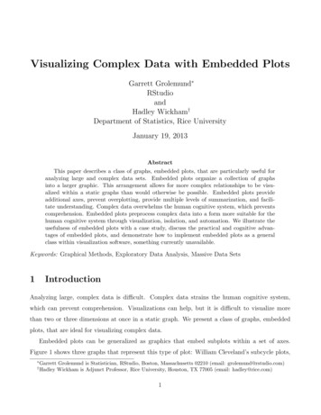
Visualizing Complex Data with Embedded PlotsGarrett Grolemund RStudioandHadley Wickham†Department of Statistics, Rice UniversityJanuary 19, 2013AbstractThis paper describes a class of graphs, embedded plots, that are particularly useful foranalyzing large and complex data sets. Embedded plots organize a collection of graphsinto a larger graphic. This arrangement allows for more complex relationships to be visualized within a static graphs than would otherwise be possible. Embedded plots provideadditional axes, prevent overplotting, provide multiple levels of summarization, and facilitate understanding. Complex data overwhelms the human cognitive system, which preventscomprehension. Embedded plots preprocess complex data into a form more suitable for thehuman cognitive system through visualization, isolation, and automation. We illustrate theusefulness of embedded plots with a case study, discuss the practical and cognitive advantages of embedded plots, and demonstrate how to implement embedded plots as a generalclass within visualization software, something currently unavailable.Keywords: Graphical Methods, Exploratory Data Analysis, Massive Data Sets1IntroductionAnalyzing large, complex data is difficult. Complex data strains the human cognitive system,which can prevent comprehension. Visualizations can help, but it is difficult to visualize morethan two or three dimensions at once in a static graph. We present a class of graphs, embeddedplots, that are ideal for visualizing complex data.Embedded plots can be generalized as graphics that embed subplots within a set of axes.Figure 1 shows three graphs that represent this type of plot: William Cleveland’s subcycle plots, †Garrett Grolemund is Statistician, RStudio, Boston, Massachusetts 02210 (email: grolemund@rstudio.com)Hadley Wickham is Adjunct Professor, Rice University, Houston, TX 77005 (email: hadley@rice.com)1
glyphmaps, and the binned graphics that are emerging from big data visualization efforts. Whenviewed on its own, each subplot is a self contained plot (or would be if it contained the appropriateaxis, labels, and legend). The axes of the subplot do not have to be the same as the axes that thesubplot is positioned on. In fact, the subplot can use an entirely different coordinate system thanthe higher level plot. For example, Figure 1.b. embeds polar graphs in a cartesian coordinatesystem.Embedded plots have a rich pedigree and a growing future. Subcycle plots were devised byWilliam Cleveland (Cleveland and Terpenning, 1982), one of the leading innovators in computerbased graphics. Glyphs and other plots have been embedded in maps since Charles Minard(Minard, 1862). Such maps figure prominently in Bertin’s Semiologie of Graphics (1983), a seminalwork in the academic study of visualization. Embedded maps comprise 21 pages of the text.More recently, glyphmaps have been developed as a tool for tracking climate and climate changedata (Wickham et al., Submitted; Hobbs et al., 2010). The binned graphics of Figure 1.c are apromising candidate for solving the problem of overplotting when visualizing big data. Other typesof embedded plots are widely used as well. Glyphs (Anderson, 1957), trees and castles (Kleinerand Hartigan, 1981), chernoff faces (Chernoff, 1973), stardinates (Lanzenberger et al., 2003), icons(Pickett and Grinstein, 1988) and others have been developed as types of subplots that can becompared to each other. Scatterplot matrices (Chambers, 1983), trellises (Sarkar, 2008) and facets(Wilkinson and Wills, 2005) are popular types of embedded graphics that arrange subplots into atable. We generalise all of these graphs into a larger class of plots, embedded plots, because theyall share a two tier structure. The first tier is the overall graph or visual itself, the second tier isthe collection of subplots that appear within the graph.The two tiered structure of embedded graphs makes them well suited for solving a number ofdata analysis problems. The examples in Figure 1 illustrate three areas where embedded graphicsare particularly useful. First, embedded graphics make it easy to visualize interaction effects.For example, Figure 1.a shows how the monthly components of the seasonal trend in CO2 levelsat Mauna Lau have varied from 1959 to 1990 in relation to the overall seasonal trend. Second,embedded graphics also provide an intuitive way to organize spatio-temporal data. Visualizingspatio-temporal data usually requires four or more dimensions: two for spatial coordinates, a thirdfor the passage of time, and a fourth for the quantity of interest. The glyphmap in Figure 1.b2
Surface temperature fluctuations 1995 2001Seasonal frequency components of Mauna Lau carbondioxide time series between 1959 and 1990, by monthSeasonal component of trend in CO2 (ppm)20 2JFMAMJJASONAverageTemperature (F)D556065707580monthDiamonds, carat vs. priceDiamonds, carat vs. price5000 03000colorDEFGHIJ20002000100010000.40.60.81.0 D E F G H I J 0.41.2caratcolor0.60.81.01.2caratFigure 1: Three examples of graphs that use embedded subplots. A. (upper left) A subseriesplot of the seasonal trend of CO2 measurements taken on Mauna Lau, Hawaii between 1959 and1990. Recreated from Cleveland (1994), page 187. B. (upper right) A glyphmap of temperaturefluctuations in the western hemisphere over a six year period. Each glyph is a polar chart withr temperature and θ date. C. (lower left) A binned plot of the diamonds data set fromthe ggplot2 software package. Subplots are used to show patterns in diamond colors withoutoverplotting. When this data is presented in its raw form, the accumulation of points hidespatterns in the data, D (lower right).3
organizes these dimensions in a way that is easily interpreted and that makes both spatial andtemporal patterns obvious. Finally, embedded graphics solve the problem of overplotting. Figure 1.c. represents almost 20,000 observations. When this data is plotted as a colored scatterplot,the accumulation of points obscures the underlying relationship between carat, color, and price.The use of binned subplots makes the relationship visible again.Embedded plots provide more than just practical advantages. They also amplify the abilitiesof the human cognitive system by presenting complex information in a way that is particularlyeasy to process. Complex data is data that includes multiple simultaneous relationships betweenits elements. At the cognitive level, complex data overwhelms the capacity of the working memorySweller (1994). Repeated studies have shown that it is difficult to comprehend, use, and teachcomplex data.1 Moreover, success in understanding complex data depends heavily on how the datais presented Mayer (2009). Embedded plots present data in a way that exploits several knownmechanisms for facilitating the processing of complex data. As a result, embedded plots may allowviewers to comprehend information that they would not grasp in other formats.As useful as embedded plots are, it is difficult to make them. Currently, programs that canmake embedded plots focus on a specific type of subplot, such as glyphs (Gribov et al., 2006) orscatterplot matrices (Sarkar, 2008). This limits the customizability and usefulness of embeddedplots. We discuss the advantages of embedded plots and describe how embedded plots can beimplemented as a general class of graphs in data analysis software.The remainder of this paper proceeds as follows:Section 2 begins with a case study that presents the usefulness of embedded plots. We explorethe Afghan War Diary data, made available by the WikiLeaks organization. The data set is largeand complex: 76,000 observations organized by location and time. The case study shows howembedded plots can be used in practice to reveal patterns that can not be seen in single levelgraphs.Section 3 examines why embedded plots are useful tools for finding and communicating information found in large data sets. At the practical level, embedded plots have two advantages: theyprovide two extra axes and a high degree of customizability. More importantly embedded plotsexploit several cognitive mechanisms for attending to and processing information. This allows1See Sweller et al. (2011) for an overview.4
embedded plots to present complex information without becoming muddled or indecipherable.Section 4 discusses how generalized embedded plots can be implemented in data analysis software. We present a very customizable implementation of embedded plots that uses the layeredgrammar of graphics (Wickham, 2010) and the ggplot2 package (Wickham, 2009) in R. Incorporating embedded plots into the grammar of graphics yields a new insight about graphics: theyhave an inherently hierarchical structure.Section 5 concludes by offereing general principles to guide the use of embedded plots.2Case study: Analyzing complex dataThe Afghan War Diary data, made available by the WikiLeaks organization at http://www.wikileaks.org/wiki/Afghan War Diary, 2004-2010, is large, complex and intriguing, becauseit provides insights into an ongoing military conflict. The data set was collected by the US militaryand contains information a
William Cleveland (Cleveland and Terpenning, 1982), one of the leading innovators in computer based graphics. Glyphs and other plots have been embedded in maps since Charles Minard (Minard, 1862). Such maps gure prominently in Bertin’s Semiologie of Graphics (1983), a seminal work in the academic study of visualization. Embedded maps comprise 21 pages of the text.