Transcription
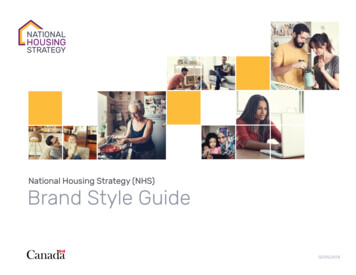
National Housing Strategy (NHS)Brand Style Guide02/05/2018
Table of ContentsNHS Introduction3The Logo4Logo Usage8Visual StyleFontsColour PaletteColour Palette - AccessibiltyGraphic ElementsImagery1011121314Applying the BrandBrand ApplicationPartnership BrandingCMHC / NHS Initiatives151719
NHS IntroductionThrough the National Housing Strategy (NHS), the federal governmentis re-engaging in affordable housing and bringing together the public,private and non-profit sectors to ensure more Canadians have “a placeto call home”.Canada’s first ever National Housing Strategy is a 10-year, 40-billionplan that will strengthen the middle class, fuel our economy and givemore Canadians across the country “a place to call home”.Over the next decade, the National Housing Strategy will remove530,000 families from housing need, cut chronic homelessness by50% and change the face of housing in Canada forever.Tagline*The NHS brand includes the tagline “A place to call home”. The taglineis designed to quickly summarize the goals of the strategy. It reinforcesthe strategies ideology and allows the audience to connect with ourmessage.the visionThe vision of the NHS is that Canadians have housing that meets theirneeds and that they can afford. Affordable housing is a cornerstone ofsustainable, inclusive communities and a Canadian economy where wecan prosper and thrive.*tagline (optional)The tagline can be used as a maintitle combined with a call-to-actionor to end a statement.Please refer to this guide whenever you develop communications onbehalf of NHS. For clarification on any branding related matters, pleasecontact CMHC PA / Branding (Kirstian Allaire, kallaire@cmhc-schl.gc.ca).NHS Brand Style Guide3
NHS LogoThe NHS logo is a visual expression, a symbol that stands for all that isexpressed in the messaging platform. The two elements that composethe NHS logo – the logomark and the logotype – are designed to relateto one another in fixed proportions and must never be altered.ARTWORK FILESElectronic artwork files of the NHSlogo are available upon request.Do not recreate these filesRequest artworkThe Canada WordmarkThe Canada wordmark is an official symbol of the Governmentof Canada and is governed under the Treasury Board of CanadaSecretariat. For complete information on the Canada wordmark andthe Federal Identity Program (FIP), please consult:tbs-sct.gc.caNHS Brand Style Guide4
Standard sizelogo SizesOther Size RequirementsWe use two specific sizes to keepthe NHS logo and Canada wordmarkconsistent in various applications.Banners, signage, kiosks, etc., will requirelarger applications. Please contactCMHC PA / Branding (Kirstian Allaire,kallaire@cmhc-schl.gc.ca) regardingscaling the NHS logo.Standard SizeNHS logoWidth: 1.46” / 3.7cm / 140pxCanada wordmarkWidth: 1.187” wide / 3cm / 113px1. Any format within the sizes of 8” x11.5” to 12” x 18” (20.3cm x 25.4cmto 30.5cm x 45.7cm)Examples: publication covers, fact sheets,newsletters, press releasesBuffer zonesMinimum SizeThe LogoTo ensure the NHS logo is viewed as aunit, a buffer zone or clear area shouldappear around the logo. The buffer zone:1. Is equal to the distance from the leftedge of the logomark to the start ofthe logotype2. Is indicated by an X in the diagramNHS logoWidth: 1.125” wide / 2.85cm / 108pxCanada wordmarkWidth: 0.8” wide / 2cm / 76px3. Must remain clear of any graphicelement, text, photo or pattern1. The minimum size restriction ensuresthat the logo and wordmark are clearlylegible in all applicationsThe Federal Identity Program states:2. This minimum size was determinedby the Federal Identity Program (FIP)guidelines which state that the Canadawordmark must be a minimum of 0.8”(2cm) wideNHS Brand Style GuideBuffer ZonesThe Canada Wordmark“The Canada wordmark should bedisplayed in generous open space;free from close association with anyinterfering or distracting elements.”5
Size RelationshipSize RelationshipSize relationship Publication CoverThe Canada wordmark must be thewidth of the English NHS logotype (asshown in the diagram).Relative Positioning In the majority of instances, the NHSlogo and Canada wordmark are toappear top and bottom, with the NHSlogo on the upper left-hand side andthe Canada wordmark on the lowerleft-hand side.Titre du produitUn chez-soi d’abord The minimum amount of spacebetween the two elements is the NHSlogo’s buffer zone (page 5). For exhibit signage, the NHS logoand Canada wordmark appear at thetop for maximum visibility. Otherexceptions are corporate stationery(envelopes, letters, etc.) and digitalapplications.NHS Brand Style GuideAdvert - 8.5x11”6
Language ChoiceBilingual formatThere are separate bilingual English andFrench logos: English-first NHS logo French-first NHS logoThe choice of which to use depends onthe language of the material on which itis to appear: In the case of a bilingual application,use English-first in all provinces andterritories except for Quebec, wherethe French-first logo is to be used In a tumble format, with English onone side and French on the other, usethe English-first logo on the Englishside and the French-first logo on theFrench sideNHS Brand Style Guide7
Logo UsageProper UsageImproper UsageDo not recreate the logo; alwaysuse original electronic artworkDo not apply the logo on an angleDo not alter the logo(e.g. stretch; condense, etc.)Do not stack the logosDo not change the size orrelationship of any of thelogo elementsDo not place the logo on a busybackground or photographyNHS Brand Style Guide8
Reverse applicationsReverse ApplicationsOther VersionsSeveral versions of the NHS logo and theCanada wordmark have been createdThe preferred application of the logoto accommodate various situations.is in colour on a white background.The NHS logo and Canada wordmark Whenever you can, apply the NHS logo are available in four different colourformats:and the Canada wordmark in theirofficial colours: NHS:NHS:All black (positive format)Gold (Pantone 136 C)All white (negative format)Purple (Pantone 259 C) and Canada wordmark:Grey (Pantone Cool Grey 11C)All black (positive format)Canada wordmark:All white (negative format)Red (Pantone 485) and blackPantone 485 and black (positive If you are limited to one colour, useformat)the greyscale versionPantone 485 and white (negativeformat on black background)Negative (Reverse) ApplicationPositive ApplicationBranding approval is required forAlthough a colour application is alwayspreferable, you may occasionally need to reverse applications with a differentbackground colourreverse the logo. If so: The background colour should beblack or dark grey On a black background, the Canadianflag in the Canada wordmark, appearin Red (Pantone 485), with theremaining elements in whiteElectronic artwork files of the NHS logoare available upon request. Do notrecreate these files. The NHS logo cannot be reversedout of a photographNHS Brand Style Guide9
FontsThe NHS font set is Rubik and OpenSans. They are highly versatile sans seriffont family offering a variety of stylesand weights. We recommend using thefollowing styles:Heading Level 1Rubik RegularHeading Level 2Rubik BoldHeading Level 3Light Italic, Medium and Medium Italic,Bold and text in CAPS may be appliedsparingly to words and passages withinbody copy for emphasis.Open Sans and Rubik are both opensourced fonts. They can be downloadedusing the links below.Rubik: Regular / Medium / BoldRubik MediumMS OFFice FontsAaHeading Level 4Use the PC system fonts as areplacements: Gulim for Open Sansand Arial for stuvwxyz(.,:;?! &@*)0123456789BodyOpen Sans Light / RegularOpen Sans Light / RegularBullets Open Sans Light / RegularHeading Level 1Gulim, upper-lowerBody text and bulletsArial / regularEmphasis NotesOpen Sans: Light / Regular / opqrstuvwxyz(.,:;?! &@*)0123456789NHS Brand Style GuideOpen Sans Regular / SemiBoldCaptionsOpen Sans RegularFootnotesOpen Sans Regular10
Colour PaletteThe NHS colour palette has two layers: primary andsecondary palettes. Using colour appropriately is oneof the easiest ways to make sure the materials reflecta cohesive visual story.It is important to maintain a sense of hierarchy,balance and harmony when using the NHS colourpalette. The color system is extremely flexible,but exercise restraint and do not recreateadditional 3/111#6e216fPMS 136 C*(NHS #474c550/0/0/0225/225/225#000000Colours can be used at 100% value or screenedat 20%, 40%, 60% and 80%.WhiteThe use of white is integral to the NHS brand. Whitespace provides an open feel and a clean backdropfor your story. Most material’s should have a whitebackground with plenty of white space.In some layouts, tinted background colours may beused to define or highlight content such as sidebars.Web:(HexColours)PMS 259 C(NHS purple)Cool Grey 11C(NHS grey)Background ColourDigital(RGB)Primary PaletteScreen ValuesFor the web, colours can be screened from20% to 99%.Print(CMYK)Secondary PalettePMS 258 C(NHS violet)37/72/0/0166/99/168#a663a8PMS 7544 C(NHS light 3c6e7178/43/49/1660/110/113#3C6E71PMS 532 C(NHS midnight blue)PMS 7475 C(NHS teal)* For readability, for the most part, text should appear in grey. Colour may be applied to Heading Level 1 or2, but only in the darker colours from NHS’s palette from Primary/Secondary (PMS 259 C and PMS CoolGrey 11 C)NHS Brand Style Guide11
Colour Palette - AccessibiltyThe NHS colours presented have been tested against theAccessibility Design Standards (ADS) and therefore shouldbe adhered to when producing materials. The aim isproviding equal treatment to everyone with visible ornon-visible disabilities.The use of colour can enhance comprehension, but do notuse colour alone to convey information. Make sure colourcontrast is strong, especially between text and background.Note: The three colour swatches to the right are therecommended text and background colour combinations.* For accessibility the dot indicates the ideal tint the text /content should be placed upon. For optimal contrast, blacktext should be used over tinted colours.Font is in 60%PMS 259 CPMS 136 CCool Grey 11CSecondary PalettePMS 258 CPMS 7544 CPMS 532 CPMS 7475 C40%20%······Font is in NHS Grey*PantonePMS 259 CPMS 136 CPMS 136 CCool Grey 11CSecondary Palette··PMS 7544 CPMS 532 CPMS 7475 C······Font is in White*PMS 259 Csize 9pt and upPMS 136 Cdo not use for typeCool Grey 11Csize 9pt and upPMS 258 Csize 18pt and upCool Grey 11CPMS 7544 Csize 18pt and upPMS 258 CPMS 532 Csize 9pt and upPMS 7544 CPMS 7475 Csize 9pt and upPMS 7475 CNHS Brand Style Guide······20%PMS 136 CPMS 258 CGuide for colour used for accessible type40%PantonePMS 259 CPMS 136 C100%··80%··60%····40%20%PMS 136 CSecondary PalettePMS 532 C12
Graphic ElementsThe photo gridYellow squaresHousing ContinuumThe grid is devised up of a series ofsquares that can be combined toform larger squares or rectangles.These act as an image divider andshould be used sparingly 2-3 per imagecombination. Do include negative space;including white squares to give theimages additional breathing space.These are specific graphic representationsof communities.Headline copyPublication coverPublication coverElectronic artwork files of the HousingContinuum graphic are available uponrequest. Do not recreate these files.Request artworkNHS Brand Style Guide13
ImageryImages are an important part of theNHS visual style and should be featuredprominently wherever possible becauseour audience likes to see themselvesreflected in our material. They help usset the tone and get our story across.You should choose images that aresimple, compelling and relevant.Photography Selection and UsagePhotographs are an important part ofthe NHS brand. You can use as many asyou like to tell your story.Photographs should: Adhere to the photo grid(as metioned on page 13) Be high quality and high resolution Be simple and clear Look natural and authentic, notcontrived Show Canada’s diversity incultures, demographics, economiccircumstances, family units, lifestyles,abilities and housing types Reflect the Canadian environment(unless only for internationalaudiences) Be accurate and up-to-date whenshowing technical detail and specificindustries – consult an expert whenneeded The NHS photography style includesapplying a filter to give a unified look.The filter is applied through a plug-in/stand alone application called ON1Effects. Once this application has beeninstalled, choose the photo you wishto apply the effect to. Edit a copy ofthe photo so the original is preserved.Choose Presets Hipster Brandon.The “Brandon” filter will give a desaturated, yellow tint to your photo.Adjust this by changing the overallsetting opacity to roughly 30. Adjust todesired effect as every photo will lookdifferent depending on how light ordark the image is to begin with. Saveyour photo according for use, whetherprint/digital format.Please ensureYou have the reproduction rightsto the imagePhotos are properly credited asagreed with the photographer oranother organizationNHS Brand Style Guide14
Brand ApplicationPublication CoversBack CoversTemplates for commonly used layoutformats can be obtained fromCMHC PA / Branding (Kirstian Allaire,kallaire@cmhc-schl.gc.ca) approval isrequired for all external documentation. The back cover provides a space thatcan be used for additional informationabout the publication, to highlightother NHS publications or for othermarketing opportunitiesCovers include the followingdesign elements: White spacePublication cover Compelling imagery (number ofimages is flexible)CMHC PA / Branding (Kirstian Allaire,kallaire@cmhc-schl.gc.ca) approvalis required for all externaldocumentation. The NHS logo Canada wordmark The
Graphic Elements 13 Imagery 14 Applying the Brand Brand Application 15 Partnership Branding 17 CMHC / NHS Initiatives 19 Table of Contents. NHS 3Brand Style Guide NHS Introduction Through the National Housing Strategy (NHS), the federal government is re-engaging in affordable housing and bringing together the public, private and non-profit sectors to ensure more Canadians have “a place to .